
Good web design is not only about how a website looks. It is about how easily visitors can understand, navigate, trust, and use the website effectively. A beautiful page can still fail if people cannot find what they need or do not know what to do next.
User experience matters because visitors make quick decisions. If the website feels confusing, slow, cluttered, or untrustworthy, they leave. If it feels clear and helpful, they are more likely to stay, read, and contact you.
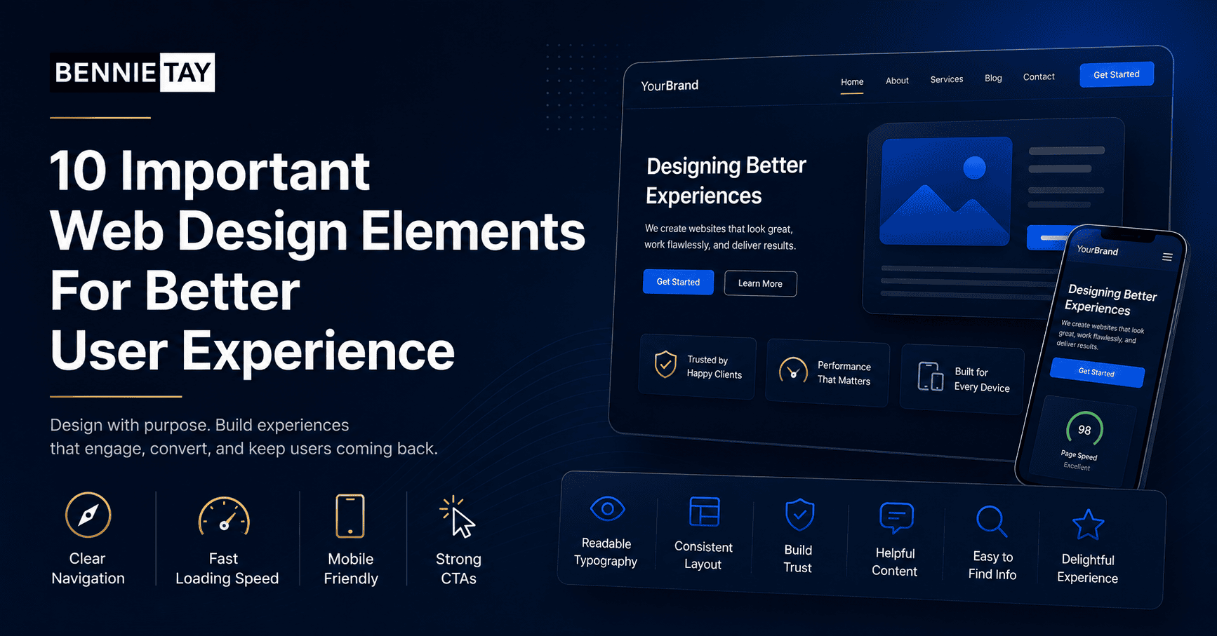
Here are ten important web design elements that can improve user experience.
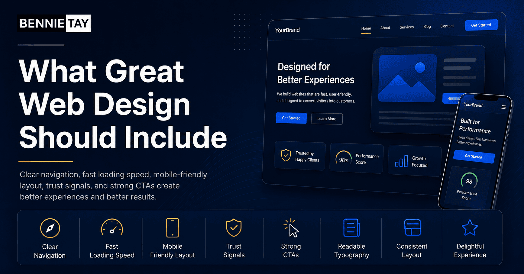
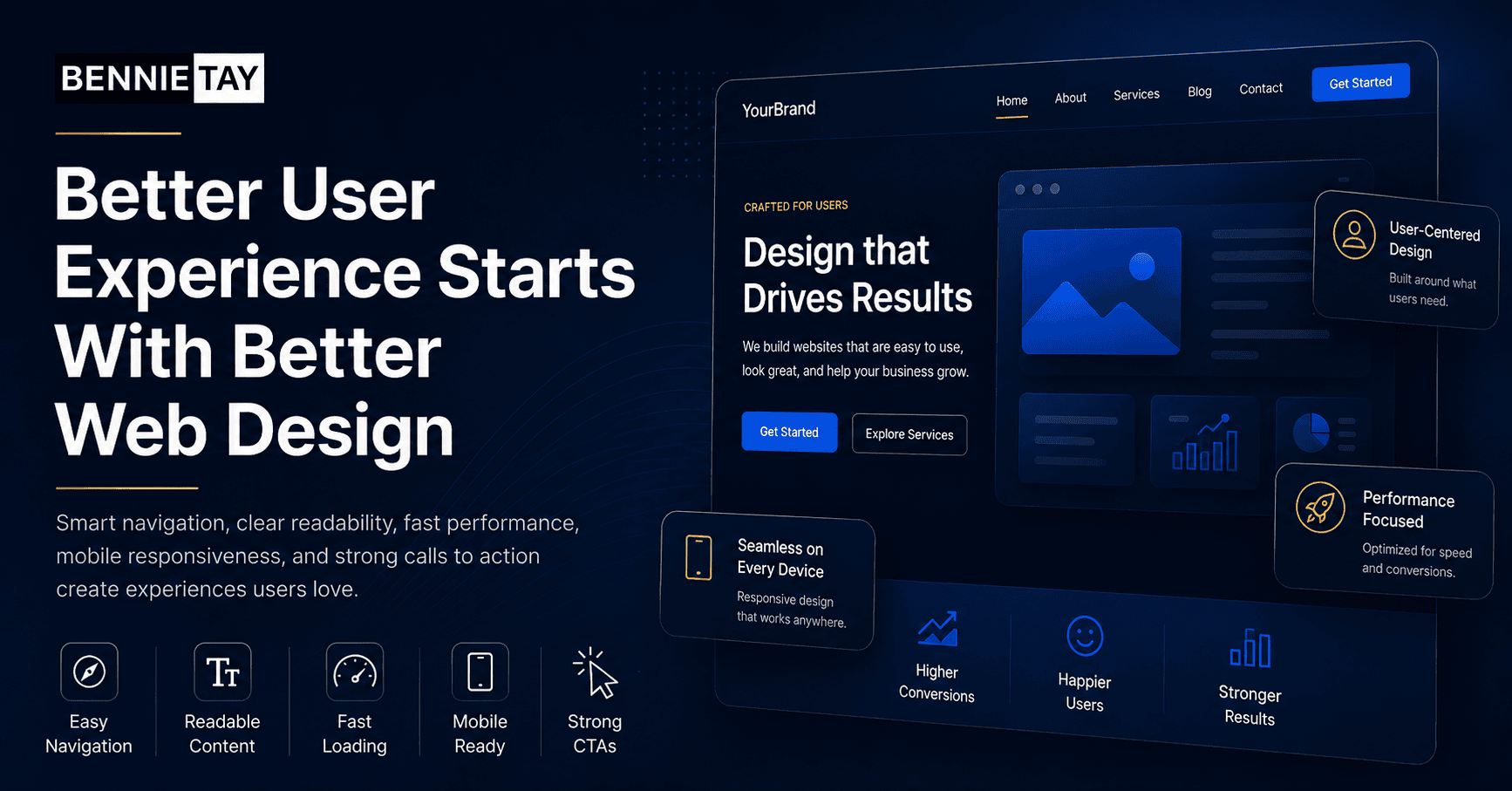
1. Clear navigation
Navigation helps visitors move around your website. It should be simple and predictable.
Use clear menu labels such as Home, Services, About, Projects, Blog, and Contact. Avoid clever labels that confuse people. If you have many services, organize them logically under a Services menu or create a services overview page.
On mobile, the menu should be easy to open and tap. Make sure important pages are not hidden too deeply.
2. Strong headline section
The first section of a page should quickly explain what the website is about. Visitors should not need to scroll or guess.
A strong headline usually explains the service, audience, or outcome. For example, “Website Design for Malaysian Service Businesses” is clearer than “Digital Solutions for Tomorrow.”
Add a short supporting sentence and a visible call-to-action button. This gives visitors a clear starting point.
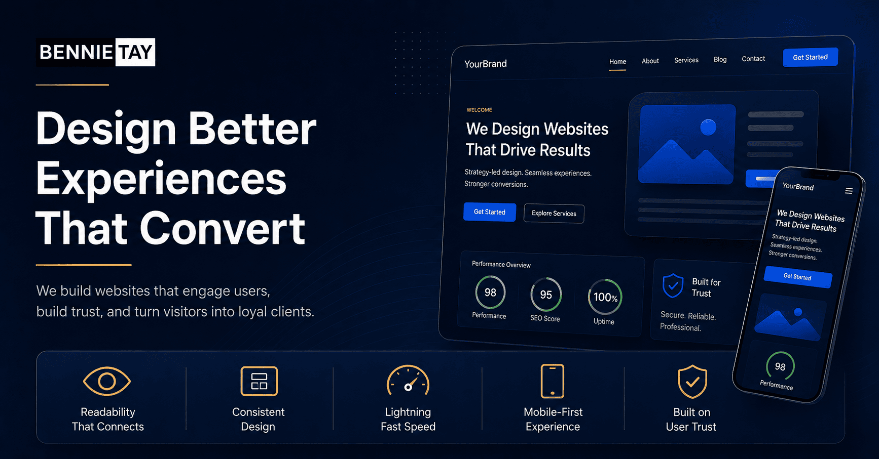
3. Readable typography
Text must be easy to read. Choose fonts that are clear on desktop and mobile. Avoid tiny text, low contrast, and long paragraphs.
Headings should create structure. Body text should be comfortable to scan. Line spacing should give the content room to breathe.
Readable typography is especially important for service pages, blog posts, pricing pages, and landing pages. If reading feels difficult, visitors may leave before understanding your offer.
4. Mobile-friendly layout
Many visitors browse from phones. A mobile-friendly website should not feel like a squeezed desktop page.
Buttons should be easy to tap. Images should resize properly. Forms should be simple. Text should not require zooming. Sections should stack in a logical order.
Test important pages on a real phone. Check the menu, contact buttons, forms, images, and page speed.
5. Fast loading speed
Speed affects user experience and conversions. A slow website makes visitors impatient, especially on mobile connections.
Common causes of slow websites include oversized images, too many plugins, heavy scripts, poor hosting, and unoptimized design elements.
Improve speed by compressing images, using caching, removing unnecessary plugins, and keeping the design focused. Fast pages feel more professional and reduce friction.
6. Clear calls to action
A call to action tells visitors what to do next. It may be “Request a Quote,” “Book a Consultation,” “Contact Us,” “Download the Guide,” or “Shop Now.”
Your buttons should be visible and specific. Avoid vague labels like “Click Here” when a clearer option is available.
Place calls to action at natural decision points. For example, after explaining a service, after showing proof, and near the bottom of the page.
7. Trust signals
Trust signals help visitors feel safe choosing your business. These can include testimonials, reviews, client logos, certifications, guarantees, project photos, case studies, security badges, or media mentions.
Use trust signals that match your industry. A contractor should show project photos and reviews. A consultant should show case studies and expertise. An ecommerce website should show secure payment and return information.
Do not hide all proof on one page. Place it near important sections where visitors are deciding whether to continue.
8. Useful visuals
Images and visuals should support the message. They should not be decoration only.
Use real photos where possible. Product photos, team photos, project images, screenshots, diagrams, and before-and-after images can help visitors understand and trust your business.
Avoid generic stock images that do not show anything specific. Also optimize images so they do not slow the website.
9. Simple forms
Forms are often where conversions happen. If your form is too long or confusing, visitors may abandon it.
Ask only for information you need at the first step. For many service businesses, name, phone number, email, service needed, and a short message are enough.
Make error messages clear. Confirm what happens after submission. If possible, offer alternative contact options such as WhatsApp or phone.
10. Consistent visual style
Consistency makes a website feel professional. Colors, fonts, buttons, icons, spacing, and image style should feel connected.
Inconsistent design makes visitors work harder. If every page looks different, the website can feel messy or unreliable.
Create simple design rules and follow them. Use the same button styles, heading sizes, spacing patterns, and colors across the site.
Bonus: Helpful content structure
Design and content work together. A page should not only look good; it should answer the visitor’s questions in the right order.
A service page might start with the problem, introduce the service, explain benefits, show proof, answer FAQs, and end with a call to action. A product page might show images, benefits, specifications, reviews, delivery information, and checkout options.
Good structure makes the design easier to understand.
Accessibility matters too
Good user experience should include accessibility. This means your website should be usable by people with different needs, devices, and browsing conditions.
Use enough color contrast between text and background. Do not rely only on color to communicate important information. Add descriptive alt text for meaningful images. Make sure buttons and links are clear. Use headings in the correct order so screen readers can understand the page.
Accessibility is not only for compliance. It improves usability for everyone. A website with clear labels, readable text, and logical structure is easier for all visitors to use.
White space and spacing
White space is the empty space around text, images, and sections. It helps the page feel organized.
When a website has too little spacing, everything feels cramped. Visitors struggle to separate sections and understand what matters. Good spacing makes content easier to scan.
Use consistent spacing between headings, paragraphs, images, and buttons. A clean layout often feels more premium than a crowded one.
Search and filtering for larger sites
If your website has many products, articles, projects, or services, search and filtering can improve user experience.
An ecommerce website may need filters by category, price, size, or brand. A project portfolio may need filters by project type or industry. A blog may need categories and search.
The goal is to help visitors find the right content quickly. If people cannot find what they need, they may assume you do not offer it.
Error handling and feedback
Small details matter. If a form fails, the error message should clearly explain what needs to be fixed. If a form is submitted successfully, the visitor should see a confirmation message.
Buttons should show clear states. Links should look clickable. Checkout steps should show progress. These details reduce confusion and make the website feel more reliable.
Good design guides visitors quietly. It helps them understand where they are, what happened, and what they can do next.
Design for business goals
Every design decision should support a business goal. A homepage for a consultant may focus on booked calls. A contractor website may focus on quote requests. An ecommerce page may focus on product confidence and checkout completion.
When the goal is clear, the design becomes easier to judge. If an element does not help visitors understand, trust, compare, or act, it may not need to be there.
This is why copying trends can be risky. A design trend may look modern but still fail your users. Choose elements based on what your audience needs to do.
Practical design wins when it removes friction.
Test with real users
You do not need a complex research process to improve user experience. Ask a few people to use the website and watch where they hesitate.
Can they find the service page? Can they understand the offer? Or can they contact you from mobile? Do they notice the call-to-action button? Do they trust the page enough to enquire?
Simple testing can reveal issues that designers and business owners miss because they already know the website too well.
Keep improving after launch
User experience should improve over time. Review analytics, form submissions, heatmaps if available, customer questions, and sales feedback.
If people visit a page but do not enquire, improve the message, proof, layout, or call to action. If people ask the same question repeatedly, add the answer to the page.
A good website is not frozen after launch. It should keep getting clearer and easier to use.
Balance beauty and usability
A visually attractive website is useful, but beauty alone is not enough. The design should make important information easier to find.
If an animation, image, or layout makes the page harder to use, simplify it. Visitors usually value clarity more than decoration.
The best websites feel polished and practical at the same time. They look credible, but they also help people complete the task they came for.
Review key pages regularly
Your most important pages should be reviewed regularly. Check your homepage, service pages, contact page, landing pages, and checkout pages if you sell online.
Business offers change, customer expectations change, and old sections can become outdated. A quick quarterly review helps keep the website accurate and useful.
Final thoughts
The most important web design elements are the ones that help visitors move forward with confidence. Clear navigation, readable text, mobile-friendly layout, fast speed, strong calls to action, trust signals, useful visuals, simple forms, and consistent design all support better user experience.
When your website is easier to use, visitors are more likely to stay, trust your business, and take action.