Your homepage is often the first page potential customers see when they visit your website. It can help people understand your business, trust your offer, and take action. Or it can confuse them, bore them, and send them straight to a competitor. The internet is generous like that.
A small business homepage should not be treated like a digital noticeboard. It should work like a clear sales conversation. It needs to explain what you do, who you help, why customers should trust you, and what they should do next.
Many small business websites fail because their homepage is missing the right sections. They may have a logo, a nice image, a short welcome message, and a contact form, but they do not guide visitors toward making an enquiry, booking a service, calling the business, or buying.
This guide explains what to put on a small business homepage, why each section matters, and how to structure the page so it can generate more leads and customers.
Why Your Homepage Matters
Your homepage is not just the front page of your website. It is often the first impression of your business. Before someone contacts you, they may visit your homepage to decide:
- What does this business do?
- Is this service right for me?
- Do they look trustworthy?
- Are they local or available in my area?
- What makes them different?
- How much does it cost?
- What should I do next?
If your homepage does not answer these questions clearly, visitors may leave.
A good homepage helps visitors quickly understand your business and feel confident enough to take the next step. For a small business, that next step may be:
- Requesting a quote
- Booking an appointment
- Calling your business
- Sending a WhatsApp message
- Filling out a form
- Visiting your shop
- Starting a free consultation
- Viewing your services
- Checking your pricing
The purpose of your homepage is not just to look nice. It is to move visitors closer to becoming customers.
The Best Small Business Homepage Structure
A strong small business homepage should usually include these sections:
- Hero section
- Trust indicators
- Problem section
- Solution or offer section
- Services overview
- Benefits section
- Why choose us section
- Process section
- Testimonials or reviews
- Pricing or package preview
- FAQ section
- Strong call to action
- Contact section
- Footer
Not every homepage needs every section, and not every section needs to be long. But these are the building blocks that help visitors understand, trust, and contact your business.
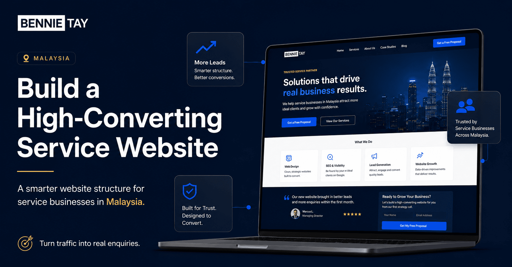
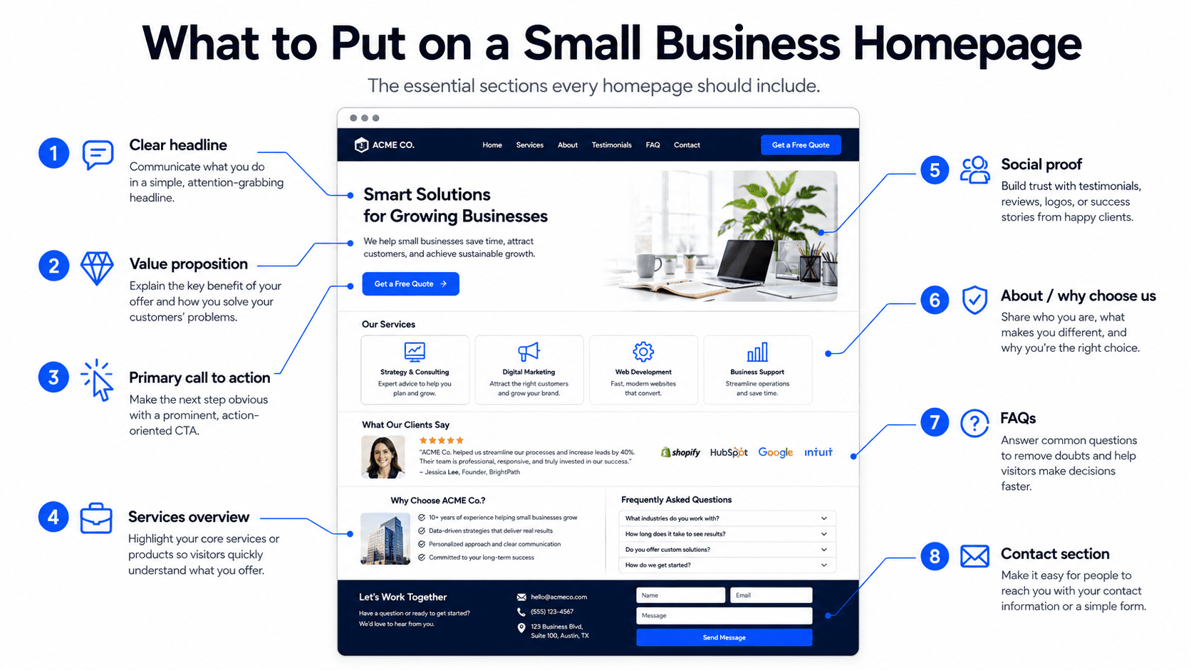
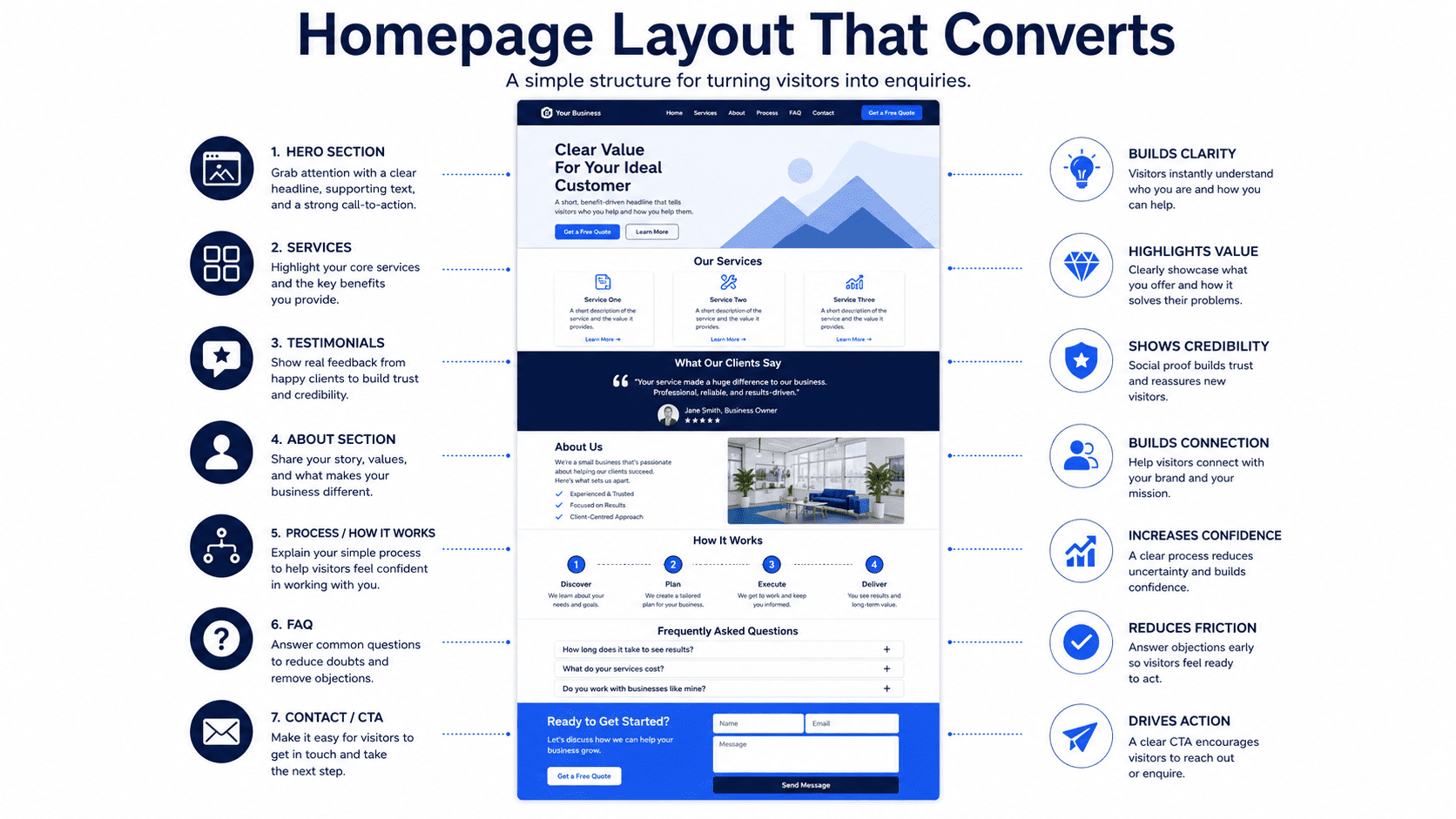
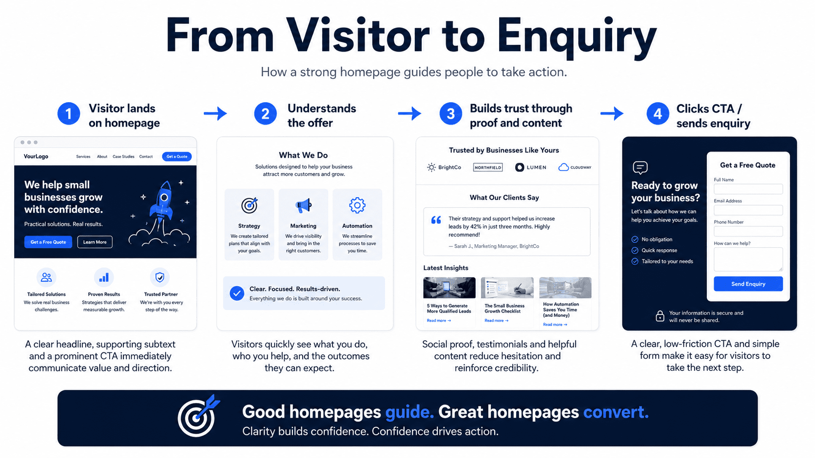
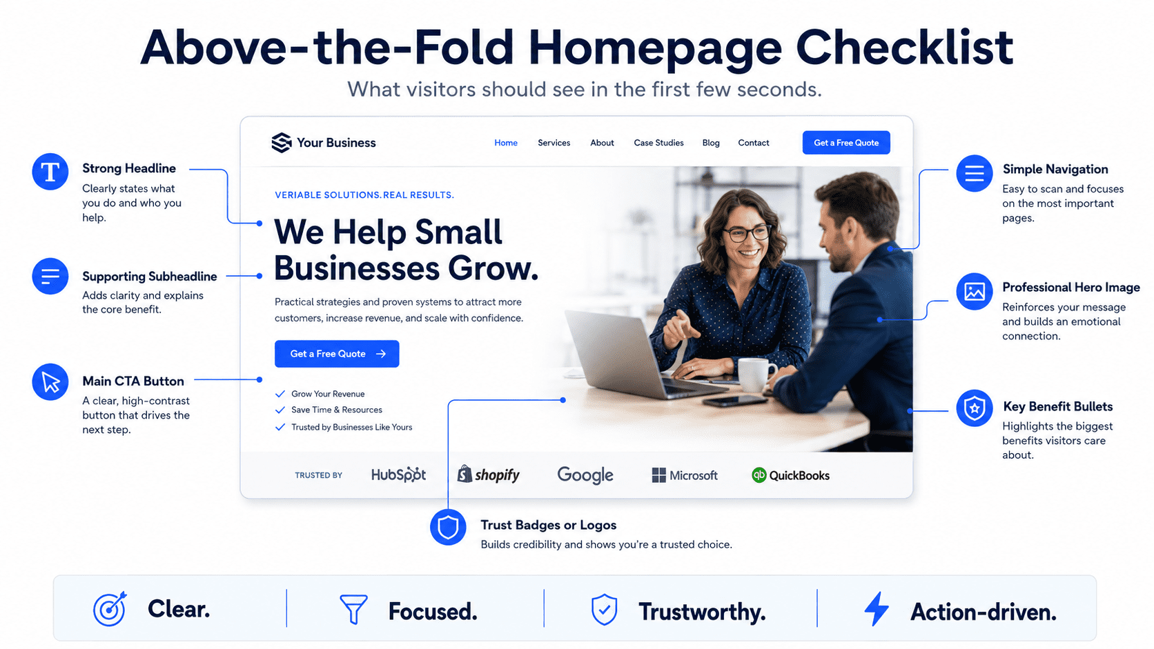
1. Clear Hero Section
The hero section is the first section at the top of your homepage. This is the most important part of the page because visitors use it to decide whether they are in the right place. A good hero section should include:
- Clear headline
- Short supporting text
- Primary call-to-action button
- Secondary call-to-action button
- Relevant image or visual
- Trust signal
Avoid vague headlines like:
“Welcome to Our Website”
“Professional Solutions for Your Business”
“Your Trusted Partner”
These phrases sound safe, but they do not explain anything useful. Impressive, if the goal is to say words without information. A stronger headline should explain what you do, who you help, and what outcome you provide.
Examples:
“Affordable Website Plans for Small Businesses That Need More Enquiries”
“Reliable Plumbing Services in Petaling Jaya and Kuala Lumpur”
“Professional Accounting Support for Small Business Owners”
“Mobile-Friendly Websites for Local Service Businesses”
A good hero section should answer three questions quickly:
- What do you offer?
- Who is it for?
- What should visitors do next?
2. Strong Call to Action
A call to action, or CTA, tells visitors what to do next. Your homepage should have one clear primary CTA. For example,
- Request a Free Quote
- Book a Free Consultation
- Call Now
- Send WhatsApp Message
- View Website Plans
- Schedule an Appointment
- Get Started
- Check Availability
Your CTA should be specific to the action you want visitors to take. For example, if your business sells website plans, “View Website Plans” or “Book a Free Website Consultation” is clearer than “Learn More.” And if you are a local service business, “Request a Free Quote” is clearer than “Contact Us.”
Place CTA buttons in key areas:
- Header
- Hero section
- Services section
- Pricing section
- FAQ section
- Final homepage section
- Footer
- Mobile sticky bar if suitable
Visitors should never have to search for how to contact you.
3. Trust Indicators Near the Top
People need a reason to trust your business. Trust indicators should appear near the top of your homepage, ideally just below the hero section. Examples of trust indicators include:
- Customer rating
- Number of customers served
- Years of experience
- Review snippets
- Client logos
- Certifications
- Awards
- Industry memberships
- Licensed or insured status
- Featured media mentions
- Service guarantees
Examples:
“Trusted by 100+ small businesses”
“Rated 4.9 by local customers”
“10+ years of experience”
“Certified and insured technicians”
“Serving Kuala Lumpur, Selangor, and surrounding areas”
Trust indicators help visitors feel more confident before reading the rest of the page. Do not hide all your proof at the bottom of the website like buried treasure nobody asked to dig for.
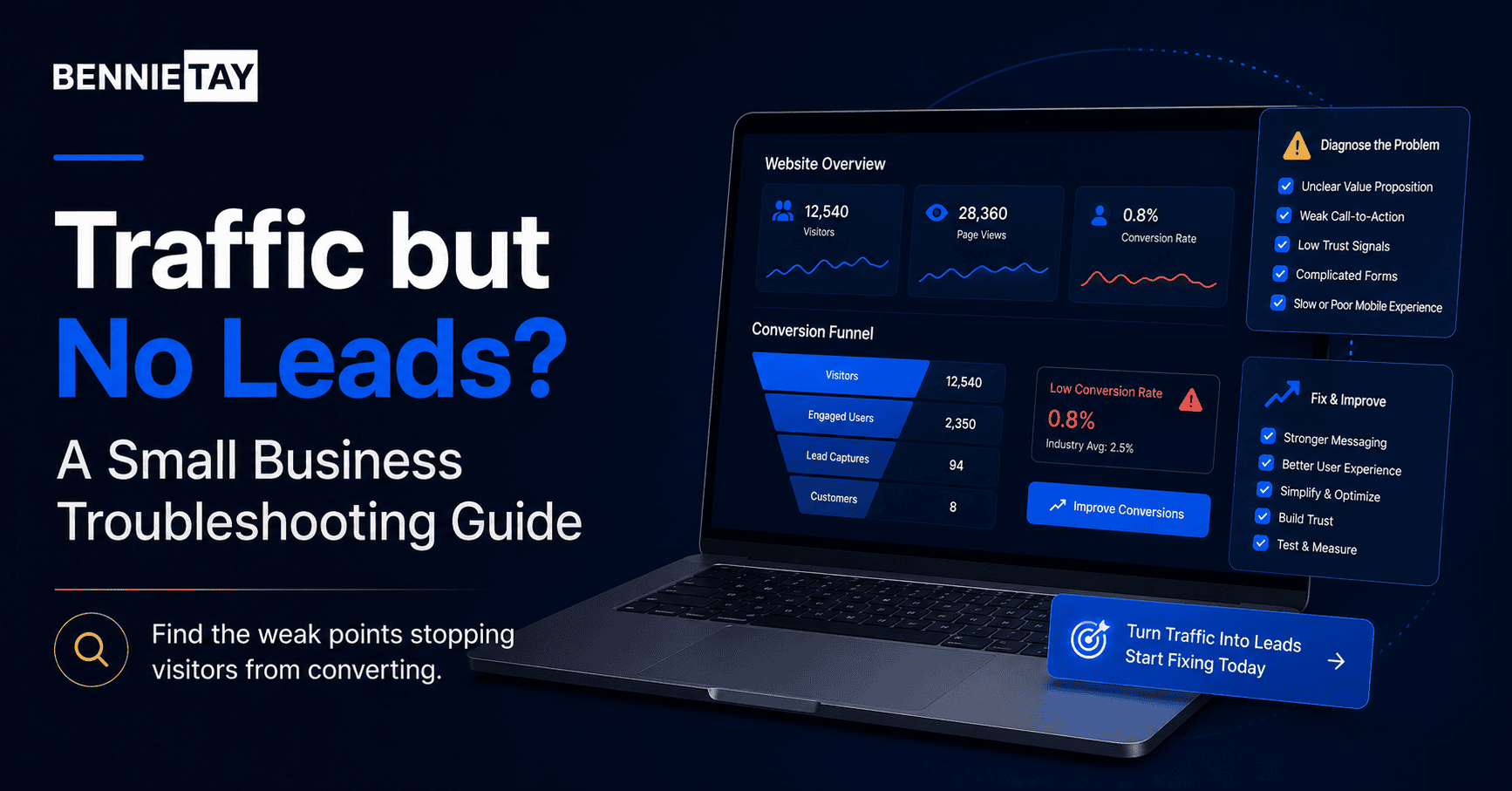
4. Problem Section
A strong homepage should show visitors that you understand their problem. Many websites jump straight into services, but they do not explain why the service matters. A problem section helps visitors think: “That sounds like me.”
For example, for a website service business: “Many small businesses have websites that look fine but do not generate enquiries. The message is unclear, the call to action is weak, and visitors leave without contacting the business.”
For a cleaning business: “Keeping your home clean while managing work, family, and daily responsibilities can be difficult. You need a reliable cleaning service that saves time and gives you peace of mind.”
For an accounting firm: “Many small business owners struggle to keep financial records organized, understand tax requirements, and make confident business decisions.”
A problem section should explain:
- What the customer is struggling with
- Why it matters
- What happens if it is ignored
- Why they need a better solution
This makes the homepage more relevant and persuasive.
5. Solution or Offer Section
After explaining the problem, your homepage should present your solution clearly. This section should explain what you offer and how it helps. For example: “Our monthly website plans help small businesses launch professional websites with design, hosting, maintenance, and support included in one predictable monthly package.”
Or: “Our local cleaning services help busy homeowners keep their homes clean, comfortable, and guest-ready without spending their weekends doing everything themselves.”
A strong solution section should answer:
- What do you provide?
- How does it solve the customer’s problem?
- What is included?
- Why is it easier, faster, or better?
- What result can the customer expect?
Keep this section clear and direct. Do not bury your offer inside long paragraphs full of generic business language. Customers are busy. Their patience is not a renewable resource.
6. Services Overview
Your homepage should include a simple overview of your main services. This helps visitors quickly understand what you provide and choose the right path. For example, a website business may include:
- Monthly Website Plans
Launch a professional website with hosting, maintenance, and support included. - Website Redesign
Improve an outdated website with clearer messaging, better mobile layout, and stronger conversion structure. - Landing Page Design
Create focused campaign pages designed to turn visitors into leads, bookings, or enquiries.
A local cleaning company may include:
- Home Cleaning
Regular cleaning services for busy households. - Office Cleaning
Reliable cleaning for small offices and commercial spaces. - Deep Cleaning
Detailed cleaning for move-ins, move-outs, and seasonal refreshes.
Each service should include:
- Service name
- Short description
- Main benefit
- Link to learn more or request a quote
If you offer multiple important services, create dedicated service pages and link to them from the homepage.
7. Benefits Section
Your homepage should explain why your service matters. Many businesses list features but forget benefits. Features describe what is included. Benefits explain why customers should care.
Example:
Feature: “Mobile-friendly website design”
Benefit: “Customers can easily browse and contact you from their phones.”
Feature: “Hosting included”
Benefit: “You do not need to manage technical setup or separate hosting accounts.”
Feature: “Same-day service available”
Benefit: “You can get urgent issues handled quickly without waiting days.”
A benefits section should focus on outcomes such as:
- Save time
- Reduce stress
- Get more enquiries
- Look more professional
- Improve customer trust
- Avoid technical problems
- Make booking easier
- Get faster service
- Improve business visibility
People do not buy services because of feature lists alone. They buy because they believe the service will improve something important.
8. Why Choose Us Section
Your homepage should explain why customers should choose your business instead of another option. Avoid generic claims such as:
- High quality
- Professional service
- Best solutions
- Customer satisfaction
- Trusted team
These phrases are everywhere. Even terrible businesses use them, which is one of humanity’s quieter tragedies. Instead, give specific reasons.
Examples:
- Fixed monthly website plans with no large upfront cost
- Hosting, maintenance, and support included
- Built specifically for small businesses and service providers
- Same-day response for urgent enquiries
- Clear pricing before work begins
- Local team serving Kuala Lumpur and Selangor
- Mobile-first design for modern customers
- Simple process from enquiry to launch
A good “Why Choose Us” section helps visitors compare you with competitors.
9. Process Section
A process section explains what happens after someone contacts you. This reduces uncertainty and makes your service feel easier to buy. Example process for a website business:
- Choose Your Plan
Select the website package that fits your business. - Submit Your Business Details
Share your services, branding, contact details, and preferred style. - Review Your Website Draft
Check the content, design, and structure before launch. - Launch and Improve
Publish your website and receive ongoing support based on your plan.
Example process for a local service business:
- Request a Quote
Tell us what service you need and where you are located. - Confirm the Details
We review your request and provide pricing or availability. - Book Your Service
Choose a suitable date and time. - Get the Job Done
Our team completes the work and follows up if needed.
A clear process helps visitors feel more comfortable taking action.
10. Testimonials or Reviews
Testimonials and reviews are essential for small business homepages. They show that real people have trusted your business before.
A weak testimonial says: “Great service. Highly recommended.”
A stronger testimonial says: “Our old website was difficult to update and did not generate many enquiries. The new website made our services clearer, improved the mobile experience, and gave us a more professional online presence.”
Specific testimonials are more persuasive because they describe the problem, experience, and result. Your homepage can include:
- Review snippets
- Star ratings
- Customer names
- Customer business names
- Google review highlights
- Before-and-after examples
- Short case study summaries
Place testimonials near important sections, such as after your services, near pricing, or before the final CTA.
11. Case Study or Portfolio Preview
If your business has visual work or measurable results, include a case study or portfolio preview. This is especially useful for:
- Website designers
- Renovation contractors
- Interior designers
- Beauty salons
- Fitness trainers
- Consultants
- Marketing agencies
- Cleaning companies
- Photographers
- Event planners
A simple case study preview can include:
- Client problem
- What you did
- Result or improvement
- Image or screenshot
- Link to full case study
Example: “A local service business needed a cleaner website that explained its offer and made enquiries easier. We redesigned the homepage, added clearer CTAs, improved mobile layout, and created dedicated service sections.”
Proof helps visitors believe your claims. A portfolio or case study preview shows that your business can deliver, not just talk.
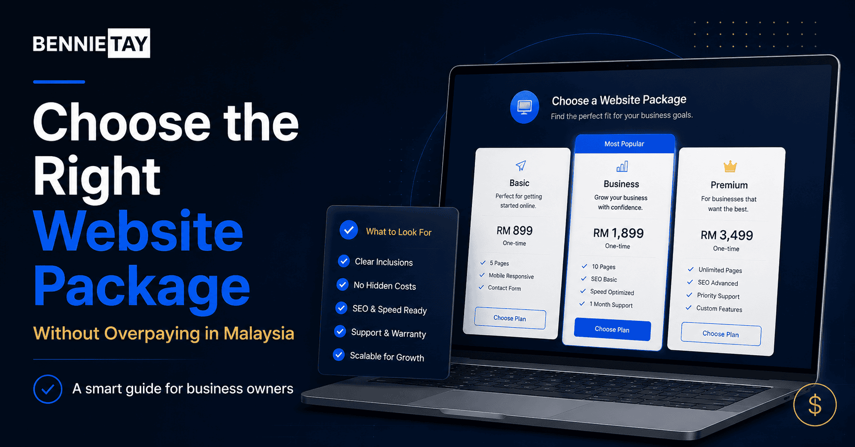
12. Pricing or Package Preview
Pricing is one of the most common questions visitors have. You do not always need to show exact pricing, especially if your services are custom. But some pricing guidance can help reduce hesitation.
Examples:
- “Website plans start from $49/month”
- “Cleaning services from RM150”
- “Custom quotes available based on project scope”
- “Book a free consultation for accurate pricing”
- “Packages available for small businesses and growing teams”
Pricing guidance helps visitors understand whether your service fits their budget. It also helps qualify enquiries. If you offer fixed plans, show a simple package preview.
Example:
| Plan | Best For | Starting Price |
|---|---|---|
| Starter | Simple one-page website | From $49/month |
| Business | 3-page small business website | From $99/month |
| Growth | 5-page website with stronger support | From $199/month |
This gives visitors clarity without overwhelming them.
13. FAQ Section
A homepage FAQ section helps answer common questions before visitors contact you. This can reduce hesitation and improve conversions. Good FAQ questions include:
- How much does it cost?
- How long does it take?
- What is included?
- Do you offer support?
- Can I use my own domain?
- Do you serve my area?
- Can I request changes?
- What happens after I enquire?
- Is there a contract?
- How do I get started?
For a small business homepage, keep FAQs short and useful. Do not add random questions nobody asks just to make the page look full. The internet already has enough filler pretending to be strategy.
14. Contact Section
Your homepage should make it easy for visitors to contact you. A good contact section can include:
- Short friendly message
- Simple enquiry form
- Phone number
- WhatsApp link
- Email address
- Booking link
- Business address if relevant
- Google Map if local
- Operating hours
- Service areas
- Response time expectation
Keep forms simple. A basic enquiry form usually only needs Name, Email or phone number, Service interest, and Message. If you ask too much too early, fewer people will complete the form. The goal is to start a conversation, not interrogate the visitor.
15. Footer
The footer is the bottom section of your homepage, but it still matters. Visitors often scroll to the footer to find contact details, service links, social media, and legal information. A strong footer should include:
- Business name
- Short description
- Main service links
- Contact details
- Service area or location
- Social links
- Legal links
- CTA
- Copyright notice
For local businesses, include consistent business information, especially your name, address, and phone number if relevant. For SEO, the footer can also help link to important pages, such as main services, pricing, blog posts, or location pages.
What Not to Put on a Small Business Homepage
Just as important as what to include is what to avoid. You usually do not need:
- A long “Welcome to our website” introduction
- Huge image sliders with no clear message
- Generic mission statements above the fold
- Too many social media feeds
- Random stock images with no purpose
- Long company history on the homepage
- Auto-playing videos
- Excessive animations
- Too many different CTAs
- Long blocks of text
- Hidden contact details
- Confusing navigation
- Blog posts with no relevance to customers
Every homepage section should earn its place. If a section does not help visitors understand, trust, or contact your business, it probably does not belong on the homepage.
Best Homepage Layout for a Small Business
Here is a simple homepage layout you can use:
1. Header
Include logo, navigation, and CTA button.
2. Hero Section
Clear headline, supporting copy, CTA buttons, trust signal, and visual.
3. Trust Indicators
Show reviews, years of experience, customers served, or certifications.
4. Problem Section
Explain the customer’s main challenge.
5. Solution Section
Present your service as the answer.
6. Services Overview
Show your main services with short descriptions.
7. Benefits
Explain the outcomes customers get.
8. Why Choose Us
Show specific reasons to trust your business.
9. Process
Explain how working with you works.
10. Testimonials
Add customer proof.
11. Pricing or Packages
Show pricing guidance or starting packages.
12. FAQs
Answer common objections.
13. Final CTA
Invite visitors to take the next step.
14. Contact Section
Make enquiry easy.
15. Footer
Include important links and business details.
This structure works because it follows how customers make decisions. They need clarity first, then trust, then proof, then action.
Homepage SEO Tips for Small Businesses
Your homepage should also support SEO. Important homepage SEO elements include:
- Clear H1 headline
- Main keyword in title tag
- Useful meta description
- Service keywords naturally included
- Location keywords if relevant
- Internal links to service pages
- Image alt text
- Fast loading speed
- Mobile-friendly design
- Clear navigation
- Local business information if applicable
For example, if your business provides website plans for small businesses, your homepage could naturally include keywords such as:
- small business website
- website plans
- monthly website plan
- Website-as-a-Service
- affordable business website
- website design for service businesses
Do not force keywords unnaturally. SEO should make your content clearer, not turn it into a robotic grocery list of search terms.
Homepage Checklist for Small Businesses
Use this checklist to review your homepage:
- Is the headline clear?
- Does it explain what you offer?
- Does it say who the service is for?
- Is there a visible CTA?
- Are trust indicators shown near the top?
- Are your main services easy to understand?
- Does the page explain customer benefits?
- Does it show why customers should choose you?
- Is there proof, such as testimonials or reviews?
- Is pricing guidance included?
- Are common questions answered?
- Is the contact section easy to find?
- Does the page work well on mobile?
- Does it load quickly?
- Is the navigation simple?
- Are important pages linked?
- Is conversion tracking installed?
If your homepage is missing several of these elements, it may not be giving visitors enough reason to become customers.
Final Thoughts
A small business homepage should not be a random mix of logo, images, welcome text, and contact details. It should guide visitors through a clear journey. A strong homepage explains what you do, who you help, why your service matters, why visitors should trust you, and what they should do next.
The most important sections to include are a clear hero section, strong CTA, trust indicators, problem and solution sections, services overview, benefits, why choose us, process, testimonials, pricing guidance, FAQs, contact section, and footer.
You do not need a complicated homepage. You need a clear one. When your homepage is structured around clarity, trust, and action, it becomes more than the front page of your website.
It becomes a lead generation tool for your small business.