Your homepage gets the visitor interested. Your service page is where they decide whether you can actually help them. That makes service pages some of the most important pages on a business website.
Yet many are treated like an afterthought.
A typical service page might say: We provide professional, reliable and high-quality solutions tailored to your needs. Then it lists a few features and ends with: Contact us today.
The problem is not that any of this is wrong. It is that almost every competitor can say exactly the same thing. A strong service page should do much more. It should help the visitor understand:
- Is this service for me?
- What problem does it solve?
- What exactly do I get?
- Why should I trust this company?
- What happens next?
If those questions are answered clearly, the page becomes more than a description. It becomes part of your sales process. Here is the service page structure I recommend for turning more website visitors into qualified enquiries.
Quick Answer: What Should a High-Converting Service Page Include?
A strong service page usually needs:
- Clear headline
- Strong value proposition
- Customer problem
- Service explanation
- Benefits
- What’s included
- Process
- Proof
- Pricing guidance where appropriate
- FAQs
- Clear call to action
You do not need every section on every page.
But these are the building blocks worth considering.
The order matters too.
Visitors should understand the offer before being asked to study your company history.
1. Start With a Clear Headline
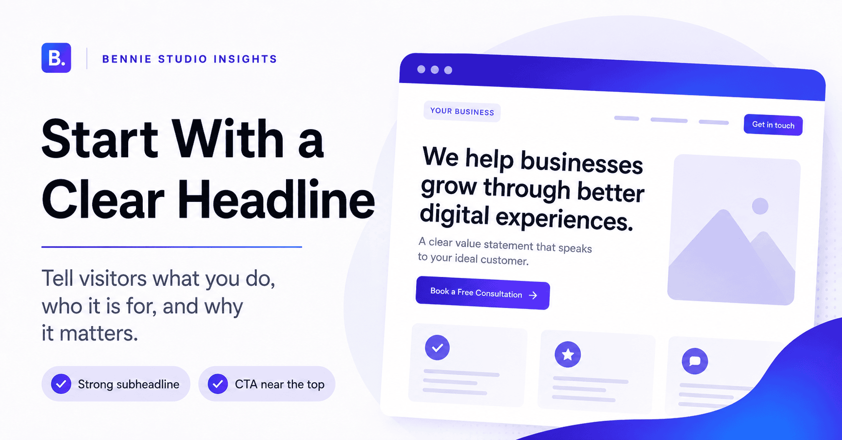
The headline should immediately tell visitors what the page is about. Avoid vague headings like: Solutions That Drive Success
That could describe consulting, logistics, software, accounting or a motivational seminar. A stronger headline might be:
Accounting and Bookkeeping Services for Malaysian SMEs
Or:
Office Renovation Services in Kuala Lumpur
Or:
Clear beats clever.
Your headline should usually communicate at least one or more of these:
- service
- audience
- location
- result
For example:
Website Design for Malaysian Service Businesses That Need More Enquiries
Now the visitor knows what the service is, who it is for and the intended outcome.
That is a much stronger start.
2. Add a Strong Subheadline
The subheadline expands on the headline.
It can explain:
- the problem
- the outcome
- the approach
- what makes the service different
For example:
Get a clear, mobile-friendly website built around your services, trust signals and enquiry flow instead of simply adding pages and hoping visitors contact you.
This is much more useful than:
We provide innovative digital solutions tailored to your needs.
Again, nothing is technically wrong with the second sentence.
It is simply saying very little.
3. Include a CTA Near the Top
Do not make visitors read the entire page before they can contact you.
Someone arriving from:
- a referral
- Google Ads
- a recommendation
- a previous conversation
may already be ready to enquire.
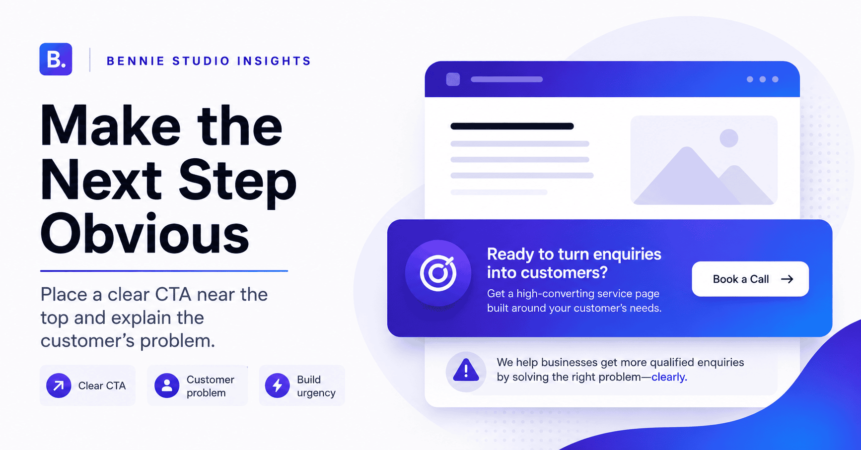
Put a clear CTA near the top.
Examples:
Request a Quote
Book a Consultation
Check Availability
Get a Free Assessment
WhatsApp Us
Choose the action that makes sense for the service.
If your service is complex, “Buy Now” may be inappropriate.
If your service is highly standardised, “Book a Consultation” may add unnecessary friction.
Match the CTA to the sales process.
4. Explain the Customer’s Problem
Before talking about your solution, show that you understand the situation.
For example, a website redesign service might say:
Your website may still be online, but if customers cannot understand your services, find important information or contact you easily on mobile, the website is not doing enough for the business.
This helps the visitor recognise themselves.
For an accounting service:
If bookkeeping is constantly falling behind, your team may be spending valuable time collecting receipts, correcting records and trying to understand numbers that should already be organised.
You are not manufacturing fear.
You are describing the problem clearly.
That helps the visitor feel:
This company understands why I am here.
5. Explain the Service Simply
Now describe what you actually provide.
Avoid filling this section with industry jargon.
If you offer managed website services, explain the service in plain language.
For example:
We build and manage your business website for you, including hosting, maintenance, routine updates and ongoing support. Instead of finding a developer every time something needs changing, you have one service responsible for keeping the website working and current.
That is easier to understand than:
Comprehensive end-to-end digital lifecycle management leveraging scalable infrastructure.
Humans remain your target audience.
Write accordingly.
6. Focus on Benefits, Not Only Features
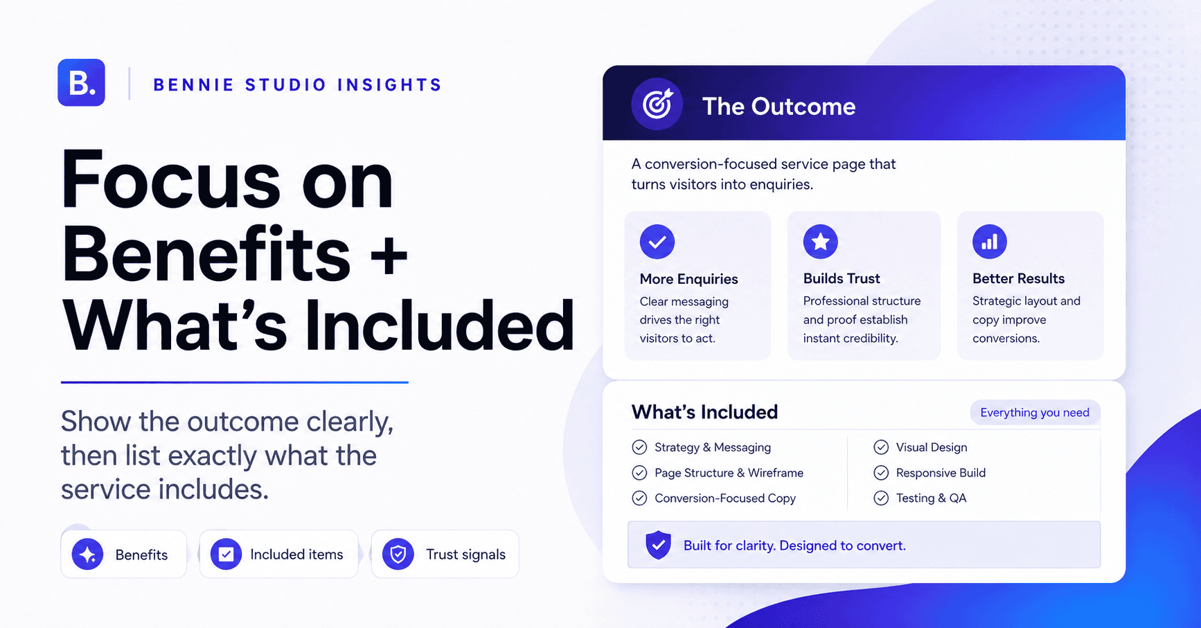
Features tell customers what they get.
Benefits explain why those features matter.
For example:
Feature
Daily backups.
Benefit
If something goes wrong, the website can be restored without rebuilding everything from scratch.
Feature
WhatsApp integration.
Benefit
Mobile visitors can contact your team immediately without copying phone numbers.
Feature
Dedicated service pages.
Benefit
Customers can find the exact service they need and understand it before contacting you.
You need both.
A page containing only benefits may sound vague.
A page containing only features may feel like a technical checklist.
Connect them.
7. Show Exactly What’s Included
This reduces uncertainty.
For example:
Your Website Package Includes
- Custom homepage
- Up to 6 service pages
- About page
- Contact page
- Mobile optimisation
- Contact form
- WhatsApp integration
- Basic SEO setup
- Analytics setup
- Launch support
The visitor now understands the scope.
If the service has different levels, use a comparison table or packages.
Be careful with enormous feature lists.
The objective is not to prove that you can count to 47.
Highlight the things customers actually care about.
8. Explain Who the Service Is For
Help visitors qualify themselves.
For example:
This service is suitable for established service businesses that need a professional website to explain their offer clearly and generate enquiries.
Then:
It may not be suitable if you only need a temporary one-page site or are looking for the lowest-cost DIY option.
This can actually improve lead quality.
You are not trying to attract everyone.
You are trying to attract the right people.
Specificity is useful.
9. Show Your Process
People are often nervous about what happens after they enquire.
A simple process removes uncertainty.
For example:
Step 1: Discovery
We understand your business, customers and goals.
Step 2: Structure
We plan the pages and customer journey.
Step 3: Content and Design
We develop the messaging and page layouts.
Step 4: Build
The website is developed and tested.
Step 5: Launch
We connect analytics, test enquiries and publish the site.
This helps the visitor imagine working with you.
Keep the process simple.
You do not need to document every internal project-management step.
The customer mainly wants to know what they should expect.
10. Add Proof Near the Decision Point
At this stage, the visitor understands the service.
Now they are asking:
Can I trust you to deliver it?
This is where proof matters.
Use:
- testimonials
- case studies
- before-and-after examples
- project screenshots
- credentials
- certifications
- client examples
- results
For example:
Client: Local service company
Problem: Website looked professional but generated very few enquiries.
Change: Simplified homepage, improved service pages and made WhatsApp and quotation CTAs more prominent.
Result: Clearer lead journey and easier enquiry tracking.
Use genuine proof.
If exact results cannot be shared, explain the work and outcome honestly.
Do not write:
300% more sales guaranteed.
unless you possess both evidence and apparently unusual control over somebody else’s sales department.
11. Address Common Objections
This is one of the most overlooked parts of service pages.
Think about why a prospect might hesitate.
Common objections include:
- price
- timeline
- commitment
- complexity
- risk
- switching provider
- support
- ownership
You can address these naturally.
For example:
Already have a website?
We can first review the existing site to determine whether it should be improved, redesigned or rebuilt. A complete rebuild is not always necessary.
Or:
Not sure how many pages you need?
We recommend the page structure based on your services and customer journey before confirming the final scope.
You do not need a section labelled:
OBJECTION HANDLING
That is an internal marketing concept, not something the customer needs to see.
Simply answer the concerns.
12. Show Pricing Guidance Where Possible
Pricing is one of the biggest questions visitors have.
If you can show exact pricing, do so.
If not, consider:
- starting price
- typical range
- package pricing
- minimum project value
For example:
Custom website projects start from RM6,000.
Or:
Most SME website projects fall between RM6,000 and RM12,000 depending on pages, content and functionality.
Then explain what affects the price.
This helps customers self-qualify.
If you cannot publish meaningful pricing, explain the quotation process clearly.
For example:
After a short requirements discussion, we confirm the recommended scope and provide a fixed project quotation.
Never make the pricing process feel mysterious for no reason.
13. Add a Mid-Page CTA
Visitors do not all make decisions at the same point.
Someone may be ready after reading:
- the scope
- pricing
- process
Give them an action there.
For example:
Not Sure Which Website Option Fits Your Business?
Tell us what you currently have and what you want the website to achieve.
Request a Website Review →
Then continue the page.
This allows high-intent visitors to convert without scrolling to the end.
14. Include Frequently Asked Questions
FAQs help answer final concerns.
Useful questions may include:
- How much does the service cost?
- How long does it take?
- What do I need to provide?
- Is support included?
- Can you work with my existing website?
- Do I own the finished website?
- What happens after launch?
Focus on real customer questions.
Do not write FAQs only to repeat keywords.
A useful FAQ reduces uncertainty and gives your sales team fewer repetitive questions to answer.
That is a win on two fronts.
15. End With a Strong CTA
The bottom of the page should make the next step very clear.
A weak ending:
Contact us for more information.
A stronger ending:
Ready to Improve Your Business Website?
Tell us what you currently have, what is not working and what you want the website to achieve. We will recommend the next step.
Request a Free Website Review →
This explains:
- who should act
- what to provide
- what happens next
The CTA should feel like a natural conclusion to the page.
Not a sudden sales interruption.
A Complete Service Page Structure
Here is the structure I would use for many service businesses.
Section 1: Hero
- Service
- Audience
- Result
- Primary CTA
Section 2: Problem
Show you understand what the customer is dealing with.
Section 3: Service Overview
Explain the solution simply.
Section 4: Benefits
Show why the service matters.
Section 5: What’s Included
Make the scope clear.
Section 6: Who It’s For
Help visitors qualify themselves.
Section 7: Process
Explain what happens.
Section 8: Proof
Testimonials, projects, case studies or credentials.
Section 9: Pricing
Provide guidance where possible.
Section 10: FAQ
Answer final concerns.
Section 11: CTA
Make the next step obvious.
You can shorten or expand this based on the complexity of the service.
The important thing is the logic.
Common Service Page Mistakes
Mistake 1: Talking About Yourself Too Early
The visitor is not yet interested in your company history.
Start with their problem and your service.
Mistake 2: Using Vague Copy
Words such as:
- professional
- innovative
- comprehensive
- trusted
- quality
are not useless.
They are simply weak without evidence.
Show what makes you those things.
Mistake 3: Hiding the CTA
Do not make contacting you a scavenger hunt.
Mistake 4: Listing Features Without Context
Explain why features matter.
Mistake 5: No Proof
Customers need reasons to believe you.
Mistake 6: No Pricing Guidance
When possible, reduce uncertainty.
Mistake 7: One Services Page for Everything
Important services often deserve dedicated pages.
Should Every Service Have Its Own Page?
If the service is commercially important, usually yes.
Dedicated pages allow you to:
- explain the service properly
- target relevant searches
- show specific proof
- answer specific FAQs
- use relevant CTAs
For example, instead of:
/services/
containing:
- Website Design
- SEO
- Landing Pages
- eCommerce
consider:
/website-design//landing-page-design//ecommerce-website-design/
Each page can then focus on a different customer problem.
That creates much clearer content.
How Long Should a Service Page Be?
There is no magic length.
A simple service may need 700–1,000 words.
A more complex or competitive service may need 1,500–2,500 words.
The page should be long enough to answer the customer’s important questions.
Do not add paragraphs simply to hit a word count.
A 3,000-word page full of repetition does not become persuasive through endurance.
Write enough.
Then stop.
Frequently Asked Questions
What should a service page include?
A strong service page normally includes a clear headline, service explanation, benefits, scope, process, proof, pricing guidance, FAQs and a clear call to action.
Should every business service have a separate page?
Important services usually benefit from dedicated pages, especially when customers search for them separately or need detailed information before enquiring.
How many CTAs should a service page have?
You can repeat the main CTA several times throughout the page.
Keep the primary action consistent rather than introducing a completely different CTA in every section.
Should a service page include prices?
If possible, show fixed pricing, starting prices or a typical range.
If pricing depends heavily on scope, explain what affects the quote and what happens after an enquiry.
Should testimonials appear on service pages?
Yes, especially when the testimonial is relevant to the service being described.
Specific proof is generally stronger than generic company-wide claims.
How do I know whether my service page converts well?
Track relevant actions such as form submissions, WhatsApp clicks, calls, consultation bookings and quotation requests.
Then compare those actions with the amount and quality of traffic reaching the page.
Your Service Page Should Help the Customer Decide
A service page is not simply a place to describe what your company does.
It should guide a visitor from:
“I might need this.”
to:
“This looks relevant.”
to:
“I trust this company enough to contact them.”
That requires more than nice design.
It requires:
- clear messaging
- useful information
- proof
- low-friction enquiry paths
- a logical customer journey
At Bennie Studio, service pages are structured around that decision process rather than simply filling sections with generic marketing copy.
The goal is to help the right visitor understand your offer quickly, trust the business and know exactly what to do next.
Explore Lead-Generation Website Design →
Already getting service-page traffic but not enough enquiries?
Get a Free Website Growth Audit →
For the wider website structure and service strategy, see our website design services page at https://bennietay.com/website-design-services/