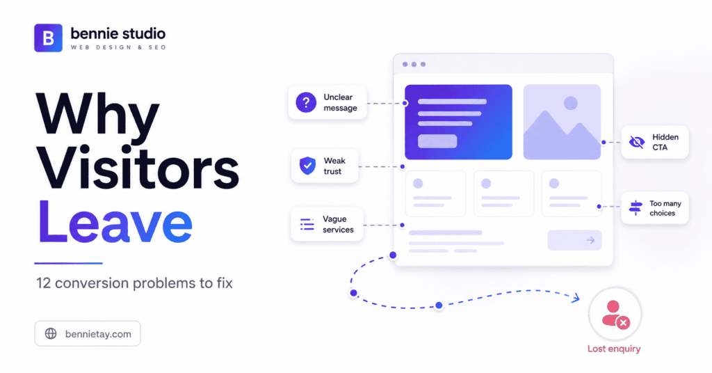
Your website is getting visitors. People find you through Google, social media, referrals, advertising and other marketing channels. They arrive on your homepage, browse a service page, read about what you offer and perhaps spend a few minutes looking around.
Then they disappear. No WhatsApp message. No phone call. No quotation request. No consultation booking. The natural reaction is often:
We need more website traffic.
Sometimes you do. But if the website already receives relevant visitors and very few of them take action, sending more people into the same experience may simply create a larger number of visitors who leave.
Before spending more on advertising, SEO or content, ask a different question:
Why are people reaching the website but deciding not to contact us?
Website conversion problems are rarely caused by one spectacular mistake. More often, several smaller issues create enough uncertainty, friction or confusion to stop the visitor from moving forward.
Here are 12 of the most common problems to investigate.
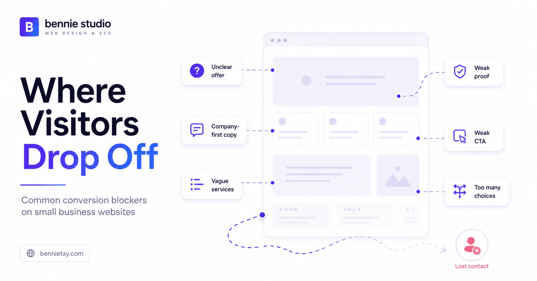
1. Visitors Cannot Quickly Understand What You Do
Open your homepage and look only at the first screen. Imagine you know absolutely nothing about the company. Can you immediately understand:
- what the business provides
- who the service is for
- what problem it solves
- what result the customer can expect
If not, you are asking visitors to work too hard. A headline such as: Transforming Possibilities Into Digital Excellence
might sound polished, but it could describe software, marketing, consulting, training, web development or an unusually ambitious photocopier company.
Compare it with:
Managed Websites for Malaysian Service Businesses That Need More Enquiries
The second headline communicates the offer, audience and intended outcome almost immediately. Visitors should not need to scroll through several sections before discovering what the company actually sells. Clarity should come before cleverness.
You can impress people after they know why they are there.
2. The Website Talks About the Company Before the Customer
Many business websites begin with a long introduction about themselves:
We are a leading organisation committed to delivering outstanding solutions through innovation, integrity and excellence. Then comes the company history. Then the mission. And then the values. Meanwhile, the visitor is still asking:
Can you solve my problem?
Your business story matters, but it should support the customer’s decision rather than dominate the opening message. Instead of beginning with who we are, start with what we help customers achieve.
For example:
Need a Business Website That Generates More Enquiries?
We design and manage websites for Malaysian service businesses around clearer messaging, stronger trust and easier enquiry journeys. Now the customer sees their objective first. You can introduce your experience, team and company story afterwards as evidence that you are capable of delivering it.
People are interested in your business mainly because of what it might do for them. A harsh arrangement, perhaps, but commerce has never been particularly sentimental.
3. Your Service Pages Do Not Explain Enough
A visitor clicks a page called Accounting Services. The page says:
We provide comprehensive accounting solutions tailored to your unique needs.
That sounds pleasant. But what does the service actually include?
Does it cover bookkeeping, management accounts, payroll, corporate tax or reporting? Who is it designed for? What does the process look like? How does the customer get started?
A strong service page should remove uncertainty.
It should normally explain:
- the customer’s problem
- what the service does
- who it is for
- what is included
- how the process works
- relevant proof
- pricing guidance
- frequently asked questions
- the next step
Your website should answer the basic questions customers repeatedly ask your sales team. If prospects must contact you simply to understand the service, the page is leaving too much work for the conversation. Good service pages do part of the sales process before the enquiry happens.
4. There Is Not Enough Evidence to Trust You
A visitor may understand your offer perfectly and still hesitate. This is particularly common with higher-value or higher-risk services. They may wonder:
- Is this company legitimate?
- Have they done this before?
- Who will actually deliver the work?
- Can I see examples?
- What do previous customers say?
- What happens if something goes wrong?
Generic reassurance is rarely enough.
Statements such as:
Trusted by businesses across Malaysia
or:
Professional service you can rely on
are claims.
Visitors need evidence. Useful trust signals can include:
- genuine testimonials
- Google reviews
- case studies
- completed projects
- before-and-after examples
- client logos where appropriate
- team photographs
- professional qualifications
- industry memberships
- clear company details
The stronger the commitment you are asking the customer to make, the more evidence they are likely to need. A person spending RM100 may accept relatively light proof. Someone considering a RM30,000 project will probably want considerably more than three stock photographs and the word “trusted” in bold.
Specific evidence beats self-description.
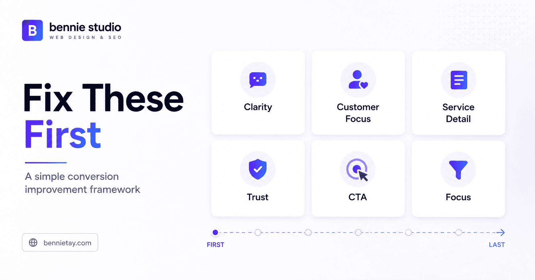
5. Your Calls to Action Are Too Vague
A visitor reads the page. They understand the service. They are interested. Then the page concludes with:
Contact Us
That is functional, but it leaves several questions unanswered. Contact you for what? What happens after clicking? Will they receive a quotation, schedule a call or simply land on another generic contact page?
Stronger calls to action describe the next step.
Examples include:
- Request a Free Quote
- Book a Consultation
- Check Class Availability
- Get a Website Review
- Schedule an Assessment
- WhatsApp Us
- The CTA should match the customer’s intent.
An urgent service may benefit from Call Now.
A complex professional service might use Book a Consultation.
A project-based service may be better suited to Request a Quote.
You should also place CTAs at natural decision points throughout longer pages.
Do not rely on one lonely button at the bottom and assume everybody will survive the expedition required to reach it.
6. You Give Visitors Too Many Ways to Contact You
Choice can be helpful. Too much choice creates hesitation. Some websites display all of these at once:
- Call Us
- Book Online
- Request a Quote
- Start Now
- Download Brochure
- Subscribe
- Live Chat
- Messenger
The visitor now has to decide how your business prefers to be contacted before they can decide whether to contact it.
For most service pages, keep the hierarchy simple.
Use:
one primary CTA
and perhaps:
one lower-friction alternative
For example:
Primary: Request a Quote
Secondary: WhatsApp Us
The primary action serves the serious prospect. The secondary action helps someone who still has a quick question.
That is usually enough.
Your website should guide the next step rather than resemble an airport departure board displaying every possible destination.
7. You Hide Pricing Completely
Not every business can publish an exact price.
A renovation project, consulting engagement or custom website may vary significantly in scope.
But complete pricing secrecy can create its own problem.
Visitors may assume:
- the service is too expensive
- pricing is unpredictable
- they will face an uncomfortable sales conversation
- they are wasting their time by enquiring
You can reduce that uncertainty without publishing a rigid rate card.
Consider showing:
- starting prices
- typical ranges
- minimum project values
- packages
- factors that affect the quotation
For example:
Custom website projects start from RM6,000. Most SME projects fall between RM6,000 and RM12,000 depending on scope and functionality.
Now the prospect has context.
Someone with a RM1,000 budget can self-qualify out.
A customer comfortable with that range can enquire with greater confidence.
Pricing guidance may reduce total lead volume while improving lead quality.
That is not necessarily a bad outcome.
More enquiries are useful only when enough of them are commercially relevant.
8. The Mobile Experience Is Frustrating
A potential customer searches Google from their phone.
Your website opens.
The text is tiny, the navigation is awkward, buttons are difficult to tap and the enquiry form contains twelve fields.
The floating WhatsApp icon overlaps another button.
The visitor leaves.
There is no complex behavioural theory required here.
The website was simply annoying.
For many local and service businesses, mobile is not a secondary version of the customer experience.
It may be the main experience.
Test important pages on actual phones and check:
- navigation
- text readability
- button size
- form usability
- phone links
- pricing sections
- tables
- images
- page speed
Pay particular attention to contact actions.
A mobile visitor who has already decided to enquire should not need the finger precision of a neurosurgeon to tap the correct button.
9. Your Website Takes Too Long to Load
Visitors do not need a website to load instantly.
They do expect it to become usable reasonably quickly.
Common performance problems include:
- oversized images
- unnecessary background videos
- excessive scripts
- poorly configured plugins
- heavy animations
- weak hosting
- too many third-party tools
Each element may look harmless by itself.
Combined, they can make a simple service page feel unnecessarily slow.
Performance matters because visitors cannot convert on a page they abandon before it becomes usable.
Review whether each heavy element contributes enough value to justify its cost.
A 12 MB background video may look cinematic on the designer’s office Wi-Fi.
It becomes less majestic when a prospect on mobile data watches a blank loading screen while trying to find an emergency service.
Optimise images, caching, scripts, fonts, hosting and unnecessary third-party resources.
Speed is part of the customer journey.
10. Important Customer Objections Remain Unanswered
People often leave because they still have a question they consider important.
Typical concerns include:
- How much does it cost?
- How long does the service take?
- What exactly is included?
- Do you serve my location?
- Is there a contract?
- Can I cancel?
- Who owns the finished work?
- What happens after I enquire?
- What support is included?
If these questions remain unanswered, the visitor has to contact you while still feeling uncertain.
Some will.
Many will simply open another competitor’s website.
Talk to the people handling sales and enquiries.
Ask:
What questions do customers repeatedly ask before they buy?
Then answer those questions on the website.
FAQs are useful, but objections can also be addressed throughout service descriptions, pricing sections, case studies and process explanations.
The objective is to reduce uncertainty gradually as the visitor moves through the page.
11. Your Contact Process Asks for Too Much
The customer finally decides to request a quotation.
They click the button.
The form asks for:
- full name
- company
- job title
- department
- industry
- annual revenue
- full address
- postcode
- telephone
- budget
- timeline
- detailed project brief
They wanted to ask whether you could help.
They now appear to be applying for a commercial loan.
Forms should collect enough information to begin or qualify the conversation, not every piece of information the business might eventually need.
For a simple enquiry, you might ask for:
- name
- contact details
- service required
- message
For a more complex project:
- name
- company
- service
- budget range
- timeline
- short project description
Additional information can be collected during the next stage.
Every extra field creates another small reason not to finish the form.
Ask whether you genuinely need the information before speaking with the lead.
If not, consider removing it.
12. Visitors Cannot See Why They Should Choose You
This may be the most important problem.
Your website clearly explains the service, pricing and contact process.
But so do your competitors.
Everyone claims to be:
- professional
- experienced
- reliable
- trusted
- customer-focused
- high quality
These words provide almost no differentiation.
Why should a prospect choose your business specifically?
Your positioning might come from:
- specialisation
- industry experience
- service model
- process
- speed
- ongoing support
- location
- pricing structure
- customer experience
- unique expertise
Compare:
We build professional websites.
with:
We build and manage websites for Malaysian service businesses that want one provider responsible for design, hosting, maintenance and ongoing improvements.
The second statement gives the customer something concrete to compare.
Strong positioning is not about inventing a clever slogan.
It is about making the reason to choose you easier to understand.
How to Find Out Why Visitors Are Leaving
Do not rely only on assumptions.
Use your website data to identify where the biggest problems may be.
Review Traffic Sources
Understand whether visitors come from Google, social media, advertising, referrals or other channels.
Different traffic sources often behave differently.
If a campaign attracts the wrong audience, the website may not be the main conversion problem.
Review Landing Pages
Identify which pages people see first.
High-traffic landing pages deserve particular attention because any weakness affects more visitors.
Track Enquiry Actions
Measure actions such as:
- form submissions
- WhatsApp clicks
- phone clicks
- booking completions
- quotation requests
This tells you whether visitors are taking meaningful steps.
Compare Device Types
If mobile traffic is high but enquiry rates are weak, inspect the mobile experience carefully.
Review Search Queries
Look at the terms bringing people from Google.
You may discover that the site ranks for searches that are only loosely connected to your actual service.
Not every conversion problem is a website design problem.
Sometimes you are simply attracting the wrong visitors.
Run a Simple Conversion Audit
Choose one important service page and review it using these questions.
Clarity
Can someone understand what is being offered within a few seconds?
Relevance
Does the page speak to a recognisable customer problem?
Value
Does it explain why the service is worth considering?
Proof
Is there genuine evidence that you can deliver?
Pricing
Is there enough guidance to reduce uncertainty?
Friction
Is contacting the business easy?
Mobile
Can the page be used comfortably on a phone?
CTA
Is the next action obvious?
If several of these areas are weak or missing, you probably have useful conversion work to do before spending heavily on additional traffic.
Do You Need to Redesign the Entire Website?
Not necessarily.
A website that does not convert well does not automatically need a complete rebuild.
Sometimes the underlying structure is acceptable and the problems are mainly communication and conversion issues.
Consider this example.
Before
Headline: Your Partner in Business Excellence
CTA: Learn More
Trust: None
Pricing: None
After
Headline: Accounting & Tax Services for Malaysian SMEs
CTA: Book a Consultation
Add:
- professional credentials
- client testimonials
- clearer service details
- frequently asked questions
- starting-price guidance
The website may retain the same basic design while becoming significantly easier to understand and trust.
Fix the highest-impact problems first.
A redesign makes sense when the existing platform, structure or experience genuinely prevents improvement.
It should not be the automatic response every time conversions disappoint.
More Enquiries Are Not Always Better
Suppose your website currently generates 100 enquiries each month.
That sounds excellent until you discover 90 are unsuitable.
You then improve the website by adding clearer service positioning, realistic pricing guidance and better qualification.
The following month you receive only 50 enquiries.
But 30 are strong opportunities.
Total leads fell by half.
Qualified leads tripled.
That is an improvement.
Conversion optimisation should not be judged only by how many people complete the form.
Measure:
- lead quality
- suitable customer type
- quotation value
- sales conversion
- resulting revenue
The goal is not to maximise the number of people who contact you.
It is to generate more useful business opportunities.
What Is a Good Website Conversion Rate?
There is no universal conversion rate every website should achieve.
Performance varies based on factors such as:
- traffic quality
- industry
- offer
- service price
- buying cycle
- marketing channel
- customer intent
A business selling a RM30 product and a consultancy selling RM100,000 projects should not expect visitors to behave in the same way.
Instead of obsessing over generic benchmarks, establish your own baseline.
For example:
1,000 relevant visitors
30 enquiries
Your current enquiry conversion rate is:
3%
Then improve the customer journey and monitor whether:
- the enquiry rate changes
- lead quality improves
- quotations increase
- more leads become customers
The trend within your own business is often more useful than comparing yourself with an arbitrary internet statistic.
Frequently Asked Questions
Why do people visit my website but not contact me?
Common reasons include unclear messaging, vague service pages, weak trust signals, hidden pricing, poor mobile usability, slow performance, weak calls to action and too much friction in the enquiry process.
Several smaller problems often combine rather than one single issue causing every lost enquiry.
Do I need more traffic or better conversion?
If your website already receives relevant traffic but produces very few enquiries, improving conversion should be a priority.
If almost nobody visits the site, you will probably need to work on both traffic generation and conversion.
Does showing pricing help website conversion?
Pricing guidance can reduce uncertainty and help customers determine whether the service fits their budget.
It may reduce unsuitable enquiries while improving confidence among stronger prospects.
Should I redesign my website if it is not generating leads?
Not automatically.
First identify whether the main problems involve messaging, proof, pricing, CTAs, mobile usability or the enquiry process.
Many conversion problems can be improved without rebuilding everything.
Should WhatsApp appear on every service page?
If customers commonly use WhatsApp and your team responds consistently, it can be a useful conversion option.
For complex services, consider using WhatsApp as a secondary action while keeping a more structured quotation or consultation CTA as the primary path.
How can I measure website conversion?
Track meaningful actions such as form submissions, WhatsApp clicks, phone calls, bookings, quotation requests and purchases.
Then compare those actions with traffic sources, landing pages and eventual lead quality.
Fix the Journey Before Buying More Traffic
More traffic can absolutely help a business grow.
But more visitors only become valuable when the website gives them a clear reason to take action.
Before increasing your advertising budget or publishing another mountain of content, review the journey you already have.
Can visitors understand what you do?
Can they see why they should trust you?
Do they know what the service may cost?
Are their common questions answered?
Is contacting you easy?
Is there a clear reason to choose your business instead of another one?
If the answer to several of those questions is no, improving the website may generate better results from traffic you already have.
At Bennie Studio, websites are designed around this complete conversion journey, from clearer positioning and service pages to trust signals, pricing guidance and enquiry flow.
The objective is not simply to attract more visitors.
It is to help more of the right visitors become genuine business opportunities.
Already getting traffic but not enough enquiries?
For a practical framework for improving weak pages, read the Service Page Structure Guide.