Your homepage may be getting visitors, but that does not mean it is doing its job.
A homepage should help people understand what your business offers, why they should trust you, and what they should do next. If visitors are landing on your website but not calling, booking, requesting quotes, sending messages, or buying, your homepage may be failing to convert. The frustrating part is that many homepages look fine at first glance. They may have a modern design, attractive images, smooth sections, and a contact button. But looking good is not the same as converting.
A high-converting homepage needs clear messaging, strong structure, trust proof, easy navigation, persuasive copy, and a visible next step.
If your homepage is not converting visitors into customers, it usually means the page is confusing, too generic, too slow, too hard to use, or not built around the customer’s decision-making process. This guide explains the most common reasons your homepage is not converting, how to identify the problem, and what to fix so your website can generate more enquiries, leads, bookings, and sales.
What Does Homepage Conversion Mean?
Homepage conversion means a visitor takes a valuable action after landing on your homepage. That action depends on your business model.
For a service business, a conversion may be:
- Filling out a contact form
- Booking a consultation
- Requesting a quote
- Calling your business
- Sending a WhatsApp message
- Scheduling an appointment
For an online business, a conversion may be:
- Starting a free trial
- Buying a product
- Joining an email list
- Downloading a lead magnet
- Registering for a webinar
- Creating an account
Your homepage does not need to close every sale immediately. But it should move visitors closer to becoming customers. If people visit your homepage and leave without taking any action, your homepage is not supporting your business properly.
Why Homepage Conversion Matters
Your homepage is often the front door of your business online. Visitors may arrive from Google, social media, referrals, ads, business cards, email signatures, LinkedIn profiles, WhatsApp messages, or direct search.
When they arrive, they quickly decide whether your business feels relevant and trustworthy. A homepage that converts well can help your business:
- Generate more enquiries
- Improve lead quality
- Reduce wasted traffic
- Support sales conversations
- Build trust faster
- Make paid ads more effective
- Improve local business credibility
- Turn more visitors into customers
A homepage that does not convert can quietly waste every marketing effort you run. Traffic is useful only when the page can turn attention into action.
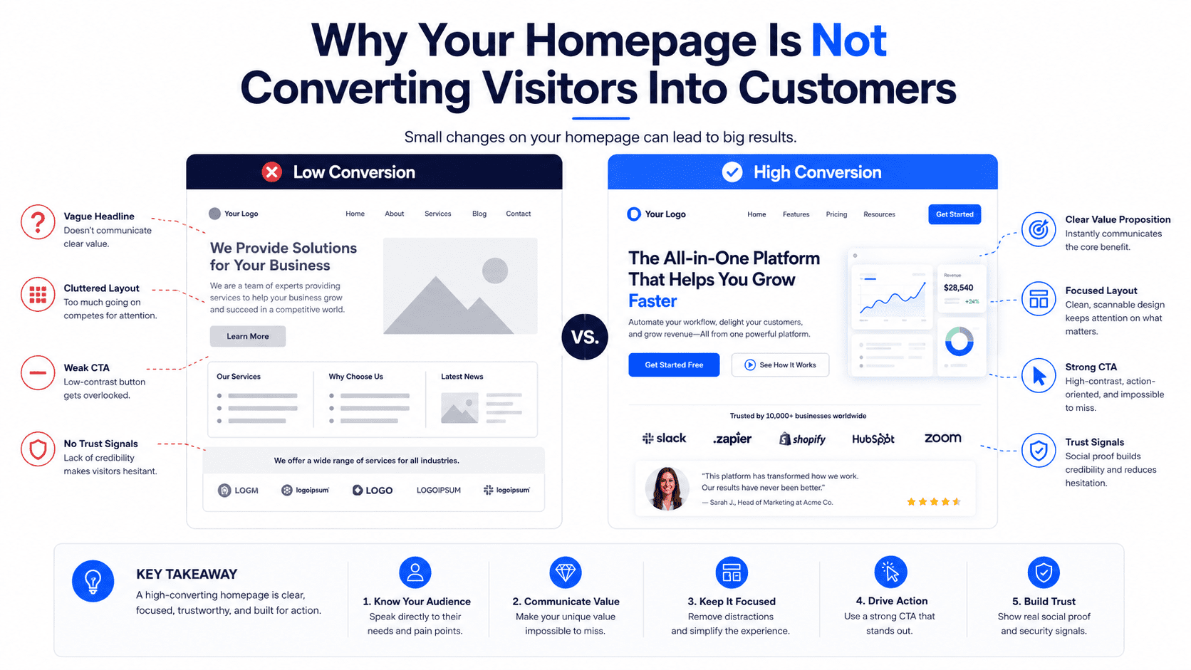
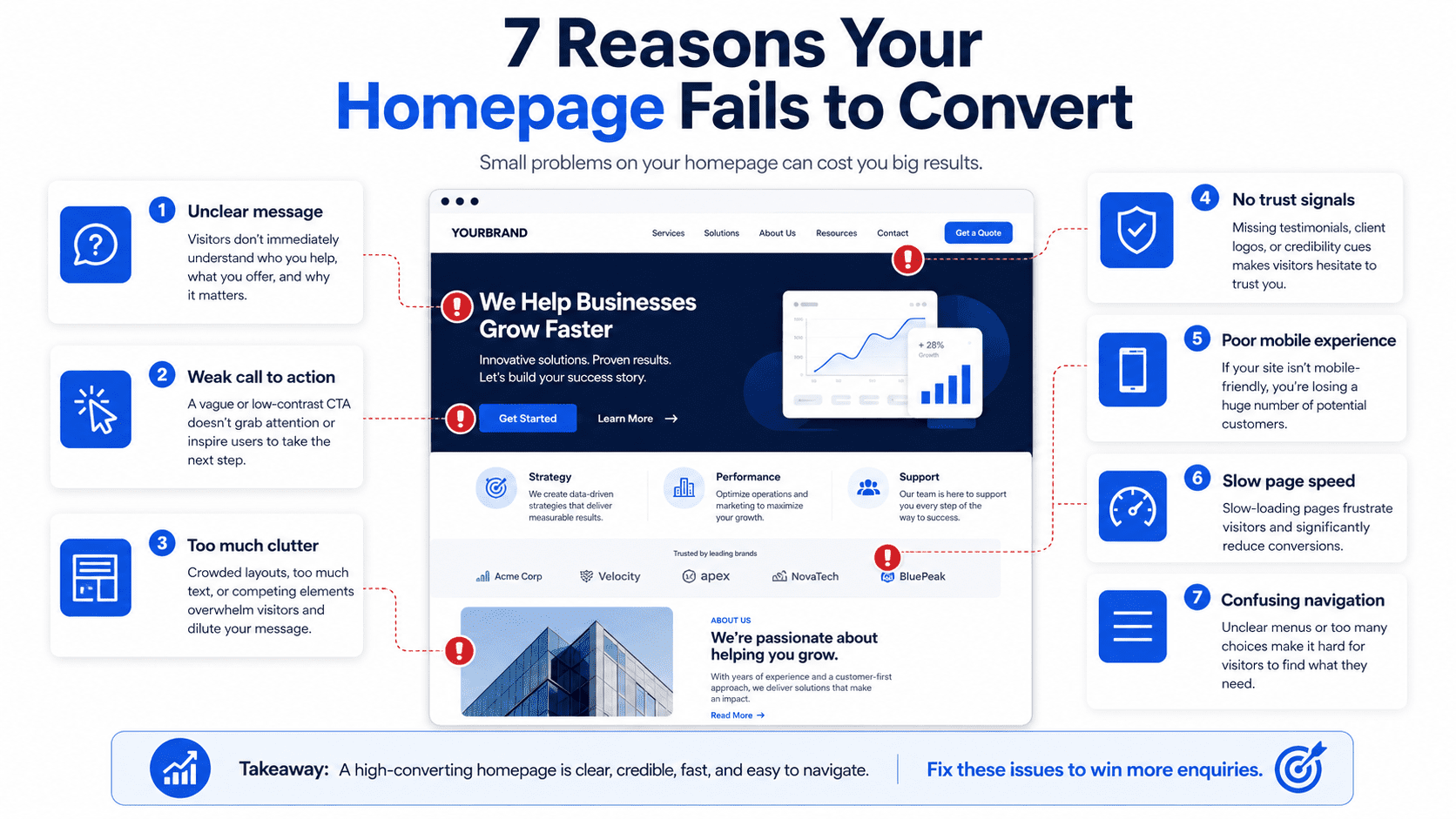
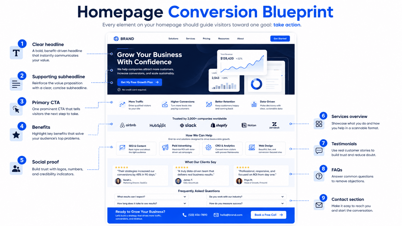
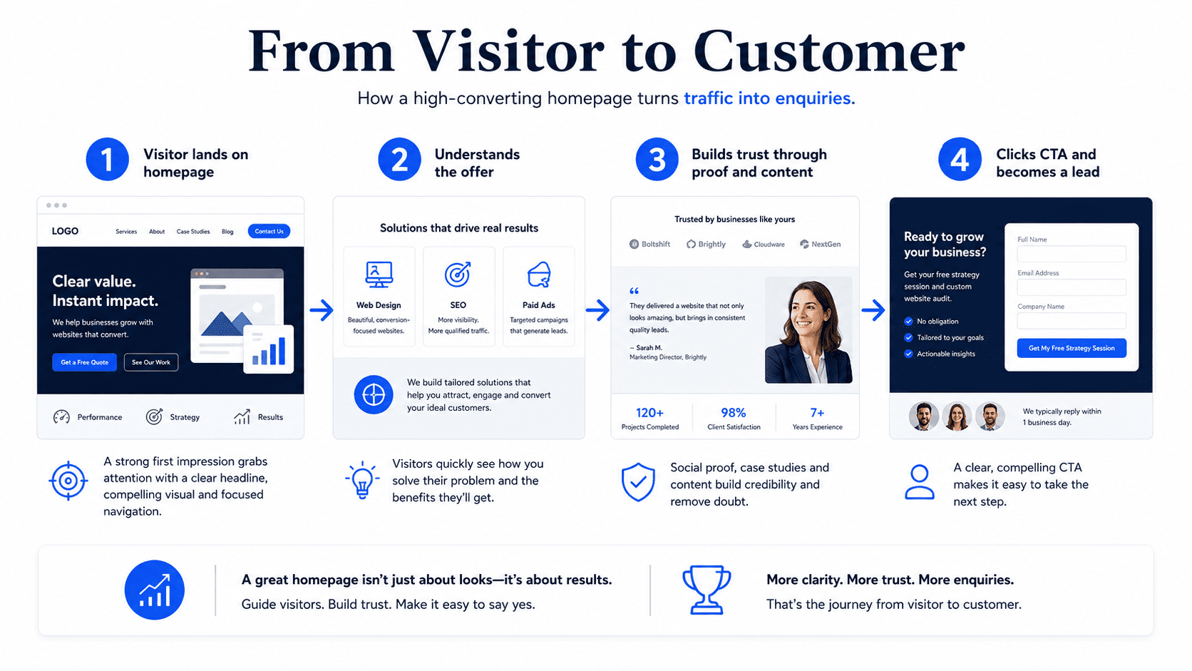
1. Your Hero Section Is Too Vague
The hero section is the first part of your homepage visitors see. This section must immediately explain what you do, who you help, and why it matters. Many homepages fail because the hero headline is vague.
Weak headlines include:
- “Welcome to Our Website”
- “Your Trusted Partner”
- “We Help Businesses Grow”
- “Professional Solutions for Modern Businesses”
- “Quality Service You Can Count On”
These phrases sound safe, but they do not explain the offer. A visitor should not have to scroll, click, or guess what your business does. A stronger hero headline is specific. For example,
- “Affordable Website Plans for Small Businesses That Need More Enquiries”
- “Same-Day Plumbing Services in Petaling Jaya”
- “Business Strategy Consulting for B2B Service Companies”
- “Website Redesign Services for Businesses Losing Leads Online”
A strong homepage headline should answer:
- What do you offer?
- Who is it for?
- What problem does it solve?
- What outcome can the customer expect?
If your hero section does not answer these questions quickly, many visitors will leave before exploring the rest of your website.
2. Your Homepage Talks Too Much About You
Many businesses make the homepage all about themselves. They talk about their passion, their history, their mission, their dedication, and their commitment to excellence. Some of that can matter, but the customer usually arrives with one selfish but reasonable question:
“Can this business solve my problem?”
Your homepage should focus more on the customer’s needs than your company’s internal story. Instead of saying: “We are a passionate team providing high-quality website solutions.”
Say: “Launch a professional website that helps your small business look credible and generate more enquiries.”
The second version is stronger because it connects the service to the customer’s desired outcome. A customer-focused homepage should explain:
- The problem visitors have
- Why that problem matters
- How your service helps
- What result they can expect
- Why your approach is better
- What they should do next
Your business matters, obviously. But on the homepage, the customer’s problem should matter first.
3. Your Call to Action Is Weak or Hidden
A call to action, also known as a CTA, tells visitors what to do next. If your CTA is weak, hidden, or unclear, visitors may leave without taking action. These are not always wrong, but they are often too generic.
Weak CTA examples include:
- Submit
- Learn More
- Click Here
- Read More
- Contact
Stronger CTA examples include:
- Request a Free Quote
- Book a Free Consultation
- Send Us a WhatsApp Message
- Start Your Website Plan
- Schedule an Appointment
- Get a Free Website Audit
- Check Availability
Your homepage should have a clear primary CTA. It should appear in important places such as:
- Header
- Hero section
- Services section
- Pricing section
- FAQ section
- Final section
- Footer
- Mobile sticky bar
Visitors should never need to search for the next step. If your homepage has no clear action path, it is not a conversion page. It is just a digital poster with buttons sprinkled on it for decoration.
4. Your Homepage Has Too Many Different Goals
Some homepages try to do everything at once. They ask visitors to:
- Read the blog
- Follow social media
- View all services
- Download a guide
- Subscribe to a newsletter
- Watch a video
- Book a call
- Read the company story
- Visit a portfolio
- Contact the team
Too many options can create confusion. A high-converting homepage needs a clear primary goal. For example:
- A consultant may want visitors to book a strategy call.
- A local service business may want visitors to request a quote.
- A clinic may want visitors to book an appointment.
- A Website-as-a-Service provider may want visitors to view plans or book a demo.
You can still include secondary actions, but the main action should be obvious. When every section competes for attention, the homepage becomes noisy. And noisy pages rarely convert well.
5. Your Offer Is Not Clear
Visitors need to understand what you are selling. Many homepages describe services too broadly.
For example: “We provide digital solutions for businesses.”
This could mean web design, software, marketing, branding, IT support, automation, or someone with a laptop and dangerous confidence. A clearer offer would be: “Monthly website plans for small businesses, including design, hosting, maintenance, and support.”
This explains the package.
A strong homepage offer should make clear:
- What is included
- Who it is for
- What problem it solves
- How it is delivered
- What makes it different
- What the next step is
If visitors cannot understand your offer quickly, they will not feel confident enough to enquire. Clarity converts. Confusion loses customers.
6. Your Homepage Does Not Build Trust
Before people contact you, they need to trust you. Many homepages fail because they make claims without proof. They say:
- We are reliable
- We are experienced
- We are professional
- We deliver quality work
- We care about customers
That is nice, but every business says that. Even the bad ones. Especially the bad ones. Trust proof makes your claims more believable. Add trust elements such as:
- Customer testimonials
- Google reviews
- Case studies
- Client logos
- Before-and-after examples
- Portfolio screenshots
- Certifications
- Awards
- Years of experience
- Number of customers served
- Team photos
- Business address
- Clear contact details
Trust proof should appear throughout your homepage, not only at the bottom. Place proof near key decision points, such as after the service section, near pricing, and before the final CTA.
7. Your Homepage Is Too Slow
A slow homepage can destroy conversions. If your page takes too long to load, visitors may leave before reading your offer. Common causes of a slow homepage include:
- Large image files
- Too many plugins
- Heavy animations
- Poor hosting
- Unoptimized videos
- Bloated page builders
- Too many tracking scripts
- Large background images
- No caching
- Uncompressed media
Speed matters even more on mobile. A visitor using mobile data will not wait patiently while your homepage loads six oversized stock photos and an animation nobody needed.
To improve speed:
- Compress images
- Use WebP where possible
- Reduce unnecessary scripts
- Remove unused plugins
- Use reliable hosting
- Avoid large autoplay videos
- Keep animations lightweight
- Test mobile performance regularly
A faster homepage gives visitors fewer reasons to leave.
8. Your Homepage Is Not Mobile-Friendly
Many businesses check their homepage on desktop and assume everything is fine. That is a mistake. A large number of visitors will view your website on mobile. For local businesses and service providers, mobile traffic can be especially important.
Your homepage may not convert on mobile if:
- Text is too small
- Buttons are hard to tap
- Sections feel cramped
- Images crop badly
- The menu is confusing
- Forms are difficult to complete
- Popups block the screen
- Contact options are hard to find
- The page loads slowly
- Important content appears too far down
A mobile-friendly homepage should include:
- Clear headline
- Short paragraphs
- Large CTA buttons
- Click-to-call button
- WhatsApp or messaging button
- Simple navigation
- Fast loading speed
- Easy-to-complete forms
- Clear spacing
Mobile users should be able to understand your offer and contact you within a few taps.
9. Your Homepage Does Not Explain the Problem
A homepage should show visitors that you understand their situation. If you jump straight into services without naming the problem, the page may feel generic.
For example, a website service business could explain: “Many small businesses have websites that look fine but do not generate enquiries. The message is unclear, the CTA is weak, and visitors leave without contacting them.”
This works because it describes a real pain point. A strong problem section helps visitors think: “That sounds like me.” Once visitors feel understood, they are more open to your solution.
A problem section should explain:
- What the visitor is struggling with
- Why it matters
- What happens if it is ignored
- Why common solutions may not work
- How your service solves it
This creates relevance and emotional connection without needing dramatic sales language.
10. Your Homepage Does Not Explain Why You Are Different
If your homepage sounds like every competitor, visitors have no reason to choose you. Many businesses use generic claims:
- Best service
- Affordable pricing
- Professional team
- Quality results
- Customer focused
These are not enough. Your homepage should explain your specific difference. For example:
- “Fixed monthly website plans with hosting and maintenance included”
- “Designed specifically for local service businesses”
- “Mobile-first websites built to generate enquiries”
- “Clear process from onboarding to launch”
- “No large upfront website cost”
- “Ongoing support included after launch”
A strong differentiation section helps visitors understand why your offer is not just another similar option. The goal is not to sound different for the sake of it. The goal is to make your value easier to compare.
11. Your Homepage Has No Pricing Guidance
Many businesses hide pricing completely. Sometimes this makes sense, especially for custom work. But no pricing guidance can create hesitation. Visitors may wonder:
- Is this within my budget?
- Is this too expensive?
- Do they work with businesses like mine?
- Will I waste time enquiring?
- What should I expect?
You do not always need to show exact prices. You can provide guidance such as:
- “Plans start from $49/month”
- “Custom website projects start from $1,500”
- “Request a quote based on your project scope”
- “Pricing depends on the number of pages, features, and support required”
Pricing guidance helps qualify leads and reduce uncertainty. If you hide all pricing, some serious buyers may leave before contacting you.
12. Your Homepage Does Not Answer Common Questions
Visitors often have questions before they enquire. If your homepage does not answer them, visitors may leave to research elsewhere. A FAQ section can help remove hesitation.
Common homepage FAQs include:
- How much does it cost?
- How long does it take?
- What is included?
- How does the process work?
- Do you offer support?
- Can I use my own domain?
- Do you serve my area?
- Can I request changes?
- What happens after I enquire?
- Is there a contract?
FAQs are useful because they address objections directly. They also help visitors feel more informed before taking action. A homepage without FAQs may leave too many doubts unresolved.
13. Your Homepage Navigation Is Confusing
Navigation should make it easy for visitors to find what they need. Many homepages lose conversions because the navigation menu is cluttered, unclear, or missing important links. Common navigation problems include:
- Too many menu items
- Vague page labels
- No visible contact button
- Services hidden under unclear names
- Mobile menu hard to use
- Important pages buried too deep
- No pricing or plans link
- No CTA in the header
A simple navigation menu may include:
- Home
- Services
- Pricing
- Work
- Blog
- Contact
For local businesses:
- Home
- Services
- Areas Served
- Reviews
- About
- Contact
For consultants:
- Home
- Services
- Case Studies
- Insights
- About
- Book a Call
Add a clear CTA button in the header, such as:
- Book a Call
- Request a Quote
- View Plans
- Contact Us
Navigation should help visitors move forward, not make them solve a puzzle.
14. Your Homepage Contact Form Has Too Much Friction
A contact form should make enquiry easy. If your form asks for too much information, visitors may abandon it. A homepage enquiry form usually only needs:
- Name
- Email or phone number
- Service interest
- Message
You can collect more details later. Common form problems include:
- Too many required fields
- No clear form title
- No confirmation message
- Poor mobile layout
- No privacy reassurance
- Form errors
- No alternative contact option
- Button only says “Submit”
A better form CTA might say:
- Request a Free Quote
- Send My Enquiry
- Book My Consultation
- Get My Website Review
The form should feel like a simple first step, not an administrative punishment.
15. Your Homepage Has No Clear Customer Journey
A homepage should guide visitors through a logical journey. A poor homepage feels like random sections stacked together. A strong homepage flows naturally:
- Clear headline
- Trust indicators
- Problem
- Solution
- Services or offer
- Benefits
- Process
- Proof
- Pricing guidance
- FAQs
- CTA
- Contact
This structure works because it matches how people make decisions. They need to understand the offer, trust the business, see value, remove objections, and know what to do next.
If your homepage sections are in the wrong order, visitors may feel confused or unconvinced. Design is not only about how the page looks. It is about how the page leads people toward action.
16. Your Homepage Copy Is Too Generic
Generic copy weakens conversion. If your homepage could apply to any business in your industry, it is not specific enough.
Generic copy says: “We provide high-quality services tailored to your needs.”
Specific copy says: “We build monthly website plans for small businesses that need a professional online presence without paying thousands upfront.”
Generic copy says: “Our team is committed to excellence.”
Specific copy says: “We handle your website design, hosting, maintenance, and support so you can focus on running your business.”
Specific copy is stronger because it tells visitors exactly what they get and why it matters. A homepage should use clear, natural language. Avoid jargon unless your audience actually uses it.
17. Your Homepage Is Designed for Looks Instead of Conversion
Some homepages are visually impressive but commercially weak. They have animations, sliders, fancy transitions, abstract graphics, and dramatic layouts. But the offer is unclear, the CTA is hidden, and the page does not answer customer questions.
This is how websites become expensive art projects with contact forms. Good design should support conversion. A conversion-focused homepage needs:
- Clear hierarchy
- Readable text
- Strong contrast
- Visible CTAs
- Clean spacing
- Trust proof
- Fast loading
- Mobile-first layout
- Simple navigation
- Relevant visuals
Design should make the message easier to understand, not harder. If your homepage looks beautiful but does not generate enquiries, the design may be serving aesthetics more than business goals.
18. Your Homepage Has No Analytics or Conversion Tracking
If you are not tracking conversions, you may not know why your homepage is underperforming. You should track:
- Form submissions
- Phone clicks
- WhatsApp clicks
- Booking clicks
- CTA clicks
- Pricing page clicks
- Lead magnet downloads
- Scroll depth
- Traffic sources
- Mobile vs desktop performance
Useful tools include:
- Google Analytics
- Google Search Console
- Google Tag Manager
- Heatmaps
- CRM tracking
- Call tracking
- Form tracking
Without tracking, you are guessing. With tracking, you can see which parts of the homepage are working and which need improvement. A homepage should be measured and improved over time.
How to Fix a Homepage That Is Not Converting
If your homepage is not converting, start with the areas that affect customer decisions most.
1. Rewrite the Hero Section
Make your headline clear, specific, and outcome-focused. Explain what you offer, who it is for, and what result visitors can expect.
2. Improve the CTA
Use specific action wording. Replace weak CTAs like “Learn More” with stronger ones like “Request a Free Quote” or “Book a Free Consultation.”
3. Add Trust Proof
Include reviews, testimonials, case studies, client logos, project examples, or customer results.
4. Simplify the Page Structure
Organize sections in a clear order that moves visitors from clarity to trust to action.
5. Improve Mobile Experience
Test your homepage on a real phone. Make sure buttons, text, forms, and navigation are easy to use.
6. Speed Up the Page
Compress images, reduce scripts, remove unnecessary plugins, and improve hosting if needed.
7. Add Pricing Guidance
Give visitors a starting price, package overview, or explanation of how pricing works.
8. Add FAQs
Answer the questions visitors commonly ask before contacting you.
9. Simplify the Contact Form
Ask only for essential information. Offer alternative contact options such as phone, WhatsApp, email, or a booking link.
10. Track Conversions
Set up tracking for every important action so you can improve based on data.
Best Homepage Structure for Conversions
A high-converting homepage should include:
- Hero section with clear headline and CTA
- Trust indicators
- Problem section
- Solution section
- Services or offer overview
- Benefits section
- Process section
- Proof or testimonials
- Pricing guidance
- FAQ section
- Final CTA
- Contact section
- Footer
This structure works for many service businesses, consultants, local businesses, and small business websites. The exact content may change by industry, but the logic stays the same.
Clarity first. Trust second. Action next.
Final Thoughts
Your homepage may not be converting visitors into customers because it is unclear, generic, slow, hard to use, or missing the proof and structure visitors need before taking action. A homepage should not simply introduce your business. It should guide visitors toward becoming leads or customers.
To improve homepage conversion, focus on clear messaging, strong calls to action, trust proof, mobile-friendly design, fast loading speed, simple contact options, helpful FAQs, pricing guidance, and conversion tracking.
The goal is not to create the most beautiful homepage. The goal is to create a homepage that helps the right visitors understand your value, trust your business, and take the next step.
A homepage that does that well becomes more than a front page. It becomes a sales asset.