A good website design is how you give a good impression to your website visitors. You certainly want your website design to be clean and simple to use. And they can get what they are looking for easily.
Your website is like your storefront for your business. Making it easy for your potential customers to browse and get what they want is the goal. Eventually, if you can simplify the process or steps required to complete the purchase, it will be better.
Many website owners try to add everything to their websites and forgot the fundamental of the website. What do you want your visitors to do? And what you are offering?
Today, we will be sharing some of the common web design mistakes by other website owners and how you can avoid them in yours.
Read more on How To Create a WordPress Website
1. Bad Website Structure

A well-organized website design will give people a better user experience where they can navigate to the information they want easily.
People are impatient and there are many other websites out there offering similar information or products. Your goal here is to create a user journey so that they can get to what they want in 1-2 redirects.
One huge mistake website owner did was to design their website like a maze. When people get lost on your website, the best thing they can do is exit.
To avoid this, first of all, the website should not consist of too many elements on a page. Ideally, there should be a logo, navigation bar and a few clear sections with one specific topic in each section. No mixing up or cramping of everything in the same section.
If you have different sub-categories, you can always create a drop-down menu to expand the selection options. It will be better that you put the selections menu on the same page, rather than redirect them to another page, and then another page again to reach the actual content.
2. Mobile Responsive Website in Website Design
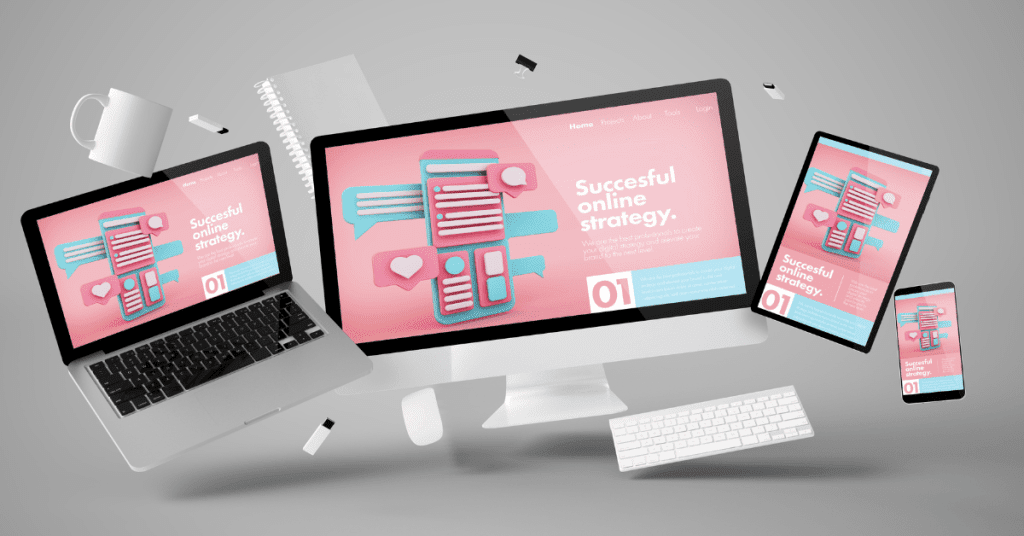
This is not something new and has been emphasized many times. Mobile responsiveness for your website design is very important and will be more and more important.
With different screen sizes of laptops, tablets and mobile phones, it is hard to display the same content for laptops and tablets on mobile phones. This is why your website should have the intelligence to adjust and fit into different screen sizes automatically.
The website uses a fixed-width layout that doesn’t adjust to the size of the screen, making it hard to read the text and click on links. And some even hard to scroll to the next part of the page. This is a serious issue that needs to be addressed.
With more than half of your website visitors coming from mobile, a lack of responsiveness across all device types and browsers will be a huge drawback in your website design.
One of the good ways to resolve this issue is by selecting a responsive theme or getting an AMP version of your website by installing the plugin.
3. Too Much Information in Website Design
While it’s true that your website shall consist of useful information for your visitor, you should make sure that it’s not overwhelming. People want some information or to understand the topic. But they are not doing research here. Providing too heavy information will get them confused and unable to consume it.
Instead, your information shall be focusing on the values that you can bring to them. Sometimes a short and unique point of view is better than a long article explaining it.
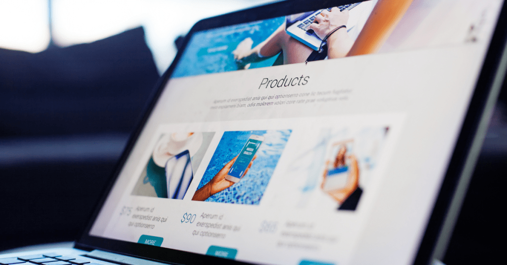
For example, if you are building an ecommerce store, on your product sales page, you should focus on the benefits and hidden benefits that they will get by buying your products. Also, you can include the customer’s testimonials to get them some confidence in buying it.
However, you don’t necessarily need to lengthy spec sheet on the product sales page. You can add a button to redirect them to another page for those who want to view it. But not directly include it on your product sales page. Else it will be messy and heavy.
Just like what Apple is doing, on their website, the first page will be introductory to all the hot products that they are focusing on. And then, after you click in, it will be the sales page for that product. The page will explain all the features and benefits of that product.
And the page will focus on the “Buy Now” CTA button. The specification of the product will only be available on a separate page for those of you who need it.
Keep information concise and organized. Use headings, bullet points, and images to break up large blocks of text.
4. Lack of Useful Information

After looking at the mistake above, some web designers will then start to remove the information from the website. However, you need to understand your customer’s behaviour and their user experience.
Your website should consist of enough information for them to make an informed decision.
If you are building a lead generation page, then it’s totally fine. You only need a compelling headline, sub-headline and contact form to collect their contact details.
But if you are doing other web pages, you need to have all the relevant information for them to make an informed decision.
For example, for your product sales page, you should have different images showing your products. This should include how it looks, and how it is when people are using it.
Then, information like reviews & testimonials, pricing, and CTA is all required for the sales page.
5. One Goal for One Page
Every page that you create, should have a clear goal. Whether it is a lead generation page to collect contact details, a blog post to promote a topic or product, or a sales page to sell the product.
No matter what the goal is, you need to have a clear goal on every page. Not to combine multiple goals on a page just because you can. This is because the more goals you are trying to have on a single page will be confusing for your visitors to make decisions or take action.
Instead, you should have a clear message of what you want to communicate and then, what you want them to do.
6. Having the right CTA (Call to Action)

A call to action is a button or link that tells users what you want them to do next. It could be to make a purchase, sign up for a newsletter, or download a file.
On every page, you should have the right and specific call to action to tell your potential customers what you want them to do. People need to be guided. If you don’t tell them what to do, they will just continue browsing without taking any action.
If you want your visitor to visit your page to take some action, either submitting their contact details, registering for your upcoming webinar, making a purchase or even signing up for a trial, you need to tell them.
For example, many people like to put wordings like “Learn More” or “Read More” in their CTA. This is very general and people will not know what to expect.
Instead, you should use wordings like “sign up for the free trial” or “Claim the free cheat sheet now”.
You see, how different it is.
Although CTA is important to guide your visitors to take a specific action you want them to do, you don’t want too many CTAs on your page. Too many CTAs will create confusion and look spammy. And with too many different CTAs asking to take different actions, people will get confused. And at the end, not clicking on any.
Instead, you should limit the number of CTAs on your page. You can limit to one CTA button on each screen or have a top banner that follows where scrolling.
7. Too Many Blank Areas in Website Design
On your website, you normally will have different sections or areas on one page. And within the section, there will be a whitespace or blank area that separates them.
Using whitespace is good to help your visitors to focus on your content and make the page more appealing. But when you have too much whitespace, your website will look empty and not attractive.
Hence, you need to control the margins, padding, and line spacing so that it looks well.
8. Limit the Number of Ads
While ads can be a good source of revenue, having too many can be distracting. When you have too many ads appearing on your page, it will look less professional and affect the user experience.
People will get distracted by all the ads banner appearing on your web page. This happens in most news websites, where there will be a side banner, on-page banner, and pop-up banner showing different ads.
This can be annoying for most visitors. People don’t like to be sold or shown advertisements all the time. By having too many ads, people will feel that you are not truly wanted to provide value or serve them. But instead, want to get their money only.
This is why, for the websites that we run and manage, we will first limit the number of ads shown. Making sure that it won’t affect the user experience. Also, if the ads don’t bring good revenue, then it is better to just remove them.
9. Popups
Popups are good to get your visitors to take specific action. Differing from the CTA button, a popup will just appear in front of you and make sure you take an action or close it.
However, as a website visitor, I don’t like popups. This is because popups can be annoying sometimes. When I am reading the content or watching the explanatory video, the popup will appear and stop my viewing.
So, we suggest that you limit the number of popups on your website and the frequency it appears. Also, you can have a time trigger event to show your popup.
Just make sure that they are not intrusive and can be closed easily. You want to have a good balance between the user experience and the popup.
Read more on How to Create a Popup That Converts
10. Easy To Read Typography in Website Design
Typography is an important aspect of web design. It’s how people read the information on your website.
If your font is too small or too big, it will be hard for your visitors to read. Not only that, but your font type is also important. Fancy font type is not good as it distracts your visitors.
An easy-to-read font is better than a fancy font. And have consistent typography for different levels so people will know at a glance. To achieve this, choose a consistent font style and size for headings and body text, and make sure it fits the tone and branding of the website.
11. Consistent Branding Across Your Website
Having a consistent brand is important for building trust. You want to have the same theme and style across different platforms. When people see the colours and themes, they will know it’s yours.
This issue for some websites is they will have different logos and colour schemes on different pages. And this is confusing.
You can avoid this problem by using a consistent logo, colour scheme, and design elements across all pages of your website.
Choose a colour palette that represents your brand and use it consistently across every page. Use the same logo on all pages and platforms, too.
12. Optimize for speed and performance in Website Design
This should be the first thing you do after completing your website design. When your website loads slowly or lags, people will leave your website.
At the same time, speed and performance are also important elements that search engines like Google consider in the SEO algorithm. They would like to have a good experience for their users anyway.
A few things that affect website speed and performance include an image that is not optimized, caching, too many plugins, and a heavy website.
To optimize this, you can install plugins for image optimization and caching.
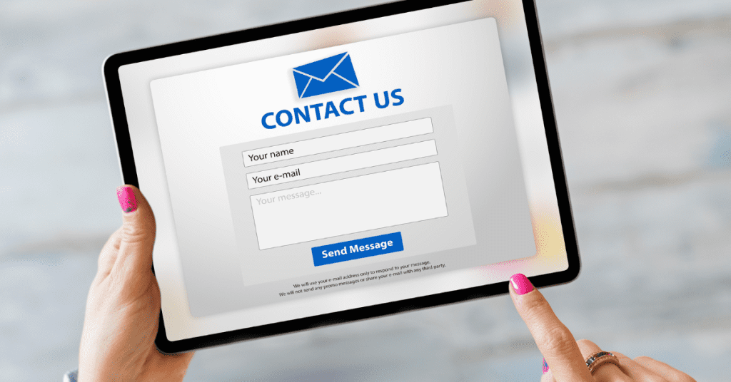
13. Contact Us Information
A website should be two-way communication. Not a one-way communication where they read your content only. You need to give them a way to inform you and possibly complain about you or feedback about your page.
Not only that, if they want to get more information or connect with you, they can always leave a message on the “Contact Us” page so that you can reply there.
On the page, you can include a contact form, contact details or your business address. This can be done easily with plugins like Contact Form 7 or WPForms.
14. Backup and Security

Losing your website hurts. It will take days or even weeks to recover your website. And if you don’t have a backup, most probably you are not going to get it back.
This is why you should use a backup plugin and back up your website regularly to ensure that you can recover from the backup file if anything happens.
Apart from that, site security is also very important especially if you process payments in your store. Neglecting site security can lead to data breaches and loss of customer trust.
When you take credit card payments on your website, make sure you have it secured with an SSL certificate. This may seem like a small thing, but it’s absolutely important to have personal information encrypted when transmitting over the internet.
Any personal information entered into the website is sent unencrypted over the web and can easily be intercepted by malicious hackers.
You can get the SSL certificate from your domain registrars, web hosting service providers or third-party SSL certificate providers. Make sure you have it ready and renew it when expired.
Apart from that, you should also consider getting an antivirus or firewall for your website to avoid data stealing.
By taking the necessary steps to secure your website, you can ensure that your business is protected from malicious attacks and data breaches.
This will also help build customer trust as customers will know their personal information is safe when visiting your site.
Final Thought – 14 Tips To Improve Your Website Design
A good website design will increase your customer’s experience and the process flow for buying the product. While it is so easy to build a website now, you should always check on this list that is recreated to make your website visually appealing, easy to navigate and able to communicate your message effectively.
A well-designed website can help to build trust with your audience and drive business success.
Remember to keep the user in mind when designing your website, and be sure to test it on different devices to ensure a consistent experience.
Read more on How To Create a WordPress Website