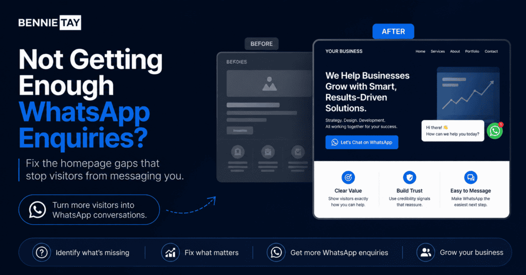
For many small businesses in Malaysia, WhatsApp is the real sales channel.
Customers may find you through Google, social media, referrals, ads, or your business card, but when they are ready to ask questions, they often prefer WhatsApp. It feels fast, familiar, and low-pressure. They do not need to fill in a long form. They do not need to wait for a formal email reply. They can simply tap a button and start a conversation.
This is why your homepage should not only look professional. It should be designed to encourage the right people to send a WhatsApp enquiry.
The mistake many businesses make is treating the WhatsApp button like an afterthought. They place a small icon in the corner, add a generic “Contact Us” section, and expect visitors to magically know what to ask. Then they wonder why the website gets visitors but very few enquiries. Because apparently buttons are now expected to read minds.
A homepage that generates WhatsApp enquiries needs more than a floating button. It needs a clear message, useful service explanation, trust signals, strong call-to-action wording, and a simple enquiry flow. Visitors should understand what you offer, feel confident enough to contact you, and know exactly what kind of message to send.
This guide explains what to put on your homepage if you want more WhatsApp enquiries from your website.
Your Homepage Must Explain What You Do Quickly
Before anyone clicks your WhatsApp button, they need to understand what your business does.
This seems obvious, but many homepages fail at the first screen. They use vague headlines such as “Your Trusted Partner,” “Professional Solutions for Your Business,” or “We Help You Grow.” These phrases sound polished, but they do not tell visitors what service is offered.
A strong homepage headline should explain your service, audience, and result as clearly as possible.
For example, a website design business could say, “Website Design for Service Businesses in Malaysia That Want More Enquiries.” A renovation company could say, “Home Renovation Services in Kuala Lumpur With Clear Quotation and Project Planning.” A beauty salon could say, “Beauty and Facial Treatments in Petaling Jaya With Easy WhatsApp Booking.”
The goal is not to impress people with clever wording. The goal is to help them understand immediately that they are in the right place.
If visitors need to scroll too much to understand what you offer, they are less likely to contact you. A confused visitor rarely sends a WhatsApp message. They usually leave and continue searching.
Your first screen should answer three questions quickly: what you offer, who it is for, and what the visitor should do next.
The WhatsApp CTA Should Be Specific
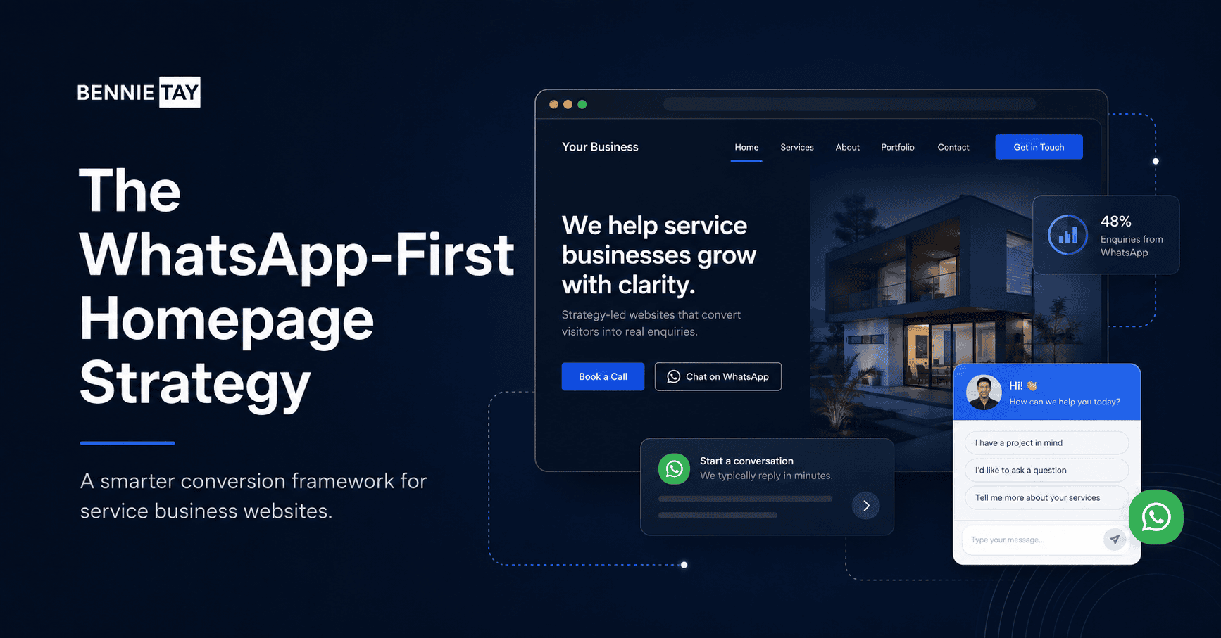
Many websites use a basic WhatsApp button that says “WhatsApp Us” or “Chat Now.” That is acceptable, but it can be stronger.
A good WhatsApp CTA should tell visitors why they should message you. It should connect to the action they want to take.
For example, instead of only saying “WhatsApp Us,” you could say “WhatsApp Us for a Free Website Review,” “WhatsApp Us to Request a Quote,” “WhatsApp Us to Check Availability,” or “WhatsApp Us to Book a Consultation.”
Specific CTAs work better because they reduce uncertainty. Visitors know what the conversation is about before they click.
For a service business, this is important because people may hesitate if they do not know what to ask. They may wonder whether they need to prepare information, whether the enquiry is free, whether they will be pressured, or whether the business will reply properly.
A specific CTA makes the first step easier.
If you offer website services, “Request a Free Website Growth Audit” is stronger than “Contact Us.” If you run a clinic, “WhatsApp Us to Book an Appointment” is clearer than “Chat With Us.” If you run a renovation business, “WhatsApp Us for a Renovation Quote” tells the visitor exactly what happens next.
Your WhatsApp CTA should appear in the hero section, not only at the bottom of the page.
Your Homepage Should Show the Problem You Solve
Visitors are more likely to contact you when they feel understood.
This is why your homepage should include a section that describes the customer’s problem before presenting your service. Many businesses skip this and jump straight into company information. The result is a homepage that talks about the business, but not about the visitor.
For example, a website design business could mention that many small businesses have websites that look outdated, fail to explain services clearly, or do not generate enough enquiries. A renovation company could mention that homeowners often struggle with unclear quotations, poor communication, and uncertainty about project timelines. A beauty salon could mention common concerns such as choosing the right treatment, understanding pricing, and booking easily.
This type of section helps visitors feel that your business understands their situation.
When someone sees their own problem clearly described, they are more likely to continue reading. They may think, “This is exactly what I need help with.” That moment matters because it moves them closer to enquiry.
Do not exaggerate or use fear-based writing. Just describe the real issues your customers face in clear language.
A good problem section prepares the visitor for your solution.
Your Service Section Should Be Easy to Understand
If visitors do not understand your services, they will not know what to ask on WhatsApp.
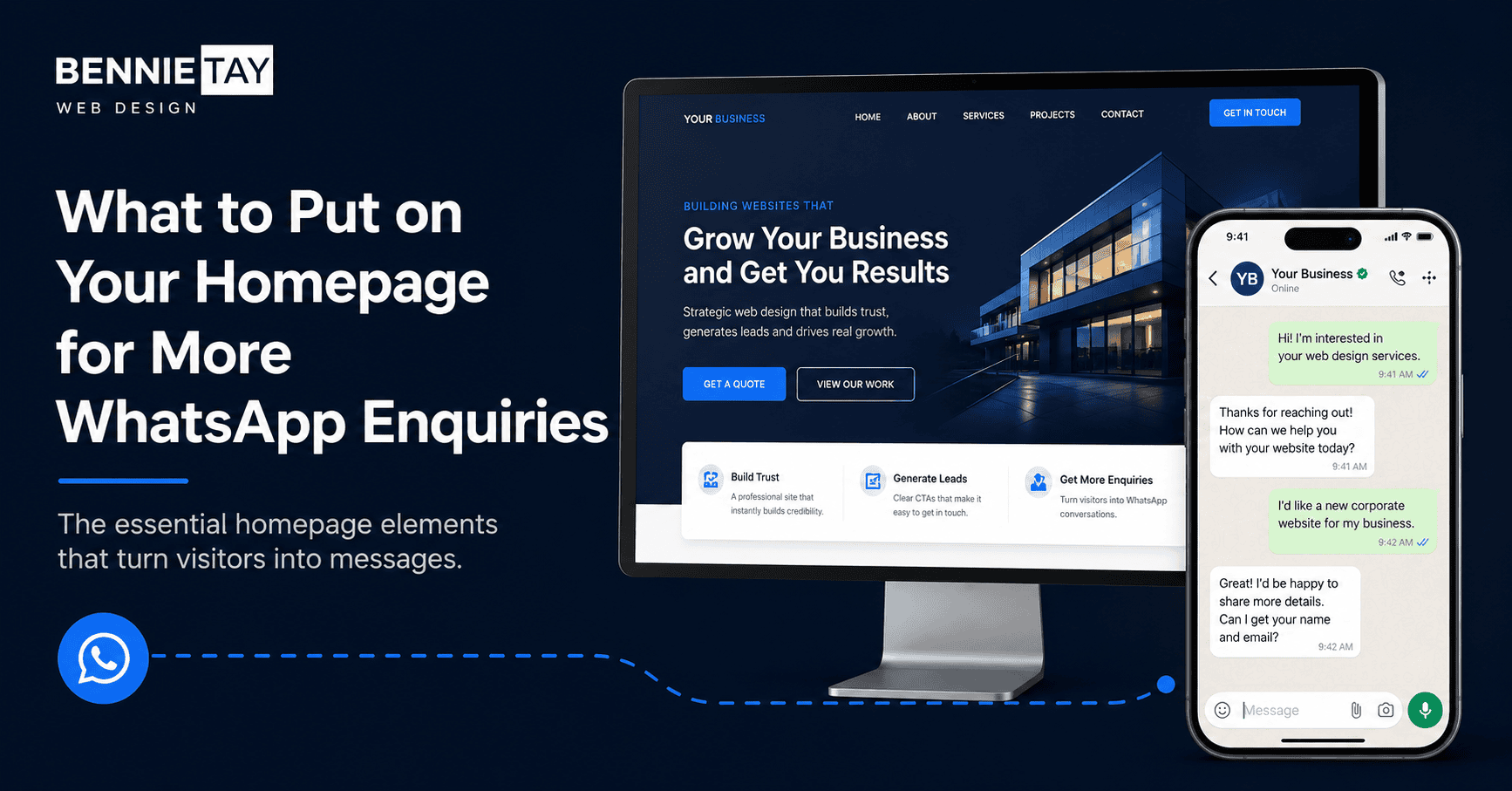
Your homepage should include a clear overview of your main services. This does not need to explain everything in full detail. The goal is to help visitors choose the service that matches their need and move to the next step.
For example, a website service business could show website design, landing page design, monthly website plans, website redesign, and local SEO pages. Each service should have a short explanation written in plain language.
A weak service description says, “We provide professional web solutions.” A stronger one says, “We build conversion-focused websites for small businesses that need more enquiries through Google, social media, and WhatsApp.”
The second version is clearer because it connects the service to the business outcome.
Your homepage service section should also guide people to either read more or enquire. Some visitors may need more details before messaging you. Others may already know what they want. Give both types of visitors a path.
For example, each service can have a link to a dedicated service page and a WhatsApp CTA nearby. The service page supports deeper research, while the WhatsApp CTA supports faster enquiry.
Trust Signals Should Appear Before the WhatsApp Push
People are more likely to send a WhatsApp message when they trust your business.
This is why your homepage should include trust signals before asking too aggressively for contact. Trust signals are proof that your business is real, reliable, and capable.
For a service business, trust can come from testimonials, case studies, portfolio examples, Google reviews, business experience, team photos, client logos, certifications, process explanation, or clear service details.
If you are a website designer, show examples of websites you have built or explain your approach. If you are a renovation company, show completed projects and client feedback. If you are a clinic, show doctor information, treatment explanations, location, and patient-friendly appointment details. If you are a consultant, show your expertise, process, and client outcomes.
A homepage without trust signals feels risky. Visitors may like your service, but still hesitate to contact you.
Trust is especially important when the service involves money, health, property, business growth, or personal appearance. People do not casually choose these providers from a vague website with three stock photos and a heroic sentence about excellence.
Your homepage should give visitors enough proof to feel safe starting a conversation.
Explain What Happens After They WhatsApp You
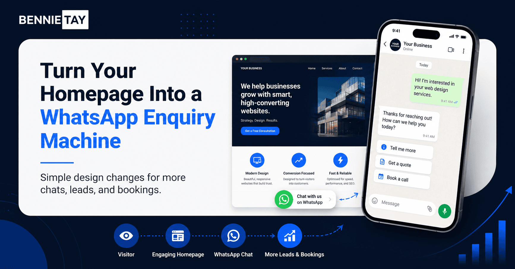
One simple way to increase WhatsApp enquiries is to explain what happens after the visitor clicks.
Many people hesitate because they do not know what to expect. Will they get a sales pitch? Will someone reply quickly? Do they need to provide details? Is the consultation free? Will they be ignored? Will they be added to some strange broadcast list and haunted forever?
You can reduce this hesitation by adding a short explanation near your WhatsApp CTA.
For example, a website service business could say, “Send us your website link or business details, and we will review what may be stopping your website from getting enquiries.” A renovation company could say, “Send us your property type, location, and renovation scope, and we will guide you on the next step.” A clinic could say, “Message us with your preferred appointment date and treatment enquiry, and our team will assist you.”
This makes the enquiry feel easier.
You can also include a simple three-step process on the homepage. The first step is sending a WhatsApp message. The second step is sharing basic details. The third step is receiving advice, appointment confirmation, or a quotation.
When visitors know what to expect, they are more comfortable taking action.
Use WhatsApp CTA Wording That Matches Buyer Intent
Not every visitor is ready to buy immediately.
Some visitors want advice. Some want pricing. Some want to check availability. Some want to compare packages. Some want to ask whether your service is suitable for them.
Your WhatsApp CTA should match the visitor’s stage.
For example, “Buy Now” may be too direct for a high-consideration service. “Request a Free Website Audit” feels easier because it gives the visitor a lower-risk first step. “Check Availability” works well for appointment-based services. “Request a Quote” works well for project-based services. “Ask Us Which Plan Fits Your Business” works well for package-based offers.
The CTA should not make the visitor feel trapped. It should feel like a helpful next step.
For your website, a strong CTA could be: “WhatsApp Us for a Free Website Growth Audit.” This works because it gives the visitor a clear reason to message. They are not just starting a random chat. They are asking for something useful.
A good CTA reduces friction. A vague CTA creates hesitation.
Keep the WhatsApp Button Visible on Mobile
A large number of visitors will view your website from their phone. If you want WhatsApp enquiries, mobile experience matters.
Your WhatsApp button should be easy to find and tap. Many businesses use a floating WhatsApp button, which can work well if it does not block important content. You can also include WhatsApp CTAs inside the page sections, especially after the hero section, service section, trust section, and FAQ section.
The mobile homepage should not make visitors scroll endlessly before they find contact options. The headline, short explanation, and main CTA should appear near the top.
If your mobile layout hides the CTA, uses tiny buttons, loads slowly, or makes users struggle with navigation, you are losing enquiries. A visitor who is ready to WhatsApp should not need to go on an archaeological expedition through your menu.
Test your homepage on a real phone. Check whether the CTA is clear, whether the button is easy to tap, and whether the WhatsApp link opens correctly.
Small friction points can reduce enquiries.
Add FAQs That Reduce WhatsApp Hesitation
A good FAQ section can increase WhatsApp enquiries because it answers common doubts before the visitor contacts you.
People often hesitate because they have unanswered questions. They may wonder about pricing, timeline, process, suitability, service area, revisions, appointment availability, or what information they need to prepare.
Your FAQ section should answer the questions that usually come up before someone sends a message.
For a website service business, FAQs can address how much a website costs, whether content writing is included, whether WhatsApp enquiry buttons can be added, whether monthly website plans are available, how long the website takes to launch, and whether existing websites can be redesigned.
The FAQ does not need to answer everything. It should answer enough to make the next step feel easier.
A good FAQ section can also improve lead quality. Visitors who read your answers before contacting you may have a clearer idea of what they need.
The FAQ should end with a WhatsApp CTA that feels natural. For example, “Not sure which website option fits your business? WhatsApp us for a free website review.”
Your Homepage Should Qualify Leads Too
Getting more WhatsApp enquiries is good, but getting the right enquiries is better.
If your homepage is too vague, you may attract people who are not suitable for your service. This creates wasted conversations and weak leads.
Your homepage should help qualify visitors by explaining who your service is for and what kind of problems you solve.
For example, if you provide website design for service businesses, say that clearly. If your monthly website plan is for small businesses that want a professional website without high upfront cost, state that. If your custom website service is better for businesses that need strategy, multiple pages, SEO structure, and conversion copywriting, explain that too.
This helps the right visitors recognize themselves.
It also helps filter out people who are looking for something completely different.
A good homepage does not try to attract everyone. It attracts the right people and guides them toward enquiry.
Do Not Depend Only on the Floating WhatsApp Icon
A floating WhatsApp icon is useful, but it should not be your only WhatsApp strategy.
Some visitors may ignore icons. Some may not know what to ask. Some may need to read more before they feel ready. This is why you need WhatsApp CTAs inside the content itself.
Place WhatsApp CTAs after meaningful sections, not randomly.
After explaining your services, invite visitors to ask which service fits their business. After showing your process, invite them to start with a free review. After answering FAQs, invite them to message you with their situation.
This makes the CTA feel connected to the content.
A floating button says, “You can contact us.” A well-written section CTA says, “Here is why you should contact us now.”
That difference matters.
Final Thoughts
If you want more WhatsApp enquiries from your homepage, do not rely only on a button.
Your homepage needs to make visitors understand your business, trust your service, and feel comfortable starting a conversation. The WhatsApp button is only the final action. The content before it is what creates the confidence to click.
Start with a clear headline. Explain what you do and who you help. Describe the customer’s problem. Show your main services in simple language. Add trust signals. Explain what happens after someone messages you. Use specific WhatsApp CTA wording. Make the button easy to find on mobile. Add FAQs that reduce hesitation.
For Malaysian service businesses, WhatsApp can be one of the easiest ways to convert website visitors into enquiries. But the website still has to do its job first.
A visitor does not click WhatsApp just because the icon exists. They click when your homepage gives them enough clarity, confidence, and reason to start the conversation.
If your homepage gets visitors but not enough WhatsApp enquiries, the issue may not be the button. It may be the message, structure, trust signals, CTA wording, or mobile experience.
Fix the journey, and the WhatsApp enquiry flow becomes much stronger.