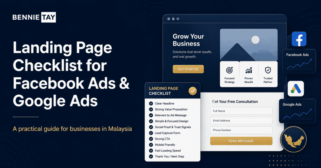
Running Facebook Ads or Google Ads without a proper landing page is one of the fastest ways to waste marketing budget.
The ad may get attention. People may click. Your cost per click may even look acceptable. But if the landing page is unclear, slow, weak on mobile, or missing trust signals, visitors will leave without enquiring.
This is where many small businesses in Malaysia get frustrated. They spend money on ads, but the results are poor. Then they blame the campaign, the audience, the platform, the algorithm, or the marketing agency. Sometimes those things are part of the problem. But often, the landing page is the real leak.
A landing page is not just a page where traffic lands. It is the bridge between interest and action. The ad creates the first click. The landing page must continue the message, build trust, answer objections, and guide the visitor toward a clear next step.
For service businesses, consultants, clinics, beauty salons, renovation companies, training providers, agencies, and local SMEs, a strong landing page can make a major difference. It can turn more paid traffic into WhatsApp enquiries, quote requests, consultation bookings, or form submissions.
This guide explains what your landing page should include before you spend more money on Facebook Ads or Google Ads in Malaysia.
A Landing Page Must Match the Ad Message
The first rule of landing page performance is message match.
If your ad promises one thing, the landing page should continue that exact idea. Visitors should feel that they arrived in the right place immediately.
For example, if your Facebook Ad promotes a free website audit, the landing page should focus on the free website audit. It should not send visitors to a general homepage where they need to search for the offer. If your Google Ad promotes landing page design in Malaysia, the page should clearly talk about landing page design, not your entire company history, logo philosophy, and inspirational journey through entrepreneurship.
When the ad and landing page do not match, visitors feel confused. Confusion kills conversions.
This is especially important for Google Ads because people often search with a specific intention. If someone searches for “website design Malaysia price,” they expect pricing guidance. If they search for “landing page design Malaysia,” they expect landing page services. If they search for “clinic website design,” they expect clinic website examples, structure, or service information.
For Facebook Ads, the visitor may not be actively searching, so the landing page must continue the hook that made them click. If the ad speaks to a pain point, the landing page should open with that same pain point. If the ad promotes a specific offer, the landing page should make that offer clear above the fold.
A strong landing page does not make visitors restart their thinking. It continues the conversation from the ad.
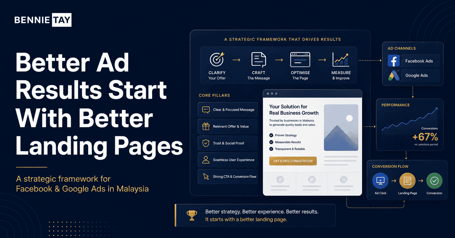
The Headline Should Be Clear, Not Clever
Your landing page headline is one of the most important parts of the page.
When visitors arrive, they should instantly understand what the page is about and why it matters. This is not the time for vague branding lines like “Grow Beyond Limits” or “Solutions for Tomorrow.” Those phrases sound polished, but they do not explain the offer.
A good landing page headline should be specific.
For example, “Get a Free Website Growth Audit for Your Small Business” is stronger than “Improve Your Online Presence.” “Landing Page Design for Malaysian Businesses Running Ads” is clearer than “Convert More Customers Online.” “Book a Website Consultation Before Spending More on Ads” gives visitors a direct reason to act.
The headline should match the visitor’s intent. If they clicked because they want more leads, talk about leads. If they clicked because they are comparing website packages, talk about website packages. If they clicked because they want a quote, talk about the quote process.
A landing page should not make visitors decode your message. They already clicked. Do not reward that tiny act of hope with corporate fog.
The First Screen Should Explain the Offer
The first screen, also called the hero section, should explain the offer before visitors scroll.
It should include a clear headline, a short supporting sentence, and a visible call-to-action. If possible, it should also include a relevant visual, trust signal, or short benefit statement.
For a lead generation landing page, the first screen should answer the visitor’s immediate questions: what is this, who is it for, and what should I do next?
For example, if you are offering a free website audit, the first screen can explain that the audit helps small businesses identify why their website is not generating enough enquiries. The CTA can invite visitors to request the audit. That is clear.
If you are promoting a monthly website plan, the first screen should explain that the plan helps small businesses launch a professional website without a high upfront cost. The CTA can guide visitors to view the plan or request a recommendation.
Do not overload the first screen with too much text. The goal is to make the offer clear enough for visitors to continue reading or take action.
The first screen should feel like a helpful introduction, not a billboard screaming into traffic.
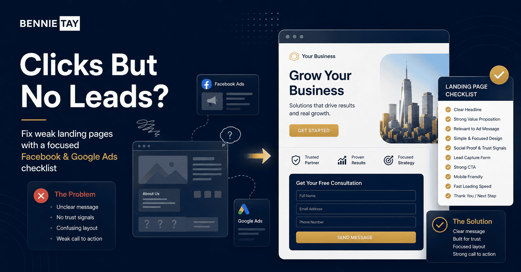
The Page Should Focus on One Main Action
A landing page should have one primary goal.
That goal may be to collect form submissions, generate WhatsApp enquiries, book consultation calls, request quotes, or promote a free audit. Whatever the goal is, the page should be designed around that action.
Many businesses weaken their landing pages by giving visitors too many choices. They link to every service, every social media profile, every package, every blog post, and every page on the website. The visitor arrives from an ad and gets treated like they entered a shopping mall with no map.
A landing page should reduce distraction. It can still provide enough information, but the main path should be obvious.
If the goal is WhatsApp enquiry, the CTA should guide visitors to WhatsApp. If the goal is consultation booking, the CTA should guide visitors to a booking form or calendar. If the goal is quote request, the form should collect project details.
You can repeat the same CTA in multiple sections, but do not create five different competing actions. The page should guide visitors toward one decision.
Explain the Problem Before Presenting the Solution
A landing page works better when it shows that you understand the visitor’s problem.
People do not respond only to services. They respond to problems they recognize. Before explaining what you offer, show that you understand what the visitor is struggling with.
For example, a website design landing page can describe how many small businesses get visitors but no enquiries because their homepage is unclear, their CTA is hidden, or their service pages are too thin. A landing page for ads can explain that paid traffic is wasted when the page does not match the ad or fails to build trust. A renovation quote landing page can explain how homeowners feel unsure about scope, pricing, timeline, and contractor reliability.
This section does not need to be dramatic. It just needs to be accurate.
When visitors see their own problem described clearly, they are more likely to believe that your solution is relevant. It creates a sense of understanding before the sales pitch begins.
A landing page that jumps straight into “we are the best” often feels self-centered. A landing page that starts with the customer’s problem feels more useful.
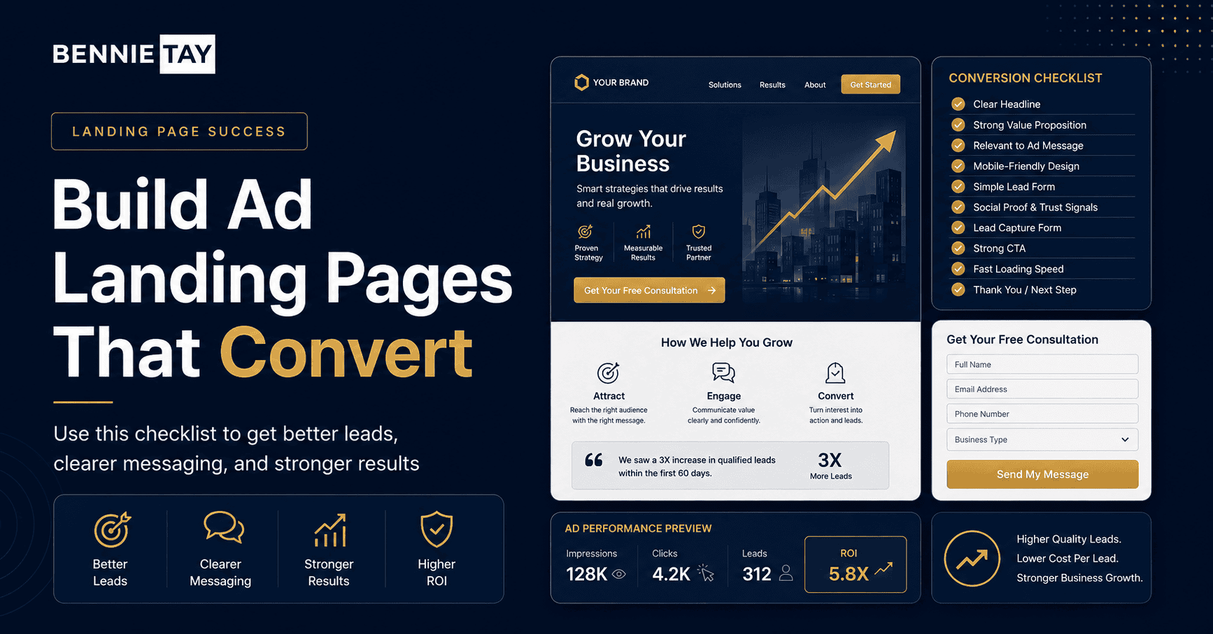
Show the Value of the Offer
After explaining the problem, the page should show how your offer helps.
This is where many landing pages become too shallow. They mention a service but do not explain why it matters.
If you offer a landing page design service, explain that the page is built to match ad traffic, explain the offer clearly, build trust, and guide visitors to enquire. If you offer a free website audit, explain that the audit reviews messaging, CTA placement, mobile experience, trust signals, and lead flow. If you offer a monthly website plan, explain that the plan helps businesses reduce upfront cost while still getting a professional website and ongoing support.
Visitors need to understand the benefit, not just the feature.
A feature is “mobile responsive design.”
A benefit is “visitors can read, tap, and enquire easily from their phone.”
A feature is “WhatsApp button.”
A benefit is “customers can contact you quickly without filling in a long form.”
A feature is “SEO setup.”
A benefit is “your page is structured more clearly for search engines and users.”
Good landing page copy connects the service to the result the visitor wants.
Build Trust Before Asking for Details
Paid traffic is often cold traffic. These visitors may not know your business yet.
That means your landing page must build trust before asking for contact details. If the page only has a headline, short paragraph, and form, it may feel too sudden. Visitors may not be ready.
Trust can be built through testimonials, case studies, client examples, portfolio screenshots, process explanations, business details, FAQs, founder background, review snippets, or clear service descriptions.
For service businesses, trust is essential because the visitor is often considering a conversation, appointment, or quote request. They need to feel that your business is credible enough to contact.
If you are new and do not have many testimonials yet, use clarity as a trust signal. Explain your process. Show what visitors will receive. Be transparent about who the offer is for. Give examples of common problems you solve. Make the next step feel safe.
A landing page does not need to prove everything. It needs to give enough confidence for the visitor to take the next step.
The Form Should Be Easy to Complete
Your form should match the level of commitment required.
If you are offering a free audit or simple enquiry, the form should be short. Asking for too much information too early can reduce submissions. For many small business landing pages, name, email or phone number, website link, and a short message may be enough.
If you are collecting quote requests for a higher-value service, you may need more details. A renovation company may ask for property type, location, project scope, timeline, and budget range. A website design company may ask for current website, business type, project goal, and preferred package.
The form should collect enough information to qualify the lead without making the visitor feel punished for being interested.
For mobile users, forms should be especially simple. Fields should be easy to tap. Labels should be clear. The submit button should explain the action, such as “Request My Free Audit” or “Get My Quote Review.”
Do not use “Submit” if you can avoid it. It sounds cold and mechanical, like the form is accepting a confession.
WhatsApp Can Be a Strong Alternative CTA
In Malaysia, WhatsApp is often one of the strongest enquiry channels for small businesses.
Some visitors do not want to fill in a form. They prefer to ask a quick question, send a screenshot, share a website link, check availability, or request guidance through chat.
If WhatsApp is part of your sales process, your landing page should support it properly. Do not only place a tiny floating icon. Use clear CTA wording that tells people why they should message.
For example, “WhatsApp Us for a Free Website Review” is stronger than “Chat Now.” “WhatsApp Us to Check Which Website Plan Fits Your Business” is more useful than “Contact Us.” “WhatsApp Us to Discuss Your Landing Page” feels natural for campaign traffic.
You can also guide visitors on what to send. For example, ask them to share their website link, business type, and main goal. This helps your team respond faster and creates better conversations.
WhatsApp works well when the landing page has already explained the offer. The page builds confidence. WhatsApp starts the conversation.
The Landing Page Must Work Well on Mobile
Most Facebook ad traffic and a large amount of Google ad traffic will come from mobile devices.
If your landing page is hard to use on mobile, your ad budget is in danger.
A mobile landing page should load quickly, show the main message clearly, keep the CTA visible, and make forms or WhatsApp buttons easy to use. The page should not force visitors to zoom, pinch, scroll through oversized images, or hunt for contact options.
The first screen on mobile matters a lot. Visitors should see the headline, short explanation, and CTA without confusion. If the first screen is taken up by a giant image with no clear message, you may lose people before they understand the offer.
Mobile design is not just about shrinking the desktop page. It is about making the decision process easier on a smaller screen.
For Malaysian service businesses, mobile-first design is especially important because visitors may click from social media and immediately contact through WhatsApp.
Add FAQs That Reduce Objections
A good FAQ section can improve landing page conversion because it answers common doubts before they stop the visitor.
People may wonder about pricing, timeline, what is included, whether the offer is free, whether they are committed to anything, how long the response takes, or whether the service is suitable for their business.
For a website audit landing page, FAQs can explain what the audit includes, who it is for, how long it takes to receive feedback, and whether the visitor needs an existing website. For a landing page design service, FAQs can explain whether copywriting is included, whether the page works with Facebook Ads and Google Ads, whether WhatsApp integration is available, and how long the design process takes.
FAQs are not filler content. They remove friction.
Place the FAQ near the lower part of the page, after the main explanation and trust sections. At that point, visitors may be close to taking action but still have doubts. Good FAQs help them continue.
Do Not Make the Page Too Long for a Simple Offer
A landing page should contain enough information to support the decision, but not so much that it becomes exhausting.
The right length depends on the offer.
A simple free audit may only need a focused page with problem, value, trust, process, form, and FAQs. A higher-priced service may need more explanation, case studies, pricing guidance, and detailed process sections.
The mistake is assuming longer is always better. More content can help when the visitor needs more reassurance. But unnecessary content can also distract people.
Every section should have a job. If a section does not explain, reassure, prove, or guide action, remove it.
A landing page is not where you dump every thought your business has ever had. That is what unedited corporate PDFs are for, and we should all be trying to heal from those.
Track the Right Actions
Before running ads, make sure your landing page actions can be measured.
At minimum, you should know how many visitors land on the page and how many complete the desired action. Depending on your setup, this may include form submissions, WhatsApp clicks, call clicks, booking confirmations, or thank-you page visits.
Without tracking, you cannot tell whether the landing page is working. You may see ad clicks, but not know whether visitors are taking meaningful action.
Tracking helps you identify where the problem is. If people click the ad but leave quickly, the message or page speed may be the issue. If people read the page but do not click the CTA, the offer or trust signals may be weak. If people start the form but do not submit, the form may be too long.
A landing page should be improved based on behaviour, not guesses.
Final Thoughts
A landing page for Facebook Ads or Google Ads should do more than receive traffic.
It should continue the ad message, explain the offer clearly, build trust, reduce hesitation, and guide visitors toward one main action. If the landing page is weak, unclear, slow, or disconnected from the ad, your paid traffic will not convert well.
For small businesses in Malaysia, this matters because every click costs money. Whether you are promoting website design, clinic services, beauty bookings, renovation quotes, training programs, consulting calls, or local services, your landing page needs to support the full journey from click to enquiry.
Start with message match. Make the headline clear. Focus on one action. Explain the problem and solution. Add trust signals. Keep the form simple. Use WhatsApp wisely. Make the page mobile-friendly. Answer common objections. Track the results.
A good ad gets attention. A good landing page turns that attention into action.
Before increasing your ad budget, review your landing page first. More traffic will not fix a poor conversion journey. It will only make the problem more expensive