A service business website should not be built only to look attractive. It should help visitors understand your offer, trust your business, and take the next step.
Many business owners redesign their websites by focusing on colors, fonts, images, animations, and layout style. These things matter, but they are not the foundation of a high-performing website.
The real foundation is structure.
A good service business website needs the right sections in the right order. Each section should answer a customer question, reduce hesitation, build confidence, or guide the visitor toward an enquiry.
After reviewing many small business and service business websites, there are certain sections I would almost never remove. Whether the website is for a consultant, agency, clinic, salon, local service provider, coach, freelancer, or professional firm, these sections help the website convert better.
This guide explains the website sections every service business should keep, why they matter, and how each one helps turn visitors into enquiries.
Why Website Sections Matter
Website sections are not just blocks of content. They create the visitor journey.
A visitor does not land on your website already convinced. They usually arrive with questions:
- What does this business do?
- Is this service right for me?
- Can I trust them?
- What makes them different?
- What exactly is included?
- How does the process work?
- How much does it cost?
- What should I do next?
If your website does not answer these questions clearly, visitors may leave and compare you with a competitor.
The best service business websites are not necessarily the most complicated. They are the clearest. Each section should move visitors closer to action.
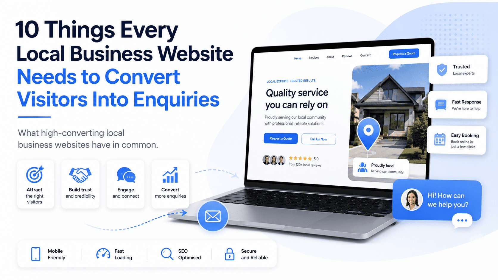
1. Clear Hero Section
The hero section is the first section visitors see at the top of your homepage or landing page. This is not the place for vague slogans.
A weak hero section might say: “Your Trusted Partner for Quality Solutions”
That sounds professional, but it does not explain what the business does.
A stronger hero section would say: “Affordable Website Plans for Small Businesses That Need More Enquiries”
This is clearer because it tells visitors what is offered, who it is for, and what outcome they can expect.
A strong hero section should include:
- Clear headline
- Short supporting sentence
- Primary call to action
- Secondary call to action
- Trust signal
- Relevant visual
The hero section should quickly answer: “Am I in the right place?”
If visitors cannot understand your offer within a few seconds, the rest of the website has to work much harder.
2. Trust Indicator Section
Trust indicators should appear near the top of the website, not only at the bottom. Before visitors read every detail, they want quick proof that your business is credible.
Trust indicators can include:
- Customer rating
- Number of businesses served
- Years of experience
- Client logos
- Certifications
- Awards
- Review snippets
- Industry memberships
- Media mentions
Examples:
- “Trusted by 100+ small businesses”
- “5-star rated by local customers”
- “10+ years of experience”
- “Certified professionals”
- “Serving Kuala Lumpur, Selangor, and surrounding areas”
A trust indicator section gives visitors a reason to keep reading. It reduces doubt early.
3. Problem Section
A service business website should show that you understand the customer’s problem. Many websites jump too quickly into services without explaining why the service matters.
A problem section helps visitors feel understood.
For example, for a website service business: “Many small businesses have websites that look fine but do not generate enquiries. The messaging is unclear, the call to action is weak, and visitors leave without contacting the business.”
This works because it describes a real pain point.
A strong problem section should explain:
- What the customer is struggling with
- Why the problem matters
- What happens if the problem is ignored
- Why the current solution may not be working
This section creates relevance. When visitors feel that you understand their problem, they are more likely to trust your solution.
4. Solution Section
After explaining the problem, your website should present your solution clearly. The solution section should not be a long technical explanation. It should connect your service to the outcome the customer wants.
For example: “Our monthly website plans help small businesses launch professional websites with design, hosting, maintenance, and support included, so they can focus on getting enquiries instead of managing technical issues.”
A good solution section should explain:
- What you offer
- How it solves the problem
- Why it is easier or better
- What result the customer can expect
This section should help visitors understand why your service exists. It should make the offer feel practical, relevant, and valuable.
5. Services Overview Section
Every service business website needs a clear services overview. Visitors should not have to guess what you provide. A good services section should show your main services in a simple, scannable format. Each service should include a short description and a link to a dedicated service page if possible.
For example:
Monthly Website Plans
Launch a professional website with hosting, maintenance, and support included in one monthly package.
Website Redesign
Improve an outdated website with clearer messaging, stronger CTAs, and better mobile performance.
Landing Page Design
Create campaign pages designed to convert visitors into leads, bookings, or enquiries.
Avoid listing too many services without explanation. A long list can feel overwhelming. The goal is to help visitors quickly identify the service that matches their need.
6. Benefits Section
Many websites explain features but forget benefits. Features describe what is included. Benefits explain why it matters.
For example:
Feature: “Mobile-friendly website design”
Benefit: “Customers can easily browse and contact you from their phone.”
Feature: “Hosting included”
Benefit: “You do not need to manage technical setup or separate hosting accounts.”
Feature: “SEO setup”
Benefit: “Your website has a stronger foundation to be discovered on search engines.”
A benefits section helps visitors understand the value of the service.
For service businesses, this section should focus on business outcomes such as:
- More enquiries
- Better credibility
- Faster launch
- Less technical stress
- Easier customer contact
- Stronger online presence
- Better mobile experience
- Clearer messaging
- Improved trust
People do not buy a service just because of what it includes. They buy because of what it helps them achieve.
7. Process Section
A process section is one of the most underrated parts of a service business website. Visitors often hesitate because they do not know what happens next.
A process section removes uncertainty.
For example:
- Book a Consultation
Share your business goals, website needs, and current challenges. - Provide Your Details
Submit your business information, services, branding, and preferred style. - Review Your Website Draft
Check the website structure, content, and design before launch. - Launch and Improve
Publish your website and receive ongoing support based on your plan.
This makes the service feel easier to buy. A clear process section is especially important for services that feel complex, expensive, or unfamiliar.
8. Why Choose Us Section
Visitors usually compare several businesses before making a decision. A “Why Choose Us” section helps explain why your business is different.
Avoid generic claims such as:
- Professional service
- High quality
- Customer satisfaction
- Best solutions
These phrases are too common. Use specific reasons instead.
Examples:
- Fixed monthly website plans with no large upfront cost
- Conversion-focused website structure, not just visual design
- Hosting, maintenance, and support included
- Built for small businesses and service providers
- Clear onboarding process from start to launch
- Mobile-first design for modern customers
- SEO-friendly page structure
A strong “Why Choose Us” section should help visitors compare your business against alternatives.
It should answer: “Why should I choose you instead of someone else?”
9. Testimonials or Reviews Section
A testimonials section is difficult to replace. You can explain your value, but customer proof makes it more believable.
A strong testimonial should be specific. It should explain the problem, experience, or result.
A weak testimonial says: “Great service. Highly recommended.”
A stronger testimonial says: “Our old website was outdated and hard to update. The new website made our services clearer, improved our mobile experience, and made it easier for customers to contact us.”
The second version works better because it gives context. For service businesses, testimonials help reduce risk. They show that other people have trusted you before.
Place testimonials near key decision points such as after service descriptions, pricing sections, or CTAs.
10. Case Study or Results Section
Testimonials are helpful, but case studies go deeper. A case study section shows how your service works in the real world.
It can include:
- Client background
- Problem
- Solution
- Result
- Images or screenshots
- Metrics if available
- Customer quote
For example: “After redesigning the homepage and improving the contact flow, the business received more qualified enquiries from mobile visitors.”
Even if you do not have big numbers yet, you can still show before-and-after improvements, project examples, or detailed service outcomes. Case studies help visitors imagine what working with you could look like.
They are especially useful for higher-value services.
11. Pricing or Pricing Guidance Section
Pricing is one of the most important decision factors for visitors. Many service businesses avoid pricing completely. That can create hesitation.
Visitors may wonder:
- Is this within my budget?
- Is this business too expensive?
- Do I need to enquire just to find out?
- Will I waste time if the price is not suitable?
You do not always need to show exact pricing. But some pricing guidance is useful.
Examples:
- “Plans start from $49/month”
- “Custom website projects start from $1,500”
- “Request a custom quote based on your project scope”
- “Pricing depends on the number of pages, features, and support required”
Pricing guidance helps qualify leads and builds transparency. For service businesses, hiding all pricing can reduce enquiries from serious buyers who want clarity before contacting you.
12. FAQ Section
A FAQ section helps remove objections before visitors contact you. This section is especially important because customers often have the same questions again and again.
Common FAQ topics include:
- Pricing
- Timeline
- What is included
- Support
- Revisions
- Cancellation
- Ownership
- Booking process
- Payment terms
- Service areas
- Results
- Maintenance
For a website service business, FAQs might include:
- How long does it take to launch my website?
- Is hosting included?
- Can I use my own domain?
- Can I request changes?
- Is SEO included?
- What happens if I cancel?
- Do I own my website content?
A good FAQ section reduces friction and makes visitors more comfortable taking action. It can also support SEO because many people search using question-based phrases.
13. Strong Call-to-Action Section
Every service business website needs a strong CTA section. A CTA section should appear more than once, especially on longer pages. The final CTA section is particularly important because it captures visitors who have read enough and are ready to act.
Weak CTA: “Contact Us”
Stronger CTA: “Ready to Launch a Website That Helps Your Business Get More Enquiries?”
Button: “Book a Free Consultation”
A strong CTA section should include:
- Action-focused headline
- Short reassurance statement
- Clear button
- Optional secondary contact method
- Low-friction next step
Examples of strong CTA buttons:
- Request a Free Quote
- Book a Free Consultation
- Send WhatsApp Message
- Start Your Website Plan
- Schedule an Appointment
- Get a Free Website Audit
The CTA should not feel vague. It should tell visitors exactly what to do next.
14. Contact Section
The contact section should be simple and easy to use. Do not make visitors search for how to reach you.
A good contact section includes:
- Short message
- Simple form
- Email address
- Phone number
- WhatsApp link
- Booking link
- Business address if relevant
- Service area if local
- Response time expectation
Keep the form short. A basic service business enquiry form usually needs:
- Name
- Email or phone number
- Service interest
- Message
If you ask too many questions too early, fewer people may complete the form. The goal is to start a conversation, not force the visitor to complete a long application.
15. Footer Section
The footer may seem basic, but it is still important. Visitors often scroll to the bottom when they are looking for contact details, service links, or business information.
A strong footer should include:
- Business name
- Short positioning statement
- Main service links
- Contact details
- Social media links
- Legal links
- Location or service area
- CTA
- Copyright notice
For local businesses, the footer should clearly show the location or service area. For service businesses with SEO goals, the footer can also help internal linking by linking to main service pages and important resources.
Bonus Section: Lead Magnet
A lead magnet is not always required, but I would include one whenever the business has a longer sales cycle. Not every visitor is ready to book a call or request a quote immediately.
A lead magnet gives them a lower-pressure way to engage.
Examples:
- Free checklist
- Website audit
- Pricing guide
- PDF guide
- Template
- Consultation
- Calculator
- Email course
- Webinar
- Report
For example: “Download the Small Business Website Launch Checklist”
or “Get a Free Website Lead Generation Audit”
A lead magnet helps capture visitors who are interested but not ready to buy yet. This turns your website from a simple enquiry page into a stronger lead generation system.
Recommended Homepage Section Order
For most service business websites, I would structure the homepage like this:
- Hero section
- Trust indicators
- Problem section
- Solution section
- Services overview
- Benefits
- Process
- Why choose us
- Testimonials
- Case study or proof
- Pricing guidance
- FAQs
- Final CTA
- Contact section
- Footer
This structure follows the customer’s decision-making journey. It starts with clarity, builds trust, explains value, removes objections, and ends with action.
Sections You Can Remove or Reduce
Not every section deserves space on your website. Some sections can be removed if they do not support clarity, trust, or conversion.
Examples:
- Generic welcome message
- Long company history on homepage
- Decorative image sliders
- Overly complex animations
- Social media feeds that distract visitors
- Huge team section if it does not affect buying decision
- Repeated slogans
- Generic mission statements
- Empty blog previews with no useful content
- Stock-photo-heavy sections with no clear message
A good rule is simple: If a section does not help visitors understand, trust, or contact your business, it may not need to be there.
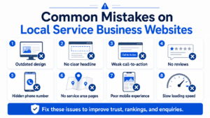
Common Mistakes With Website Sections
Many service business websites include the right sections but use them poorly.
Common mistakes include:
- Hero headline is vague
- CTA buttons are hidden
- Services are listed without benefits
- Testimonials are too generic
- Pricing is completely absent
- FAQ section does not answer real objections
- Contact form is too long
- Process section is missing
- Trust proof appears too late
- Footer has no useful links
- Sections are arranged in a confusing order
The issue is not only what sections you include. It is how clearly each section communicates.
Final Thoughts
The sections I would never remove from a service business website are the sections that support clarity, trust, and conversion. A strong service business website needs a clear hero section, trust indicators, problem and solution sections, services overview, benefits, process, why choose us, testimonials, proof, pricing guidance, FAQs, CTAs, contact options, and a useful footer.
These sections work together to guide visitors from interest to enquiry. Your website does not need to be complicated. It needs to be clear.
When every section has a purpose, your website becomes more than an online brochure. It becomes a business asset that helps visitors understand your value and take the next step.