Running Facebook Ads or Google Ads without a proper landing page is one of the fastest ways to waste marketing budget.
The ad may get attention. People may click. Your cost per click may even look acceptable. But if the landing page is unclear, slow, weak on mobile, or missing trust signals, visitors will leave without enquiring.
This is where many small businesses in Malaysia get frustrated. They spend money on ads, but the results are poor. Then they blame the campaign, the audience, the platform, the algorithm, or the marketing agency. Sometimes those things are part of the problem. But often, the landing page is the real leak.
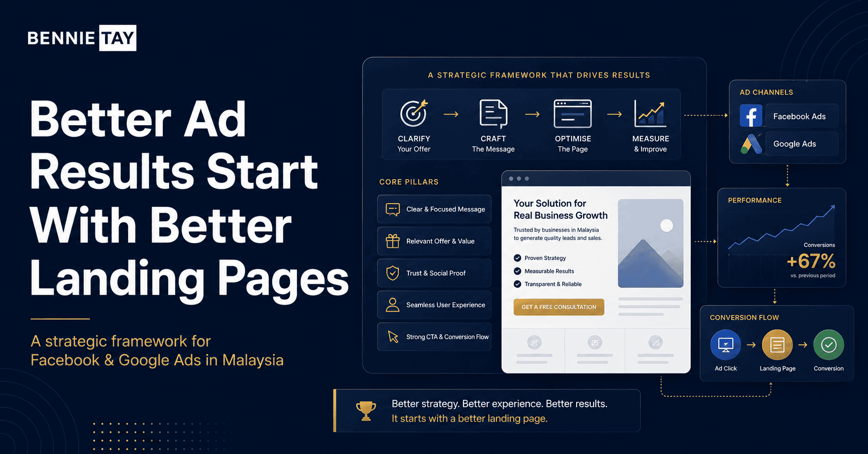
A landing page is not just a page where traffic lands. It is the bridge between interest and action. The ad creates the first click. The landing page must continue the message, build trust, answer objections, and guide the visitor toward a clear next step.
For service businesses, consultants, clinics, beauty salons, renovation companies, training providers, agencies, and local SMEs, a strong landing page can make a major difference. It can turn more paid traffic into WhatsApp enquiries, quote requests, consultation bookings, or form submissions.
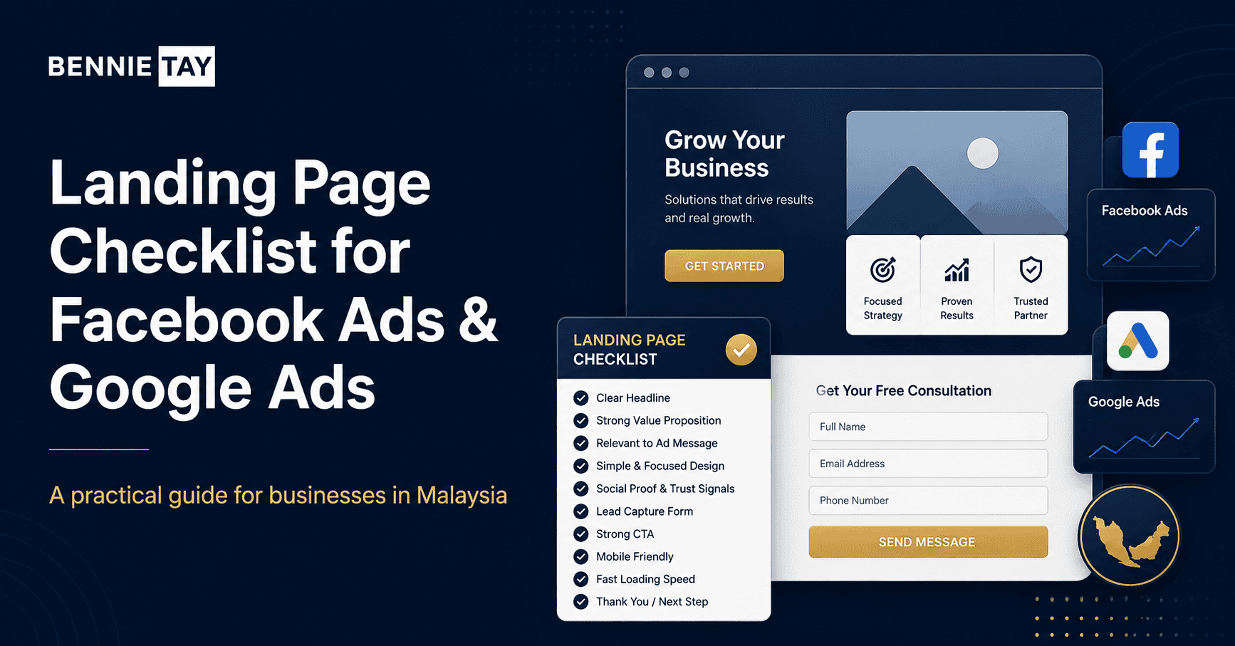
A Landing Page Must Match the Ad Message
The first rule of landing page performance is message match.
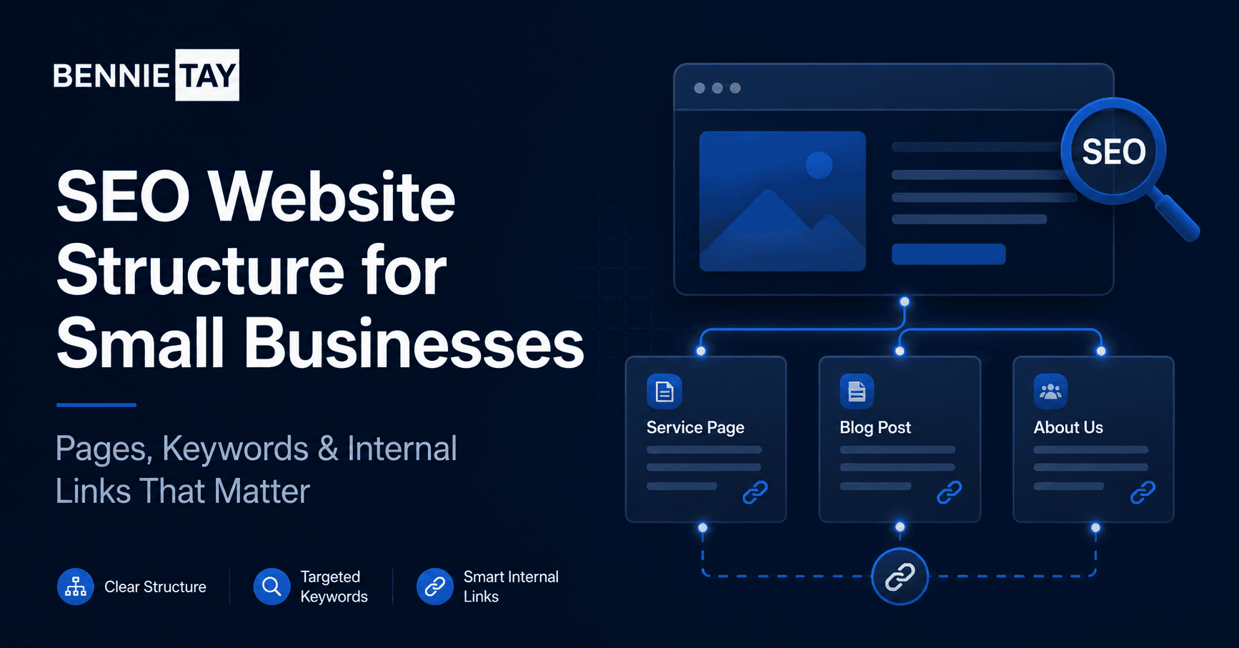
A strong page structure helps both people and search engines. Each page should have one clear purpose, a focused headline, supporting sections, internal links to related pages, and a next step that matches the visitor’s stage of decision-making.
For readability, keep each section focused. Use one idea per section, short paragraphs, direct headings, and clear transitions. Visitors should be able to scan the page and still understand what you do, who it is for, and why it matters.
The Headline Should Be Clear, Not Clever
Your landing page headline is one of the most important parts of the page.
The goal is not to add more words for the sake of length. The goal is to answer the questions a serious buyer is already asking, remove uncertainty, and make the next step feel obvious, useful, and worth taking.
When writing this section, use concrete details instead of broad claims. Replace vague lines such as “we provide quality service” with details about the offer, timeline, deliverables, target customer, common problems solved, and what makes the experience easier for the buyer.
The First Screen Should Explain the Offer
The first screen, also called the hero section, should explain the offer before visitors scroll.
The goal is not to add more words for the sake of length. The goal is to answer the questions a serious buyer is already asking, remove uncertainty, and make the next step feel obvious, useful, and worth taking.
When writing this section, use concrete details instead of broad claims. Replace vague lines such as “we provide quality service” with details about the offer, timeline, deliverables, target customer, common problems solved, and what makes the experience easier for the buyer.
The Page Should Focus on One Main Action
A landing page should have one primary goal.
The conversion step should feel simple and low-friction. Make the button easy to find, tell visitors what happens after they enquire, and avoid asking for unnecessary information before they understand the value of speaking with you.
Do not hide the next step at the bottom only. Repeat the call-to-action after major decision points, especially after the offer, proof, FAQ, pricing guidance, or portfolio section. This helps interested visitors act at the moment they feel ready.
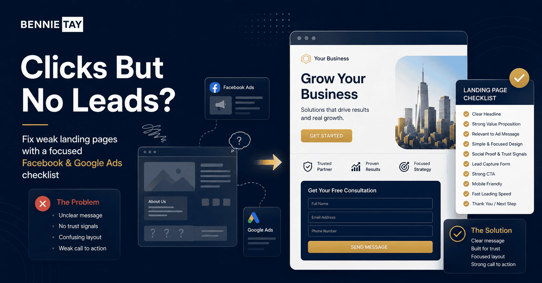
Explain the Problem Before Presenting the Solution
A landing page works better when it shows that you understand the visitor’s problem.
The goal is not to add more words for the sake of length. The goal is to answer the questions a serious buyer is already asking, remove uncertainty, and make the next step feel obvious, useful, and worth taking.
When writing this section, use concrete details instead of broad claims. Replace vague lines such as “we provide quality service” with details about the offer, timeline, deliverables, target customer, common problems solved, and what makes the experience easier for the buyer.
Show the Value of the Offer
After explaining the problem, the page should show how your offer helps.
The goal is not to add more words for the sake of length. The goal is to answer the questions a serious buyer is already asking, remove uncertainty, and make the next step feel obvious, useful, and worth taking.
When writing this section, use concrete details instead of broad claims. Replace vague lines such as “we provide quality service” with details about the offer, timeline, deliverables, target customer, common problems solved, and what makes the experience easier for the buyer.
Build Trust Before Asking for Details
Paid traffic is often cold traffic. These visitors may not know your business yet.
Trust signals work best when they are specific. Use real project examples, before-and-after context, client outcomes, reviews, certifications, process details, and clear expectations so visitors can judge whether your business is credible before they contact you.
Place proof close to the claim it supports. If you say you deliver fast turnaround, show the timeline. If you say you improve enquiries, show the result. If you say your process is organised, show the steps, documents, or examples that prove it.
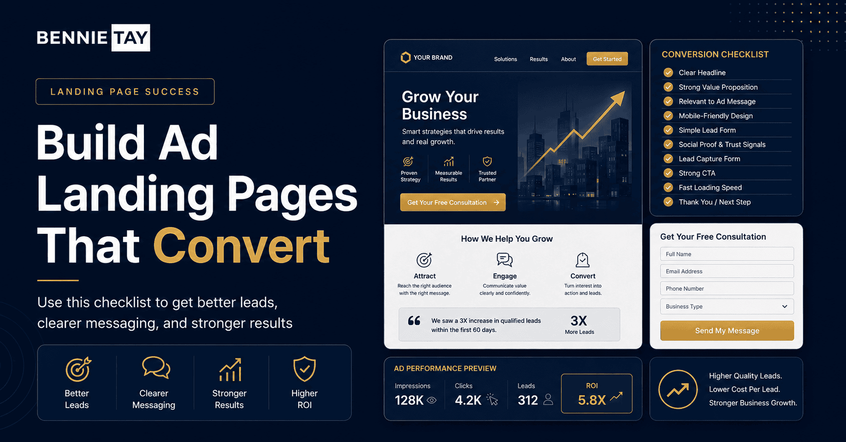
The Form Should Be Easy to Complete
Your form should match the level of commitment required.
The conversion step should feel simple and low-friction. Make the button easy to find, tell visitors what happens after they enquire, and avoid asking for unnecessary information before they understand the value of speaking with you.
Do not hide the next step at the bottom only. Repeat the call-to-action after major decision points, especially after the offer, proof, FAQ, pricing guidance, or portfolio section. This helps interested visitors act at the moment they feel ready.
WhatsApp Can Be a Strong Alternative CTA
In Malaysia, WhatsApp is often one of the strongest enquiry channels for small businesses.
The conversion step should feel simple and low-friction. Make the button easy to find, tell visitors what happens after they enquire, and avoid asking for unnecessary information before they understand the value of speaking with you.
Do not hide the next step at the bottom only. Repeat the call-to-action after major decision points, especially after the offer, proof, FAQ, pricing guidance, or portfolio section. This helps interested visitors act at the moment they feel ready.
The Landing Page Must Work Well on Mobile
Most Facebook ad traffic and a large amount of Google ad traffic will come from mobile devices.
A strong page structure helps both people and search engines. Each page should have one clear purpose, a focused headline, supporting sections, internal links to related pages, and a next step that matches the visitor’s stage of decision-making.
For readability, keep each section focused. Use one idea per section, short paragraphs, direct headings, and clear transitions. Visitors should be able to scan the page and still understand what you do, who it is for, and why it matters.
Add FAQs That Reduce Objections
A good FAQ section can improve landing page conversion because it answers common doubts before they stop the visitor.
The goal is not to add more words for the sake of length. The goal is to answer the questions a serious buyer is already asking, remove uncertainty, and make the next step feel obvious, useful, and worth taking.
When writing this section, use concrete details instead of broad claims. Replace vague lines such as “we provide quality service” with details about the offer, timeline, deliverables, target customer, common problems solved, and what makes the experience easier for the buyer.
Do Not Make the Page Too Long for a Simple Offer
A landing page should contain enough information to support the decision, but not so much that it becomes exhausting.
A strong page structure helps both people and search engines. Each page should have one clear purpose, a focused headline, supporting sections, internal links to related pages, and a next step that matches the visitor’s stage of decision-making.
For readability, keep each section focused. Use one idea per section, short paragraphs, direct headings, and clear transitions. Visitors should be able to scan the page and still understand what you do, who it is for, and why it matters.
Track the Right Actions
Before running ads, make sure your landing page actions can be measured.
The conversion step should feel simple and low-friction. Make the button easy to find, tell visitors what happens after they enquire, and avoid asking for unnecessary information before they understand the value of speaking with you.
Do not hide the next step at the bottom only. Repeat the call-to-action after major decision points, especially after the offer, proof, FAQ, pricing guidance, or portfolio section. This helps interested visitors act at the moment they feel ready.
Final Thoughts
A landing page for Facebook Ads or Google Ads should do more than receive traffic.
Use this as a practical checklist before redesigning or publishing the page. When the structure, copy, proof, and call-to-action are clear, the website becomes easier to rank, easier to read, and more likely to turn visitors into real enquiries.
Before publishing, read the page as if you were a new customer with limited time. If the promise, proof, process, and enquiry step are clear within a few minutes, the page is already doing more strategic work than most small business websites.