In online marketing and digital advertising, a High Conversion Landing Page can make or break a campaign. It serves as the pivotal gateway, enticing potential customers and encouraging them to take specific actions that align with your objectives.
Crafting an effective landing page is an art that involves understanding your audience, employing persuasive elements, and optimizing for a seamless user experience.
When it comes to the design, the foundational step lies in comprehending your audience, their needs, and their behaviour patterns. Tailoring your landing page to resonate with their expectations and motivations is paramount.
Additionally, simplicity and clarity are key elements that should permeate every aspect of the design, ensuring that visitors can effortlessly navigate and comprehend the offerings. Moreover, optimizing for speed and mobile responsiveness is essential in today’s fast-paced digital landscape, where users demand instant gratification and a seamless experience across devices.
Today, we will guide you through the essential principles and strategies to create landing pages that not only capture attention but also drive meaningful conversions.
Building Your Landing Page with Shopify Today
What is A High Conversion Landing Page?
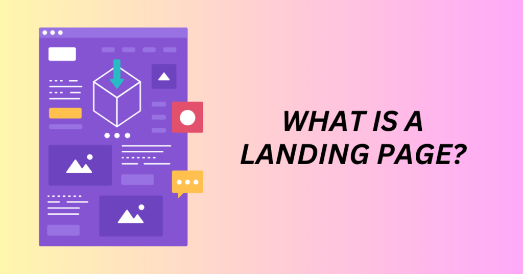
A landing page is a standalone web page specifically designed to capture the attention and prompt a desired action from visitors. It serves as a crucial component of online marketing and advertising strategies.
The primary goal of a landing page is to convert visitors into leads or customers by encouraging them to take a specific action, such as filling out a form, signing up for a newsletter, making a purchase, or downloading content.
Unlike typical website pages that cater to various informational needs, a landing page focuses on a single call-to-action (CTA) to maximize conversion rates.
In terms of design and content, landing pages are meticulously crafted to align with the marketing campaign’s objective. They often feature persuasive copy, compelling headlines, relevant images or videos, and a clear and prominent CTA. The content is tailored to resonate with the target audience, addressing their pain points and offering solutions.
Additionally, landing pages are strategically structured to minimize distractions and guide visitors toward the desired action, enhancing the likelihood of successful conversion. The effectiveness of a landing page is often measured through metrics such as conversion rates, click-through rates, and bounce rates to evaluate its performance and optimize it for better results.
On your landing page, you can either get the visitor to purchase a product, order free samples, sign up for your email list, download an ebook, or inquire about an information package.
Building Your Landing Page with Shopify Today
How to Build a High Conversion Landing Page For Your Audiences
Creating effective landing pages that resonate with your audience’s needs involves a strategic and empathetic approach. First and foremost, a thorough understanding of your target audience is essential.
Conduct market research to gather insights into their preferences, pain points, and motivations. Identify their specific needs and how your product or service can address those needs. This forms the foundation for crafting a landing page that genuinely speaks to your audience.
Once you have a clear understanding of your audience, tailor the messaging and content of the landing page to align with their needs and interests. Then, craft compelling headlines and subheadings that grab attention and clearly convey the value proposition of your offering.
Next, you will need to use language and tone that resonates with your audience, focusing on benefits and solutions rather than just features. It is also important to incorporate persuasive visuals, such as images or videos, that reinforce the message and engage visitors emotionally. Highlight testimonials, case studies, or customer success stories to build trust and credibility.
The design and layout of the landing page should be intuitive and user-friendly. This will ensure a seamless user experience. In addition, you need to structure the page in a way that guides visitors through a logical flow, leading them toward the desired action, whether it’s filling out a form, making a purchase, or signing up.
Finally, place the primary CTA prominently and make it visually appealing. Utilize A/B testing to experiment with different elements of the landing page, such as layout, colours, and copy, to optimize for higher conversion rates based on your audience’s response and preferences.
You need to monitor and analyze the landing page performance continuously to refine and iterate it for better results over time.
Building Your Landing Page with Shopify Today
Key Elements of High Conversion Landing Page
Landing pages are the linchpin of successful digital marketing efforts, serving as the gateway between curious visitors and potential customers. A well-crafted landing page design is crucial in not only captivating the audience but also compelling them to take the desired action. Let’s explore in detail the fundamental elements that make up an effective landing page design.
1. Clear and Compelling Headline – High Conversion Landing Page
The headline is the initial point of contact for a visitor. It must be attention-grabbing and powerfully convey the core value proposition of the offering. A compelling headline tailored to the visitor’s needs and pain points can significantly influence their decision to engage further with the page.
2. Engaging Visuals – High Conversion Landing Page
Visuals, such as images, videos, or graphics, play a vital role in capturing attention and conveying emotions. You need to include high-quality visuals that are directly relevant to your product or service on your landing page. This can ensure that they enhance the overall aesthetic of the page and provide a visually pleasing experience for the visitor.
3. Concise and Persuasive Copy – High Conversion Landing Page
The written content on a landing page should be concise, yet persuasive. You need to focus on presenting the benefits and value of your offering, addressing the visitor’s needs or challenges. Also, utilize bullet points, subheadings, and short paragraphs to deliver the information in an easily digestible format.
4. Compelling Call-to-Action (CTA) – High Conversion Landing Page
The CTA button is the pinnacle of your landing page. It will guide your visitors towards the ultimate action you desire. Besides, it should be prominently displayed with contrasting colours to capture attention.
The CTA text should be action-oriented and clearly state the action you want the visitor to take, like “Subscribe Now” or “Claim Your Free Trial.” Don’t use something generic like “Learn More” or “Read More”. It doesn’t give your potential customers the urge to click on.
Building Your Landing Page with Shopify Today
5. Form Optimization – High Conversion Landing Page
If your landing page includes a form for collecting visitor information, optimize it for simplicity and minimalism. Only request essential information, typically a name and email address, to reduce friction and increase the likelihood of conversion.
In addition, you can also use a timely popup or an exit popup to show your contact forms. With this, they can’t miss the form as it will appear and make them fill in or quit before proceeding.
6. Trust Indicators – High Conversion Landing Page
Building trust is paramount. You need to incorporate trust signals such as customer testimonials, reviews, ratings, industry certifications, or security badges to reassure visitors about the credibility and reliability of your product or service.
7. Mobile Responsiveness – High Conversion Landing Page
Given the significant mobile user base, it’s essential to ensure that your landing page design is responsive. This will provide an equally seamless experience across a spectrum of devices. Your landing page design should be able to adapt and function flawlessly on smartphones, tablets, and desktops alike.
8. Social Sharing Buttons – High Conversion Landing Page
For your landing page, you can facilitate easy sharing of your landing page by integrating social sharing buttons. This will allow your visitors to effortlessly spread the word within their network. And also, potentially amplifying your reach and generating more traffic and conversions.
9. A/B Testing and Iteration – High Conversion Landing Page
To optimize your landing page’s performance, you will need to implement A/B testing. Always try to experiment with various design elements such as colours, copy, CTA placement, or even form length to understand what resonates best with your audience. By continuously analyzing the results and iterating based on the insights gained, you can then fine-tune your landing page for improved outcomes.
By paying careful attention to these essential design elements, you can craft landing pages that effectively engage your audience and drive them toward meaningful actions. Keep refining and experimenting to ensure your landing pages stay aligned with your audience’s evolving preferences and behaviours, ultimately leading to higher conversions and successful marketing endeavours.
Building Your Landing Page with Shopify Today
How to Create a High Conversion Landing Page
Landing pages are the unsung heroes of successful online marketing campaigns. They act as a pivotal link between your marketing efforts and your target audience, converting visitors into leads or customers.
An effective landing page design can make all the difference in driving conversions. We will walk you through essential ways to enhance your landing page designs and provide insights into various tools and real-world examples to help you craft compelling landing pages.
1. Understand Your Audience
Understanding your audience is foundational to crafting an effective landing page. Conduct thorough market research to identify your target audience’s demographics, preferences, behaviour patterns, and pain points. You can utilize tools like Google Analytics to gather insights about your website visitors. Surveys and social media analytics are also valuable sources of information.
Once you have a clear understanding, tailor your landing page content, language, and design to cater specifically to your audience. This ensures that your landing page resonates with them, effectively addressing their needs and motivating them to take the desired action.
For example, Airbnb’s landing page for potential hosts is a prime example of understanding the audience. The page provides a straightforward value proposition, addressing the audience’s desire for additional income.
The language used on this page appeals to potential hosts, enticing them to consider becoming a host on Airbnb. By aligning the message with what the audience values, Airbnb encourages more people to sign up as hosts.
2. Simplify and Streamline
Simplicity is vital when it comes to landing page design. A clutter-free layout with a clear and concise message helps visitors quickly grasp the value your product or service offers. You should also remove any distractions that may divert the visitor’s attention from the main message or call-to-action (CTA).
Present a single, compelling CTA that stands out and guides visitors towards the desired action. A well-organized and easy-to-navigate landing page ensures a smooth user experience, increasing the likelihood of conversions.
For example, Dropbox’s landing page is a prime example of a streamlined design. It conveys a simple message of file storage and sharing. The page is uncluttered, focusing on presenting the main features and benefits, along with a clear CTA to sign up.
The straightforward design minimizes distractions and effectively guides visitors towards the CTA, resulting in a clean and effective landing page.
3. Optimize for Speed and Performance
Speed is a critical factor in web design, especially for landing pages. Slow-loading pages frustrate visitors and may cause them to leave. To enhance speed and performance, optimize the page’s images and code, and choose a reliable hosting provider.
Tools like Google PageSpeed Insights can help you identify areas for improvement. A fast-loading landing page not only provides a better user experience but also positively impacts your SEO and conversion rates.
For example, Slack’s landing page is optimized for speed, ensuring swift load times. This quick loading is essential for a communication platform, as it allows users to swiftly access the product and get a glimpse of its features without any lag. The seamless user experience contributes to the overall success of their landing page.
Building Your Landing Page with Shopify Today
4. Craft Engaging Visuals
Visuals are powerful tools for capturing attention and conveying messages effectively. High-quality images, videos, or graphics should be chosen to resonate with your brand and offering. Visuals should tell a story and evoke emotions related to your product or service.
Incorporate visuals that align with your brand identity and enhance the overall aesthetic of the landing page. Images of people using your product, infographics showcasing benefits, or videos explaining your service can significantly improve engagement and conversion rates.
There are some tools like Canva, Adobe Spark, and Shutterstock that are suitable for anyone to start creating the art for their landing page.
For example, Apple’s landing pages are a testament to the use of engaging visuals. Their pages showcase their products with stunning, high-resolution images and videos that highlight features and design intricacies. The visuals are consistent with Apple’s brand, presenting a premium and sleek look. These visuals not only grab attention but also effectively communicate the value of their products.
5. Implement A/B Testing
A/B testing, or split testing, involves creating two or more versions of your landing page with slight variations in elements like headlines, images, CTA buttons, or layouts. By running these versions concurrently and analyzing the results, you can understand which design elements resonate better with your audience.
It’s a powerful method to optimize your landing page for higher conversions by making data-driven design decisions.
For example, HubSpot, a renowned marketing software company, frequently employs A/B testing to optimize their landing pages. They experiment with various elements such as form placement, colour schemes, and CTA text. Through rigorous testing and iteration, HubSpot fine-tunes its landing pages, enhancing its conversion rates and achieving better results.
6. Ensure Mobile Responsiveness
Mobile devices play a significant role in internet usage, making it crucial to ensure that your landing page is fully responsive. Responsive design ensures that your page functions seamlessly across devices, adapting to various screen sizes. Elements like text, images, and CTA buttons should be appropriately sized and spaced for a pleasant user experience on smartphones and tablets.
For example, Amazon’s landing page is an excellent illustration of mobile responsiveness. Whether viewed on a desktop, tablet, or smartphone, the design adjusts smoothly, providing an effortless browsing and shopping experience. This ensures that users can easily navigate and make purchases, regardless of the device they use.
Building Your Landing Page with Shopify Today
Final Thoughts: Building a High Conversion Landing Page
A landing page is crucial for every business as it is the first interaction for your new leads or potential customers. Having a carefully designed landing page can increase your conversion rate and sales.
By implementing the strategies and key elements shared, you will be able to build a nice landing page in no time. However, remember to always test and optimise it to get better performance from it.
If you are interested in building your landing page, you can try building it with Shopify. Shopify is an eCommerce builder platform that has all the tools, apps, integrations and themes that you need to get started to build your landing page.
There are plenty of proven templates available so you can get started and find your winning landing page faster.
