If you are trying to generate leads online but fail, chances are your traffic is bad or your website is bad. Why not try using a High Converting Squeeze Page?
Lead generation is like getting new blood to flow into your business and sustain your business growth.
Now, traffic is easy with paid traffic, as long as you start paying, they will send traffic to your website.
So, today, we will instead suggest creating a squeeze page and driving traffic to it.
Yes, you are not going to send traffic to your website homepage or product page, instead, you will be using a squeeze page.
What is a squeeze page?
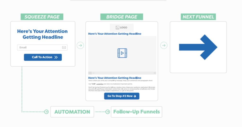
A squeeze page is a landing page designed to collect a visitor’s contact information. Usually, it will be an email address, with an optional phone number or Facebook contact.
On a squeeze page, there is only one goal. To convert visitors into subscribers by directing them to the signup form or the call to action button.
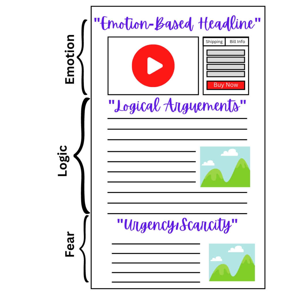
While a squeeze page is a type of landing page, it only does one thing in general. A squeeze page is used exclusively to capture an email address and start a conversation with a potential lead or prospect.
That’s all. And, nothing else.
Hence, squeeze pages are sometimes referred to as signup pages or opt-in pages.
Why Use Squeeze Page vs Website Homepage?
Why or when should you use a squeeze page instead of your homepage?
To answer this, we shall take a step back and look at the difference between a website and a squeeze page.
What is a website?
A website consists of different pages that show everything about your business, your product/service, and other links.
A website is designed for many types of users and various goals. There are elements like a navigation bar, potentially tons of links, images, and multiple calls-to-action (CTAs).
All these elements in a website will distract your audience’s attention and waste their time checking your website. It’s good to show your business after they already make a purchase and to know more about you.
But not when they do not yet know or trust you.
At this stage, your only goal is to convert them from a visitor to a lead or buyers. The rest can come in later.
What is a squeeze page?
On the other hand, a squeeze page only consists of one page and targetted call to action button.
Squeeze pages are free of excessive content, links, and any other elements that could potentially distract users from the main goal – providing their email addresses.
Typically, it should only consist of a headline, sub-headline, Video Sales Letter, Call to action button, and signup form.
No other link shall be included.
This is critical, especially when you’re running paid ad campaigns to drive traffic to your pages. You need to maximize the conversion rate as you are spending to buy the traffic.
For some newer companies that just starting online, they might directly design their homepage as a typical landing page.
While it seems simple to create a squeeze page, without the right strategy, your conversion rate will not be good as well.
Here we are going to share 6 simple steps so you can follow and build yours.
Sign up to GetResponse for Free
How to create a squeeze page in 6 simple steps
Now let’s look at all the elements you should include in your page and how to create high-converting squeeze pages.
1. Create an Irresistible Offer
The most important element of your squeeze page is the offer. This is the second touchpoint for the visitors after they saw your ads.
The offer needs to be something that they can’t resist but to say yes and provide their contact details.
A no-brainer deal. Just like the Black Friday Deal.
People value their contact details very much nowadays with all those privacy and data leaking issues. So what makes them want to give you their contact details?
The high perceived value freebies your offer on your squeeze page.
We called this a lead magnet or a signup incentive. A freebie that’s meant to convince the potential subscriber to leave their email address.

A few common lead magnets can be an ebook, reports, cheatsheet, or email courses.
There are many others, however, and it’s important that you use the right lead magnet for your target audience and your campaign.
2. An Eye-catching Headline
How long do you usually spend on a page before you decide to exit it or fill out the form?
Normally less than 10s.
Your headline needs to be interesting enough for them to go through your page further. Capture your user’s attention, spark interest, emphasize the value or pain points you’re helping with, and convince them to read more or go right to the form.
Try the Epiphany Bridge Script
3. Write a convincing sales copy
Copywriting is the art of convincing people to take an action. Your supporting sales letter has to convince users that the offer is exactly what they need and it’s in their best interest to fill out the form right away.
Other times you just need to emphasize the value and minimize the perceived risk.
Get the Copywriting Secrets Book
4. Social Proof
A good sales copy isn’t always sufficient to convince people as it comes from you.
Instead, they will be more likely to listen to the voice of other customers or users that is willing to give a testimonial after using your product or service.
That’s where social proof comes in.
Customer quotes, testimonials, and case studies can help you fulfil that need.
5. Add trust and authority elements
Your offer sounds fine, the sales copy is convincing, and there are some customer reviews on the page. But those are still not convincing enough for some customers. They are more cautious when giving out their details.
We understand that.
This is where you can show your authority by sharing past works are done or big clients.
6. Cut down the deadweight
Since squeeze pages are meant to convert as many website visitors into subscribers, everything you place on that page should point toward the goal.
At the same time, everything that could potentially distract your visitors from leaving their email addresses should be removed.
What kind of elements?
Think of all the extra links and buttons that you have. Your resources, blog, social media, about us page, contact us page, etc. All of these are useful links for your website but not the squeeze page.
The same goes for all the other products or services you may want to promote along with your lead magnet. Those things should be on the next page after they submitted their email address to you.
You’ll have to approach this individually and let them do a simple decision only.
Sign up to GetResponse for Free
High Converting Squeeze Page templates
Now that you know how to make squeeze pages, I’d like to provide you with some more inspiration.
Below you’ll find squeeze page templates that are ready to use in GetResponse.
As you’ll see, they’ve been prepared to fit several different industries, but you can adjust them easily to fit any other vertical, too.
Want to give it a try? Go ahead and sign up for a free account to access these templates right away.
List of tools that’ll help you create High Converting Squeeze Page
Now, you’ve learned why squeeze pages are important, and the strategy behind designing a high converting one.
It’s time to look at how to build it.
Squeeze page builder
Squeeze page builders had been around specifically to ease the process to build and promote your squeeze pages with ease.
For example, the Landing Page Creator feature in GetResponse is a squeeze page builder that lets you create landing pages both from scratch or using one of the mobile-responsive templates.
Now Your Turn To Create Your First High Converting Squeeze Page
Now that you know the basics and how to build a high-converting squeeze page. It’s your turn to start and get working.
Now, keep in mind that you rarely hit the home run on your first attempt.
