Every year introduces new trends in web design, bringing updates and shifts in emphasis to familiar website structures. While the foundation of websites remains constant, designers continually highlight different web design elements and explore fresh customizations that yield optimal results.
Audience expectations evolve regarding navigation intuitiveness, font professionalism, and checkout functionalities. To ensure your homepage meets these changing demands and provides an exceptional user experience, let’s get into the top 10 essential elements of web design.
What is A Web Design Element?
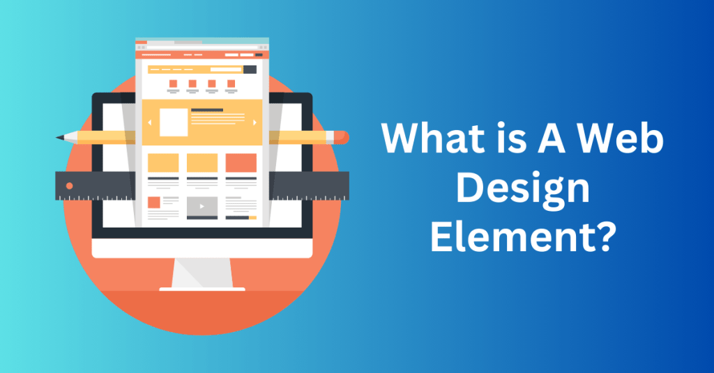
Web design elements play an important role in shaping the visual appeal and user experience of your website. They not only dictate how your site looks but also determine how visitors interact with each page.
Consider elements like links and buttons, which enable navigation and user actions, and imagery and typography, which convey messages and set the tone. Optimizing these elements is essential for enhancing various aspects of your website, including branding, sales, customer service, and content engagement.
Start Your WordPress Website with Bluehost Hosting – Exclusive discount available
Let’s get into each website element and explore their typical use cases:
Header:
The header of a webpage typically spans horizontally across the topmost section, serving as one of the initial focal points for visitors. An effective header is not only visually appealing but also ensures ease of navigation and accessibility.
A well-designed header should prioritize readability, employing clear typography and concise information. It often integrates essential navigational links, leading visitors to key categories of the website. These links act as signposts, facilitating intuitive exploration of the site’s content. Furthermore, a responsive header is crucial, seamlessly adapting to various screen sizes and devices, and ensuring optimal user experience across platforms.
Footer – Web Design Elements
Located at the bottom of each webpage, the footer serves as a vital concluding element. It provides users with essential information and further navigational aids. This horizontal section complements the header by offering a comprehensive overview of the website’s details.
The footer is commonly utilized to display a range of information, including contact details like addresses, phone numbers, and email addresses. It also serves as a platform for showcasing social media handles, encouraging visitors to connect with the website through various online channels.
Moreover, the footer is an ideal space to embed an email sign-up form, enabling visitors to subscribe to newsletters or updates. This strategic placement helps in building and maintaining user engagement over time.
Typography – Web Design Elements
The selection of fonts plays an important role in defining your brand identity and enhancing the visual appeal of your website. While it’s tempting to opt for striking and dramatic fonts that capture attention, it’s crucial to maintain a balance by incorporating an easy-to-read typeface. This ensures that visitors can quickly comprehend your content without any hindrance. It enables smooth skimming and efficient reading.
Besides, strategic font choices can reflect the tone and personality of your brand. A combination of headline fonts for emphasis and body fonts for readability creates a harmonious typographic hierarchy. Additionally, considering font styles that are web-safe and compatible across different devices ensures a consistent and accessible experience for all users.
Calls to Action (CTAs) – Web Design Elements
A call to action (CTA) serves as a direct prompt to your audience, guiding them towards specific actions that align with your business objectives. These actionable elements are strategically placed throughout your website to encourage user engagement and conversions.
For instance, a compelling CTA might be a prominent button labelled “Request a free consultation” strategically positioned on a services page. This prompts potential customers who have learned about your offerings to take the next step towards engagement.
CTAs can be customized to suit various objectives, such as signing up for a newsletter, making a purchase, or scheduling an appointment. By clearly articulating the desired action and using persuasive language, CTAs can significantly impact user behaviour and drive desired outcomes.
When designing effective CTAs, consider factors like placement, colour contrast, and wording. A well-crafted CTA stands out visually and motivates visitors to take decisive actions, ultimately contributing to the overall success of your website’s conversion strategy.
White Space – Web Design Elements
White space, often referred to as negative space, encompasses the areas of a webpage that are intentionally left empty or uncluttered by other design elements. While it might seem counterintuitive to leave spaces devoid of content, white space is a fundamental component of effective web design.
Besides, the strategic use of white space enhances the overall layout and readability of a website. By providing breathing room between text, images, buttons, and other elements, white space reduces visual clutter and improves user comprehension. It allows content to stand out, making it easier for visitors to scan, understand, and interact with your website.
In addition, controlling white space involves adjusting padding and margins around various web design elements. Proper spacing not only contributes to a clean and organized appearance but also enhances usability by ensuring that clickable elements are adequately sized and spaced apart.
Colour Scheme – Web Design Elements
The colour scheme you choose for your website is a critical aspect of visual communication, capable of influencing user perception and behaviour. Research shows that 39% of users prioritize colour over other visual elements when engaging with a website.
Different colours evoke specific emotions and associations. It ranges from energetic reds to soothing blues. Selecting an appropriate colour palette that aligns with your brand identity and resonates with your target audience is essential for creating a cohesive and impactful visual experience.
Harmonious colour combinations contribute to the overall aesthetic appeal of your website and can convey specific messages or moods. For example, warm tones like oranges and yellows can evoke a sense of friendliness or excitement, while cooler tones such as greens and blues might convey calmness or professionalism.
Branding – Web Design Elements
Branding is the essence of what distinguishes your website and embodies the unique personality of your company in the digital landscape. It encompasses a comprehensive strategy that encompasses visual and conceptual elements aimed at creating a distinct and memorable impression on your audience.
Central components of branding include:
- Logo: A graphical representation that serves as the cornerstone of your brand’s visual identity. It should be instantly recognizable and synonymous with your company’s values and offerings.
- Brand Colors: A carefully curated palette of colours that reflects your brand’s tone, personality, and message. Consistent use of colours across your website reinforces brand recognition and emotional connections with your audience.
- Slogan/Tagline: An impactful phrase that encapsulates your brand’s mission, values, or unique selling proposition. It should resonate with your target audience and leave a lasting impression.
- Design Elements: Beyond logos and colours, branding extends to typography, imagery, iconography, and overall design aesthetics. These elements collectively contribute to a cohesive brand identity that communicates professionalism and credibility.
Effective branding ensures that visitors not only recognize your website but also develop a positive association with your brand. It cultivates trust, loyalty, and differentiation from competitors, ultimately driving engagement and conversions.
Menus – Web Design Elements
Menus play a pivotal role in guiding users through your website’s content, serving as a navigational backbone that facilitates seamless exploration and interaction. A well-structured menu enhances user experience by simplifying access to key information and resources.
Key aspects of optimizing website menus include:
- Comprehensive Links: The menu should prominently feature links to essential web pages such as Home, About Us, Services, Products, Blog, and Contact. This helps users quickly locate relevant content.
- Mobile-Friendly Design: For mobile websites, consider implementing a hamburger menu icon (three horizontal lines) that expands to reveal menu options when tapped. This conserves screen space and ensures a clutter-free interface.
- Desktop Visibility: On desktop versions, the menu should remain prominently visible at the top of each page for easy access and navigation. Sticky or fixed menu bars enhance user convenience by remaining static as users scroll down.
- Organizational Structure: Arrange menu items logically and categorically to streamline user navigation and improve the discoverability of content. Use descriptive labels that communicate the purpose of each menu section.
By prioritizing user-centric menu design and cohesive branding strategies, you create a cohesive and engaging digital experience that resonates with your audience. A well-crafted brand identity paired with intuitive navigation enhances user satisfaction and reinforces your website’s value proposition.
Images – Web Design Elements
Incorporating engaging images and illustrations is essential for effective communication on your website. When paired thoughtfully with text, these visuals amplify your message. You can utilize high-quality photographs and bespoke graphics can significantly elevate your online presence. For instance, integrating a captivating hero image on your landing page or showcasing staff photos on your About Us page adds a personal touch and enhances user engagement.
The strategic use of visuals plays a crucial role in conveying your brand’s identity and values. By selecting images that resonate with your audience and align with your content, you establish a memorable and impactful online experience. Furthermore, custom graphics tailored to your brand’s aesthetic create a cohesive and professional appearance, distinguishing your website from competitors.
Layout – Web Design Elements
Equally important to your website’s visual impact is the layout and design style you choose. The placement of elements on a webpage significantly influences user behaviour and engagement. By strategically arranging media, text, white space, and interactive elements like buttons, you can guide visitors through your content and highlight key messages effectively.
A well-considered layout enhances usability and ensures that important information stands out prominently. For example, positioning a call-to-action button prominently increases its visibility and encourages user interaction. Moreover, thoughtful use of white space around elements creates a clean and uncluttered look, enhancing readability and user experience.
Start Your WordPress Website with Bluehost Hosting – Exclusive discount available
Why Web Design Elements Are Important
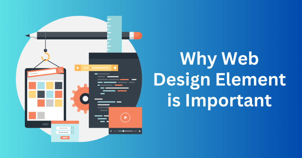
Design elements are the fundamental components that shape the appearance and functionality of your website. They wield significant influence over user interaction and can determine whether visitors are compelled to engage and take desired actions.
When your web design elements are carefully considered and customized, you can expect several positive outcomes:
Increased Visitor Retention
Well-crafted design elements contribute to a positive user experience, encouraging visitors to stay longer on your website. This increased dwell time indicates user engagement and reduces bounce rates. Bounce rate is the percentage of visitors who leave your site after viewing only one page. An ideal bounce rate is generally 40% or lower. Factors such as fast-loading pages and an appealing design both contribute to retaining visitors.
Enhanced User Experience
A user-friendly interface and intuitive navigation are crucial aspects of effective web design. When visitors can easily find what they’re looking for, they are more likely to explore further rather than abandon the site out of frustration. Clear navigation menus, logical page layouts, and responsive design contribute to a seamless browsing experience.
Encouraged Interaction
Well-thought-out design elements prompt visitors to interact with your website. This could involve engaging with content, filling out forms, clicking on calls-to-action, or exploring additional pages. Interactive elements such as sliders, buttons, and intuitive forms guide users through their journey, making it more likely they will take desired actions.
Positive Brand Perception
A visually appealing and functional website reflects positively on your brand. Customized design elements that align with your brand identity convey professionalism and credibility, fostering trust with your audience.
Improved Conversions
Ultimately, effective web design contributes to higher conversion rates. When users have a positive experience on your website and find it easy to navigate, they are more likely to convert. Whether that means making a purchase, signing up for a newsletter, or filling out a contact form.
Start Your WordPress Website with Bluehost Hosting – Exclusive discount available
How to Optimize The Web Design Elements
Let’s get into some of the key aspects of web design and how they play into current approaches for 2024. These strategies will help you update your website, draw in more visitors, and make a lasting impact.
Header
While headers typically remain consistent across all pages of your website, consider crafting alternate headers with customized layouts for specific pages.
For instance, if you operate an eCommerce store, the homepage header might link to your blog, About Us page, and product section. Conversely, on a product page, the header could highlight your main product categories to enhance the shopping experience.

The header presents an excellent opportunity to incorporate mobile-friendly design elements, such as a streamlined navigation menu tailored for smartphone browsers. Given that mobile users accounted for 58.22% of all web activity in January 2024, designing with mobile users in mind is crucial, as they comprise a significant portion of your audience.

Footer
In web design, the footer often gets overlooked in favour of content positioned above the fold—immediately visible when a website loads. While this approach had its merits in the past, it’s no longer the prevailing wisdom.
Today, websites are viewed on a variety of screen sizes, from smartphones to laptops and large monitors. Compared to five years ago, users are more inclined to scroll, often heading straight for information typically found in a website’s footer.

To meet these expectations, ensure your footer is responsive and includes all relevant links. Your footer should feature links to your high-traffic product and service pages, social media profiles, customer support resources, and comprehensive brand information.
These links are displayed horizontally on larger screens like computers but stack vertically on mobile browsers, ensuring clarity and accessibility across all devices.
Typography
Typography has undergone notable changes over the past decade. In the late 2010s, many brands adopted a minimalist approach with simple sans-serif fonts. A movement dubbed “blanding” by the British Design and Art Direction.
Initially popularized by high fashion labels, this streamlined aesthetic became ubiquitous across industries. However, trendsetting brands like Burberry have recently shifted gears, opting for more traditional, detailed, and asymmetric typography in their logos and branding.
With influential brands embracing stylized typography, designers are likely to move away from standardized fonts now. For prominent text on your website, consider using a font that exudes personality while maintaining readability.
Calls to action
Refining calls to action (CTAs) with meticulous attention has become a standard practice in web design due to its profound impact on conversions. For now, the focus will be on personalized CTAs.

Personalized CTAs dynamically adjust based on user actions. For instance, your website can display different CTAs depending on what products a user has viewed in your store section or how much time they’ve spent reading your blog. According to HubSpot, these personalized CTAs have been shown to convert 202% better than standard CTAs.
White space
Similar to typography, the use of white space in web design has undergone significant shifts over time. In earlier internet culture, white space seemed virtually nonexistent.
Over the years, there was a gradual shift towards minimalism, with landing pages becoming almost bare, featuring only a few lines of text. Today, however, we have reached a more balanced approach.
The most effective websites now leverage white space strategically to guide the viewer’s attention towards key design elements. By incorporating padding around CTAs (calls to action) and headings, visitors can easily identify and engage with specific components amid the array of design elements presented on the page.
Colour scheme
Eco-friendly companies often choose shades of green to reflect their sustainability and nature-oriented values, while restaurants frequently use shades of red or yellow to evoke appetite and warmth. The colours you select for your brand can convey nuanced messages to your audience.
In 2024, Pantone designated “peach fuzz” as the colour of the year, suggesting its potential to influence web design trends. This warm and inviting tone offers a softer alternative to the bright, vibrant colours that are prevalent. It indicates a shift towards more subdued and calming shades in design aesthetics.
Branding
There’s been an overall decrease in spending now. People are somewhat cautious about their purchases. Despite this trend, 66% of consumers express a willingness to invest more in brands they perceive as genuine. The importance of honesty, transparency, and authenticity remains paramount to customers, proving authenticity to be the most impactful factor.
Given this context, it’s crucial to openly communicate the materials you use, your business’s founding principles, and your brand’s core values. Incorporate these messages into your web design elements, such as an icon leading to your company’s origin story, a font that reflects your commitment to creativity, or a detailed policy section in the footer. This approach will effectively convey the essence of your brand to your audience.
Menus
Menus are commonly associated with the header section of a website, but they don’t have to be confined there. Many brands choose to position their menus on the left or right side of their web layout. For those who prefer the hamburger menu icon, the menu can stay hidden until activated.
In WordPress, managing menus is straightforward. You can easily rearrange menu items by dragging and dropping them, instantly updating your website’s navigation. To simplify navigation, you can also create submenus, which are small drop-down menus that fold away when not needed. This allows you to organize and present your content clearly and efficiently.
Images
The choice of images for your website will naturally differ based on your products or the content of your blog. However, certain visual themes are expected to be popular this year.
According to Adobe’s 2024 creative trends forecast, we can anticipate a surge in surreal, vibrant, and uplifting imagery. Additionally, experts at Adobe predict that AI-generated content will remain prevalent in the coming months. These trends suggest a focus on visually striking and innovative images that captivate and engage visitors to your website.
Layout
There are emerging website layout trends deviating from the traditional top-down structure, with one notable trend being the adoption of “bento box” layouts.
The term “bento box” originates from Japanese lunch boxes that feature multiple compartments, each containing a different food item. In web design, this concept involves organizing various elements within distinct segments. For example, headings can be placed in one segment, client reviews in another, and links in a separate section.
Start Your WordPress Website with Bluehost Hosting – Exclusive discount available
How to Customize The Web Elements For WordPress Website
Creating a compelling website with customized web design elements using WordPress is simpler than you might imagine. WordPress provides intuitive tools that allow you to easily enhance and customize your website’s appearance and functionality.
To start incorporating web design elements into your pages, you need to log in to your WordPress dashboard.
Access Appearance Settings
Firstly, locate the “Appearance” tab on the left-hand sidebar of your dashboard. Click on it to reveal a dropdown menu with various customization options.
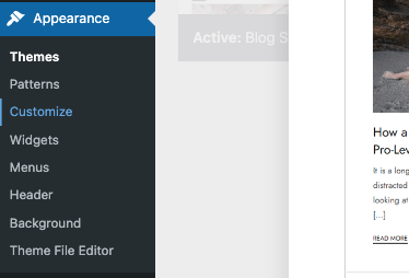
Under the “Appearance” tab, select “Customize.” This tool allows you to edit specific aspects of your website’s theme directly within the WordPress dashboard.
Customize Theme Elements
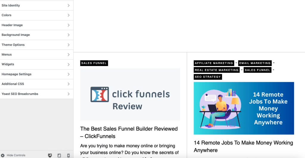
Then, you can modify different elements based on your selected theme. Each theme offers specific customization options. For example, some themes enable customization of the menu structure, footer layout, or colour scheme.
Choosing the right theme is crucial. Different themes offer varying degrees of flexibility and customization. Some themes are highly versatile and allow extensive modifications, while others are more restrictive. It’s essential to choose a theme that aligns with your design preferences and functional requirements.
Modify Color Scheme
To adjust the colour scheme of your website, navigate to the “Colors” section within the Theme Customizer. Here, you can easily change the colours used across your website. WordPress typically provides preset colour recommendations that complement each other, simplifying the customization process.
Implement Changes
Finally, apply your desired changes with a simple click of the mouse. Adjusting the colour scheme can have a profound impact on the overall look and feel of your website, enhancing its visual appeal and effectiveness.
By leveraging WordPress’s user-friendly interface and robust customization options, you can quickly transform your website’s design to align with your brand and engage your audience effectively.
Start Your WordPress Website with Bluehost Hosting – Exclusive discount available
Final thoughts: 10 Important Web Design Elements For Better User Experience
Creating an entire website may feel daunting, but simplifying the process by focusing on fundamental elements can greatly simplify the task, as you’ve experienced.
Whether it’s incorporating adequate white space into your landing page or ensuring your call-to-action (CTA) remains accessible across all devices. There are always adjustments you can make to enhance your website’s effectiveness.
Start Your WordPress Website with Bluehost Hosting – Exclusive discount available
