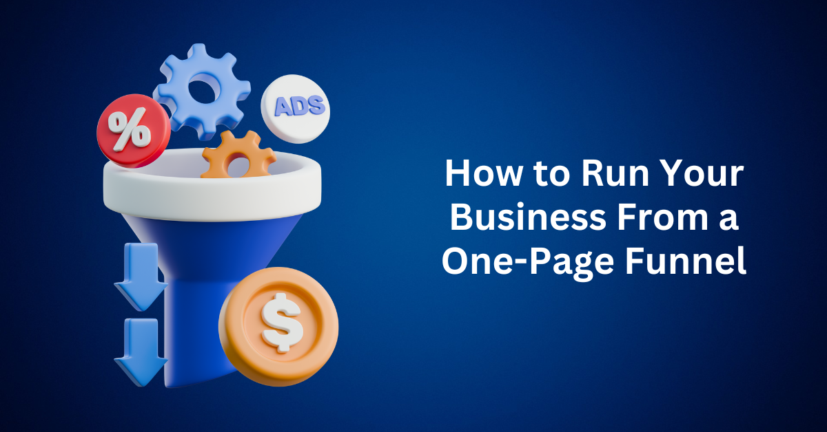
Are you struggling to manage your business across countless tools and platforms? If so, it’s time to discover how a one-page funnel can serve as your all-in-one solution, helping you attract leads, close sales, and onboard customers without the usual chaos.
Too often, small business owners are told they need more tools, more pages, more apps, and more content. At first, this might sound like solid advice. However, in reality, more often means more mess. You might start with a simple website, but soon you’re adding product pages, landing pages, email marketing software, payment gateways, lead capture forms, CRMs—and before you know it, you’re buried under a pile of tech stacks and monthly subscription fees.
But what if there was a better way?
Imagine running your entire business from just one single page.
That’s exactly what the One-Page Funnel is designed to deliver—a streamlined, high-converting business system that functions like an entire website, sales team, and marketing department—all wrapped into one seamless, focused experience.
What Is a One-Page Funnel?
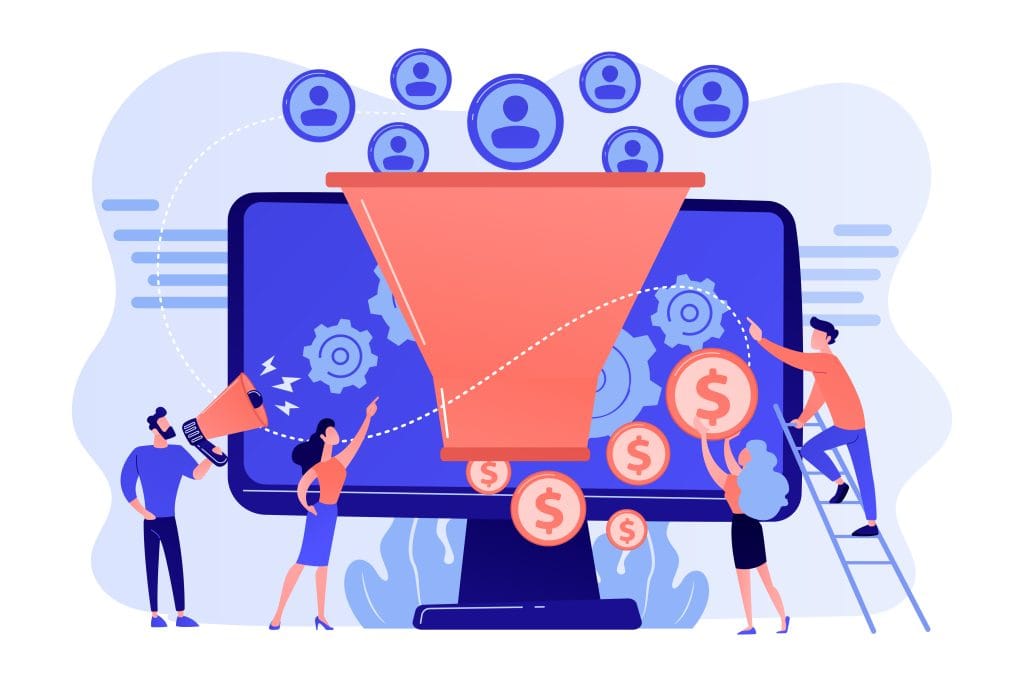
A One-Page Funnel is a single web page that takes your visitor through the complete customer journey from discovery to decision.
Here’s what it typically includes:
- A compelling hook or headline that grabs attention
- A persuasive sales message that speaks directly to a pain point
- A value-driven offer with a clear call-to-action (CTA)
- An embedded payment or checkout section
- Optional upsell/downsell offers for maximizing revenue
- Email opt-ins for lead nurturing and automation
- Social proof, testimonials, and FAQs for trust-building
- A follow-up onboarding sequence is triggered after purchase
All of this on one scrollable, purpose-built page.
Why One-Page Funnels Work Better
Instead of spreading your message thin across multiple web pages, a one-page funnel brings everything together into a single, focused sales experience. This streamlined approach allows you to present your entire offer clearly and cohesively, removing distractions and guiding visitors toward action. You may be surprised at just how much you can achieve when all your core business functions, lead capture, sales pitch, customer proof, and checkout, are unified on one page.
When designed strategically, a one-page funnel can do far more than just display your offer. It can capture leads using opt-in forms paired with irresistible hooks that grab attention. Besides, it presents your offer through persuasive storytelling, compelling visuals, and urgency-driven elements like countdown timers or limited-time bonuses. It builds trust by incorporating testimonials, user reviews, brand credibility, and money-back guarantees. Common objections are handled proactively with FAQs, comparison charts, or feature breakdowns that remove doubt and encourage decision-making.
Additionally, a one-page funnel can process payments through integrated checkout systems, ensuring a seamless transaction experience. Behind the scenes, it can also trigger automation such as email follow-up sequences, upsell flows, or thank-you messages, maximizing the lifetime value of every lead or customer.
By eliminating the complexity of traditional multi-page websites, a one-page funnel puts you in full control of the customer journey. Every section is intentionally crafted to guide the visitor step-by-step toward one ultimate goal: becoming a paying customer.
Why Less Structure Leads to More Sales
When it comes to online selling, many entrepreneurs fall into a common trap: more pages, more content, more credibility. But the truth is, your audience isn’t looking for a digital library. Instead, they’re looking for direction.
In the age of information overload, clarity wins.
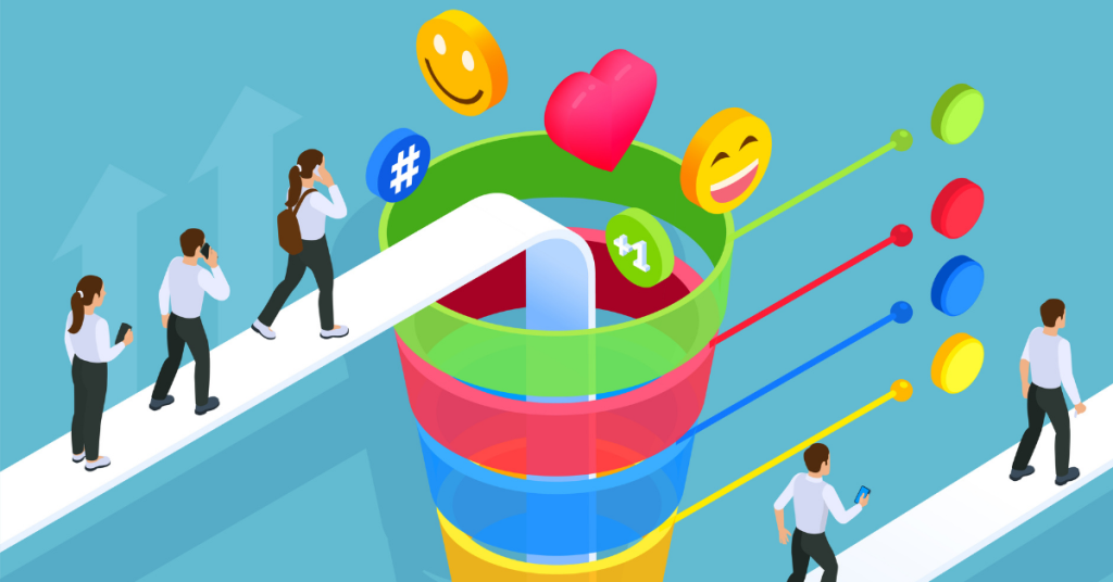
A One-Page Funnel thrives because it eliminates choice paralysis. Instead of bombarding your visitors with menus, tabs, and sidebars, you present them with one smooth, logical journey. Each scroll section is designed to build momentum, addressing objections, increasing trust, and nudging them toward a single call-to-action.
There are no distractions. No extra buttons, no “About Us” detours, no “Pricing” rabbit holes. Just one page, one purpose, one powerful conversion path. This focused approach works because it mirrors how people make decisions online: quickly, emotionally, and with minimal friction.
In digital marketing, momentum is everything. The more streamlined the journey, the faster you move your audience from curious to converted.
The Core Benefits of Running Your Business on a One-Page Funnel
Whether you’re a freelancer, coach, course creator, or product seller, the One-Page Funnel is a smart, scalable way to streamline your operations and maximize sales. Here’s why:
1. Laser-Focused Conversions
A traditional website often spreads your message thin. In contrast, a one-page funnel keeps the spotlight on your offer, guiding every visitor toward a single, clear CTA—whether it’s to book, buy, or join. With no distractions, you focus solely on driving results.
2. Rapid Launches With Minimal Tech
Building an entire website can take weeks or even months. By contrast, with a one-page funnel, you can launch in a single day using no-code platforms such as:
These tools are designed for speed, simplicity, and results—making them perfect for solopreneurs and lean teams.
3. Seamless Email Automation
Most funnel builders today come equipped with native or third-party integrations for email marketing, making it easier than ever to automate your communication. With these tools, you can capture leads through opt-in forms embedded directly into your funnel. As soon as someone signs up, a welcome email can be triggered automatically, setting the tone for your relationship from the start.
Beyond the initial contact, your funnel doesn’t stop working. Instead, you can continue the conversation by sending follow-up offers, onboarding sequences, and even educational content designed to build trust and drive conversions. Over time, these automated emails work quietly in the background, nurturing your list without requiring ongoing manual effort. In essence, once someone enters your funnel, you’re not just making a one-time sale. You’re initiating a long-term relationship that continues to grow and deepen on autopilot.
4. Scalable, Repeatable Sales System
Whether you’re targeting 100 customers or 100,000, a one-page funnel scales effortlessly. You can duplicate the structure for different offers, split test elements for higher performance, and continuously optimize for more revenue, without reinventing the wheel.
5. Frictionless User Experience
Your visitors don’t need a map—they need a guided journey. A one-page funnel removes all the guesswork by leading them from awareness to action in a natural, scroll-based format.
With no confusing menus and no back buttons, it provides a clean, cohesive flow that makes it easy for visitors to say “yes.”
The Biggest One-Page Funnel Mistakes (And How to Avoid Them)
Building a one-page funnel is one of the smartest moves you can make for your business, but only if it’s done right. Unfortunately, even well-intentioned entrepreneurs can fall into conversion-killing traps that sabotage performance before the first lead ever opts in.
Let’s break down the most common mistakes (and exactly how to avoid them) so you can build a one-page funnel that converts.
Mistake #1: Cramming Too Much Above the Fold
What goes wrong: It’s tempting to stuff every key point, headline, benefit, CTA, and video into the top of the page, assuming visitors won’t scroll. However, a cluttered header overwhelms users and dilutes the impact of your message.
The fix: Let your headline breathe. Start with a clean, bold hook with minimal distractions, then introduce supporting content—subheadlines, visuals, and CTAs—in logical steps as visitors scroll down. Trust the scroll. Modern users are accustomed to scrolling, and well-structured funnels guide them naturally.
Mistake #2: Weak or Vague Headlines
What goes wrong: If your headline doesn’t grab attention and communicate value within three seconds, you risk losing visitors. In fact, a generic or confusing headline fails to spark interest or curiosity.
The fix: Craft a clear, bold hook that answers the visitor’s unspoken question: “What’s in it for me?” Additionally, use power words, emotional triggers, and outcome-focused language. Remember: clarity always trumps cleverness.
Example:
Bad: “Welcome to My Page”
Good: “Turn Your Skills Into a 6-Figure Online Business, Even If You’re Starting From Scratch”
Mistake #3: No Clear Value Proposition
What goes wrong: Listing features alone is not the same as selling benefits. If your page focuses solely on what your product does—without showing what your customer gains—you’re missing the mark.
The fix: Shift from features to transformations. Instead of saying “This course includes 10 modules,” say “Learn how to attract high-ticket clients in just 30 days.”
Frame your offer as a solution to a pain point or a path to a desired result.
Mistake #4: Skipping Mobile Optimization
What goes wrong: More than 60% of traffic comes from mobile, and if your one-page funnel isn’t mobile-friendly, you’re instantly losing a majority of potential conversions.
The fix: Test your page on multiple devices. Ensure you use a responsive design that automatically adjusts layouts, buttons, and text sizes for smartphones and tablets. Fortunately, funnel builders like Systeme.io, ClickFunnels, and Leadpages offer mobile preview modes—so make sure to use them!
Mistake #5: Too Many Calls-to-Action (CTAs)
What goes wrong: Multiple CTAs pointing in different directions confuse the user: “Should I buy the product, book a call, or join the newsletter?” That indecision leads to inaction.
The fix: Give your funnel one primary goal and stick to it. Every element should guide visitors to that one outcome, whether it’s a purchase, a signup, or a booking. Secondary actions (like social follows or blog links) should be minimal or placed at the very end.
Mistake #6: Ignoring Load Speed
What goes wrong: Slow-loading pages kill conversions. Every second delay can drop conversions by up to 20% or more.
The fix:
- Compress images without sacrificing quality
- Minimize the use of unnecessary scripts and plugins
- Use lightweight fonts and themes
- Consider using tools like GTmetrix or PageSpeed Insights to test and improve performance.
Speed is part of the user experience, and it directly impacts your bottom line.
Important Sections of a High-Converting One-Page Funnel
To turn curious visitors into paying customers, your one-page funnel needs more than flashy design; it needs strategic structure. Think of it as a digital sales rep that walks every visitor through a complete buying journey, one scroll at a time.
Whether you’re using a funnel builder like ClickFunnels or coding it yourself, these seven essential elements will help your funnel function as a complete business system:
1. Hero Section – The First Impression That Captures Attention
Your headline and subheadline should do two things fast:
- Communicate the transformation you’re offering
- Spark enough curiosity to get visitors to scroll down
Use bold, benefit-driven language and avoid industry jargon. Think “clear over clever.”
Example: “Launch Your Digital Product in 7 Days Even If You Have No Audience or Tech Skills.”
2. Lead Magnet or Primary Call-to-Action
To keep visitors from clicking away, it’s crucial to give them a compelling reason to act immediately. This can take many forms, such as offering a free downloadable resource, inviting them to register for a live or on-demand webinar, presenting a limited-time discount with a countdown timer, or simply prompting them to book a call for a personalized consultation.
Whatever call-to-action (CTA) you choose, it should align with your visitors’ intent and feel like a natural next step in their journey. A well-placed, high-converting CTA not only grabs attention but also moves your audience closer to saying yes to your offer.
3. Authority Builders – Build Instant Trust
Social proof plays a powerful role in reassuring your visitors that they’ve landed in the right place. By showcasing testimonials or detailed case studies, you demonstrate real-world results and happy customers who’ve benefited from your offer. Trust logos from partners, certifications, or media mentions help boost credibility, especially if your audience is unfamiliar with your brand.
You can also highlight impressive numbers such as customer success rates, total users served, or revenue milestones, to create a sense of momentum and authority. Including your origin story or professional credentials adds a personal touch, building trust and connection. Altogether, these elements work to reduce scepticism, validate your expertise, and increase the likelihood that visitors will take action.
4. Offer Stack – Make the Offer Irresistible
Your “Offer Stack” serves as the centerpiece of your funnel—it’s the moment where you lay out the full value of what you’re offering. At this stage, it’s crucial to communicate exactly what the customer is getting by listing the key features of your product or service. However, don’t just stop at describing what each feature is. Instead, go a step further and explain why it matters. By connecting each feature to real, tangible benefits, you show your audience how it solves their problems or improves their lives.
To boost perceived value, consider including additional bonuses or limited-time extras that complement and enhance the core offer. After that, provide a transparent pricing breakdown. Then, compare the price to the total value, reinforcing just how much of a deal they’re getting.
Finally, to make your Offer Stack easy to digest, use visual aids such as icons, images, and bullet points. A clean, skimmable layout not only helps hold attention but also makes your pitch more persuasive, so visitors can instantly see why your offer is simply too good to ignore.
5. Objection Handling – Answer Before They Ask
Don’t leave your visitors with unanswered questions or lingering doubts; address them directly on your page to build confidence and reduce hesitation. A short, clear FAQ section can tackle common objections or concerns before they become deal-breakers. Offering a money-back guarantee or a free trial shows that you stand behind your product, giving potential customers the safety net they need to move forward.
You can also include a strong risk-reversal promise, such as “Cancel anytime, no questions asked,” to remove any perceived pressure or commitment. The goal is to eliminate as much friction as possible. When people feel secure and informed, they’re far more likely to convert.
6. Checkout Section – Make Payment Seamless
Your checkout form is one of the most critical elements of your funnel, and optimizing it for simplicity and trust is essential. To begin with, keep the layout clean and uncluttered. Avoid adding distractions, unnecessary fields, or multi-step processes that could create hesitation or lead to cart abandonment. Moreover, ensure the design is mobile-friendly, as a significant portion of users will likely complete their purchase on a smartphone or tablet. By streamlining this step, you reduce friction and make it easier for customers to confidently complete their transaction.
Make the form feel secure by including trust badges, SSL indicators, and familiar payment icons to reassure users that their information is safe. Whenever possible, keep the checkout process on your page rather than redirecting to a third-party site. The fewer clicks and inputs required, the smoother the experience, and the higher your conversion rate.
7. Upsell Teaser or Next Steps – Keep the Momentum Going
Once someone makes a purchase or opts in, your job isn’t over. It’s just beginning. Right after conversion is the perfect moment to guide them toward the next logical step while their interest and excitement are still high. You can offer a relevant upsell, product bundle, or limited-time upgrade that complements their original purchase. This not only increases your average order value but also enhances their overall experience.
Let them know what to expect next. Whether it’s a confirmation email, access to a course, or the delivery of a digital resource. If onboarding is required, explain the process clearly so they feel supported and confident moving forward.
Additionally, encourage them to engage further by sharing your offer, referring friends, or joining a community space where they can connect with others. Keeping the momentum going after the sale helps build stronger relationships, fosters loyalty, and opens the door to repeat business and referrals.
Finding Your Ideal One-Page Funnel Platform
To run your business from a single page, you need more than just a page builder. You need a complete funnel ecosystem. That means automation, email marketing, checkout systems, and analytics all working together.
Look for a platform that offers the following features out of the box:
Drag-and-Drop Funnel Builder
Build and test layouts without code. Your platform should offer intuitive design tools to create responsive, scroll-based journeys quickly.
Built-In Checkout & Payment Integration
You can avoid relying on third-party cart tools by choosing a platform with built-in eCommerce features. Specifically, look for solutions that support one-click payments, integrate seamlessly with Stripe, PayPal, or local payment gateways, and include order bump and upsell capabilities. By doing so, you streamline the purchasing process, reduce friction, and maximize revenue—all without adding extra tools or unnecessary complexity.
Email Automation & CRM
You can automate your follow-up process by using built-in features such as welcome sequences, abandoned cart recovery, and lead nurturing campaigns. Additionally, behavior-based segmentation allows you to tailor actions based on how visitors interact with your site. Together, these tools transform your one-page funnel into a 24/7 selling system, ensuring no lead is left unattended and maximizing your conversion potential.
Pre-Built Funnel Templates
Templates save hours of work and ensure your layout follows proven best practices. Look for industry-specific templates or ones optimized for webinars, lead magnets, or digital product sales.
“But My Offer Is Too Complex for One Page…”
This is a common concern, but also a misconception.
A one-page funnel doesn’t mean cramming everything above the fold. Instead, it uses progressive disclosure, unfolding your message piece by piece as the user scrolls.
Each section builds anticipation, establishes authority, and answers objections in the right order. The result? A frictionless, engaging sales experience that increases trust and drives conversions without overwhelming your audience.
Final Thought: Supercharge Your Business with One Page Funnel
It’s time to stop overcomplicating your online business with a patchwork of platforms, pages, and plugins. The truth is, the most successful digital entrepreneurs aren’t doing more—they’re doing less, but better.
That’s where the One-Page Funnel comes in. It provides everything you need to attract leads, convert customers, and follow up automatically—all from a single, purpose-built page. No more technical headaches. No more costly development delays. Instead, you get one streamlined system designed to deliver results.
With the right funnel-building tool, you can launch in hours instead of weeks. This means you’re free to focus on what truly moves the needle: your message, your offer, and your customer journey.
Ultimately, this is the exact strategy that today’s smartest business owners are using to simplify, scale, and succeed. Now, it’s your turn.
Build one page that transforms your business. Streamline your systems. Increase your conversions. And finally, run your business with clarity and confidence.