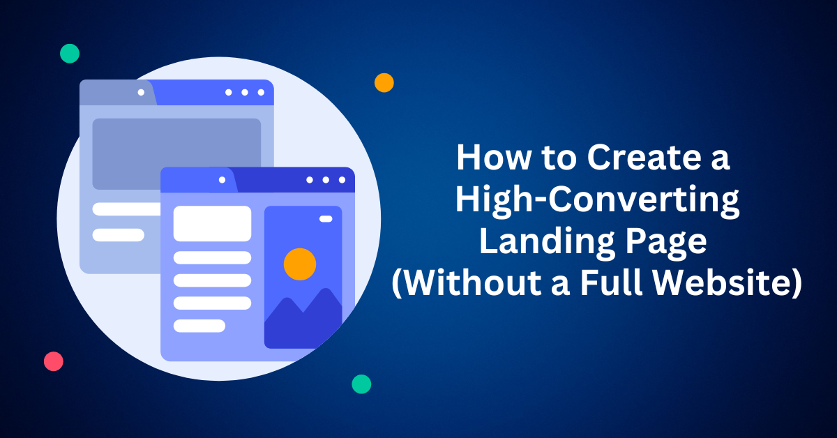
When most people think about starting an online business, they immediately picture a full website, complete with product pages, an “About Us” section, a blog, and contact forms. While this seems like the “professional” thing to do, it’s often the wrong first step. The reason is simple: building a website from scratch can take weeks, even months, of dedicated work in design, copywriting, and development. Furthermore, it can cost thousands of dollars before you’ve even tested if your business idea has any demand. However, there is a smarter, faster, and more effective way to launch: start with a single, high-converting landing page.
Specifically, a landing page is a standalone web page with one clear goal, such as to collect emails, generate leads, sell a product, or book appointments. Moreover, with modern drag-and-drop tools, you can create a professional one in under an hour, even with zero coding skills.
In this guide, you’ll learn why this focused approach works, the essential elements you need, and how to set up your first landing page step-by-step. By the end, you’ll see exactly how to launch fast, test ideas, and start getting tangible results, all without the headache of building a full website.
What is a Landing Page? (And Why It’s Different)
Before we dive into the “how,” let’s clarify the “what.”
A landing page is a standalone page with a single purpose: to get visitors to take one specific action. Unlike a multi-page website with navigation menus, a landing page eliminates all distractions. Every element from the copy to the design guides the visitor toward one decision, such as:
- Signing up for a newsletter
- Registering for a webinar
- Downloading a free guide
- Purchasing a product
- Booking a consultation
Think of it as a digital storefront window. Instead of walking through an entire mall (a full website), the visitor sees only the one offer you want them to focus on.
Landing Page vs. Website: Key Differences
| Feature | Landing Page | Full Website |
| Purpose | Drive one action | Showcase the entire brand |
| Navigation | Minimal or none | Multiple pages and menus |
| Setup Time | Minutes or hours | Weeks or months |
| Cost | Low | High |
| Focus | Conversion | Information & Conversion |
This simplicity is what makes landing pages so powerful for startups. Instead of overwhelming your audience with options, you give them one clear path forward.
Why You Don’t Need a Full Website to Start
Many entrepreneurs believe they can’t look professional without a complete website. In reality, a well-designed landing page not only looks professional but often performs better in the early stages.
Here’s why a full website can wait:
- It’s Expensive and Time-Consuming: Hiring designers and developers adds up quickly. Even DIY website builders take significant time. By the time your site goes live, your business idea might already feel outdated.
- You Haven’t Validated Your Idea: A landing page lets you test demand before a major investment. You can use ads or social media to drive traffic and see if people are interested. If it works, you have proof before scaling.
- Landing Pages Convert Higher: Websites distract visitors with menus, blog posts, and other links. A landing page removes the clutter. The data shows that focused landing pages consistently convert at higher rates.
- Modern Tools Make It Incredibly Easy: Platforms like Carrd, Leadpages, Unbounce, and ClickFunnels allow you to build a page quickly with pre-designed templates. No code required.
Real-World Example: Imagine you’re launching a new organic skincare product. Instead of building a 10-page e-commerce site, you create one landing page with a compelling headline, product benefits, testimonials, and a “Buy Now” button. Within days, you’re generating sales and validating your idea.
The Strategic Benefits of Starting with a Landing Page
Adopting a “landing page first” approach offers a cascade of benefits that accelerate your path to success.
To start, you’ll achieve lightning-fast Speed to Market, going from an idea to a live page in hours rather than months. Coupled with this speed are significantly Lower Costs, since you can avoid hefty developer fees by using intuitive and affordable DIY tools.
As a result of this simplicity, you create Focused Messaging. By presenting one clear message and a single call-to-action, you guide visitors directly toward conversion, minimizing distractions. This streamlined setup also makes Easy A/B Testing a breeze, allowing you to quickly iterate on headlines, images, and offers to optimize performance.
Ultimately, this makes your landing page Perfect for Paid Ads. A targeted page ensures that whether your traffic comes from Facebook, Google, or TikTok, every click is driven toward a single, measurable goal, maximizing your return on ad spend.
The 7 Essential Elements of a High-Converting Landing Page
While anyone can create a landing page, the difference between one that simply exists and one that converts lies in its strategic construction. A high-converting landing page is a carefully engineered sales tool, where every element serves the singular purpose of guiding the visitor toward your goal.
To ensure your page delivers maximum results, these seven elements are non-negotiable. Think of them as the building blocks of conversion:
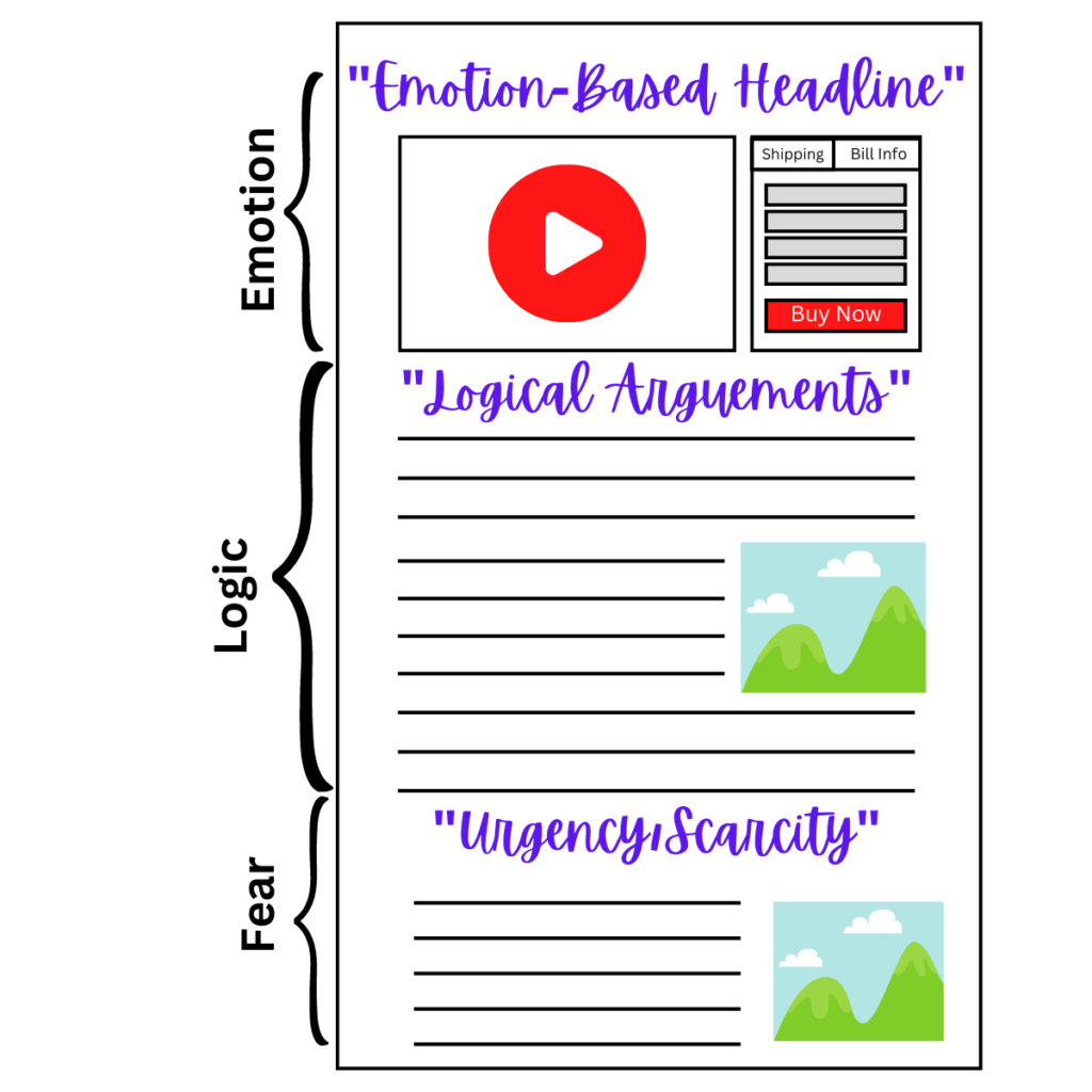
1. The Irresistible Headline: Your 3-Second Hook
Your headline is the first element a visitor encounters, and it plays a crucial role in determining whether they stay on your page or leave. To be effective, it must do more than simply inform; it needs to captivate the audience and clearly promise a core benefit or value.
When crafting your headline, it is best to lead with the primary benefit your offer provides. This immediately communicates the value to the reader. You should also incorporate your target keyword for SEO purposes, such as “The Ultimate Guide to a High-Converting Landing Page.” Furthermore, a powerful headline either sparks curiosity or addresses a specific pain point your audience faces, making it instantly relevant.
For example, a weak headline like “Marketing eBook” is vague and offers no incentive. A much stronger alternative would be, “Download Our Free eBook: The 5-Step Framework That Generated 500 Leads in 30 Days.” This version is compelling because it states a clear, desirable outcome, incorporates a tangible result, and directly addresses the reader’s goal of generating more leads.
2. The Crystal-Clear Value Proposition: The “Why You Should Care”
Immediately following your compelling headline, you must answer the visitor’s silent question: “What’s in it for me?” This is the role of your value proposition. It’s a concise statement that explains how your product or service solves their problem, outlines the specific benefit they will receive, and highlights what sets you apart from the competition.
To nail this critical element, focus on stating the ultimate result the user can expect. A powerful formula is to promise they can “Achieve [Desired Outcome] without [Common Obstacle].” This copy should be simple and easy to skim, often using a short introductory paragraph supported by clear, impactful bullet points. Most importantly, the focus must always be on the transformation you provide. Instead of just listing features, articulate the tangible outcome and positive change the user will experience, making the value impossible to miss.
3. Compelling Visuals: Show, Don’t Just Tell
The human brain processes images an astonishing 60,000 times faster than text, which means the visuals on your page are far from merely decorative. Instead, they are critical for capturing attention, fostering engagement, and ensuring clear understanding. To leverage this, you should incorporate high-quality, relevant visuals such as product demo videos, which have been shown to increase conversions by over 80%, and high-resolution images that show your product in use to help visitors visualize the benefit.
For simplifying complex data or processes, infographics are exceptionally effective. Finally, an engaging hero image that visually supports your headline and value proposition can immediately reinforce your core message and create a powerful first impression.
4. Unshakeable Social Proof: The Trust Catalyst
In the digital landscape, where trust cannot be assumed, it must be actively and quickly earned. Social proof serves this vital function by providing external validation that reassures visitors they are making a smart and safe decision. This can be effectively demonstrated through several key types of evidence. Customer testimonials and reviews are most powerful when they include real names and photos, adding a layer of authenticity.
For a deeper dive, detailed case studies that showcase how a specific client achieved a tangible result can be very compelling. Additionally, trust badges such as security seals and recognized payment provider icons help to alleviate security concerns, while displaying social media proof like your number of subscribers or positive mentions, leveraging the power of the crowd to build immediate credibility.
5. The Unmissable Call-to-Action (CTA): The Conversion Engine
Your Call to Action (CTA) is the culmination of your entire landing page strategy; therefore, it is the most critical element. It must be visually prominent, commanding attention and action with clear, benefit-driven language. To achieve this, use action-oriented and value-focused commands like “Get My Free Trial,” “Start My Transformation,” or “Download Your Guide,” which clearly state the user’s reward. Most importantly, avoid vague, passive words like “Submit.”
From a design perspective, the button should be crafted for maximum visibility, using a contrasting color that makes it stand out from the rest of the page, and ensuring it is large enough to be easily clicked on any device. Furthermore, incorporating a sense of urgency or scarcity, such as “Get Instant Access” or “Join the Waitlist,” can provide the final nudge a visitor needs to take the desired action.
6. A Focused, Frictionless Environment: The Path of Least Resistance
Ultimately, a landing page’s greatest strength is its singular focus. As a result, every element, from the headline to the CTA, must work in harmony to guide the visitor toward one primary action. To achieve this, you must eliminate any extraneous link, navigation menu, or off-topic information that creates friction and presents an easy exit opportunity. Specifically, this means removing the top navigation menu, which is often the number one source of distraction, and avoiding footer links to your blog or social media that can pull visitors away from their goal.
Most importantly, resist the urge to include multiple calls-to-action. By sticking to one primary goal per page rather than asking a visitor to both “Buy Now” and “Sign Up for Our Newsletter”, you create a seamless, persuasive path that dramatically increases your chances of conversion.
7. Flawless Mobile Optimization: The Non-Negotiable Standard
In today’s digital landscape, with over 60% of web traffic originating from mobile devices, a page that isn’t optimized for smartphones is fundamentally failing its audience. A poor mobile experience will instantly destroy your hard-earned credibility and send your bounce rate soaring. To prevent this, a mobile-optimized design is non-negotiable. This includes a responsive layout that adapts seamlessly to any screen size, fast load times achieved by compressing images and minimizing code, and thumb-friendly CTAs with buttons that are large and well-spaced for easy tapping. Furthermore, all text must be legible without requiring the user to zoom.
By implementing and harmonizing these seven core elements, from the captivating headline and persuasive value proposition to the strategic visuals, trust-building social proof, the focused CTA, and a flawless mobile experience, you move beyond simply creating a web page. Ultimately, you are architecting a focused, persuasive, and high-converting machine, deliberately designed to turn visitors into leads and customers.
What to Include (and What to Cut)
The biggest mistake is turning a landing page into a mini-website. Clarity, not clutter, is key.
✅ MUST-HAVE ELEMENTS:
- A clear, benefit-driven headline.
- A simple explanation of value (use bullet points!).
- Proof it works (testimonials, case studies).
- A single, obvious call-to-action button.
🚫 WHAT TO LEAVE OUT:
- Navigation menus.
- Links to your social media or other pages.
- Multiple CTAs competing for attention.
- Any information that doesn’t help the visitor say “yes.”
Think of your landing page as a guided conversation. Every element should lead the visitor one step closer to your goal.
Your Secret Weapon: Speed and Simplicity
In online business, speed consistently beats perfection. Essentially, every day you spend tweaking a logo or designing web pages is a day you’re not selling. This is precisely why landing pages are your ultimate advantage. They let you move fast, test fast, and learn fast.
Here’s a real-world scenario: You have an idea for a free 5-day email course. Instead of building a full website, you use a funnel builder like Carrd or Leadpages. Then, you pick a template, add your headline and details, and hit publish. As a result, by the end of the day, you’re already driving traffic and collecting signups.
The key takeaway is that perfection isn’t required to launch. Ultimately, what you need is:
- A clear message.
- A focused landing page.
- And finally, the willingness to go live and adjust.
The faster you launch, the faster you’ll get the data you need to succeed.
Always Launch First and Optimize Later
A landing page allows you to validate your business hypothesis without a massive upfront investment. Here’s how the process works:
If nobody signs up or buys, this isn’t failure; it’s invaluable feedback. It simply tells you your message, offer, or audience needs tweaking. Therefore, you can pivot quickly and test again.
On the other hand, if people do sign up or buy: Congratulations! You’ve validated demand. As a result, this is your green light to expand. You can now confidently build email sequences, add upsells, or even create that full website, knowing there’s a market for it.
Ultimately, this approach helps you avoid the trap of building something nobody wants. In short, you grow your business based on real data, not guesses.
Final Thought: Stop Planning, Start Launching Your Landing Page
Don’t let “I need a website” hold you back.
After all, every day spent obsessing over the perfect site is a day you’re not validating your idea with real people. Instead, a landing page gives you speed, clarity, and immediate feedback.
Remember, perfection isn’t the goal, but progress is.
A single page, built with a clear goal, can put you miles ahead of anyone stuck in “planning mode.” Later, once you see results, you can expand. But it all starts with taking that first step.
Therefore, choose a landing page builder, craft your message, and launch today. Ultimately, the sooner you go live, the sooner you’ll have the proof you need to build a real, sustainable business.