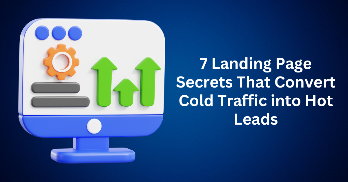
Is your landing page bringing in visitors but failing to convert them into leads or customers? You’re not alone. Many business owners and marketers face this exact challenge: daily page views with little to show for it.
You’ve tried tweaking your headline, changing your button colours, and rewriting your copy. But the bounce rate stays high, and the conversions stay low.
Here’s the hard truth: getting people to your landing page is only half the battle. The real magic happens when you transform that landing page into a powerful conversion funnel, one that warms up cold traffic and guides visitors toward a “yes.”
Ready to learn how? Let’s break down 7 data-backed strategies to turn curious clickers into committed buyers.

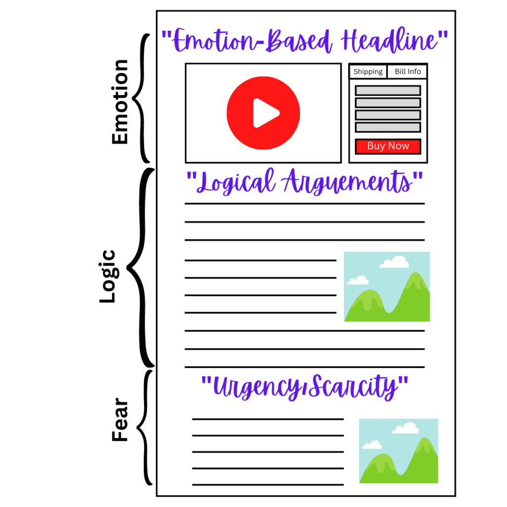
1. Hook Visitors Instantly With a Magnetic Headline
In the fast-paced digital world, first impressions aren’t made in minutes. Instead, they’re made in milliseconds. Research shows you have less than 5 seconds to grab your reader’s attention before they scroll away forever. That’s why your headline isn’t just a sentence. Instead, it’s your first and most powerful conversion tool.
A high-performing headline must do more than just look good. It needs to:
- Stop the scroll with a bold, benefit-driven hook
- Communicate immediate, tangible value to your audience
- Evoke curiosity that makes readers want to learn more
Unfortunately, vague or generic headlines like “Download Our Free Ebook” fall flat. They lack specificity, emotion, and urgency.
Instead, aim for headlines that tap into real outcomes and clear benefits, like:
“How We Grew Our Email List by 300% Using This 7-Step Strategy”
This kind of headline works because it’s outcome-focused, emotionally resonant, and promise-oriented. It tells the reader exactly what they’ll gain and sparks enough curiosity to earn that all-important click.
If your headline doesn’t instantly answer the reader’s silent question, “What’s in it for me?”, you’ve already lost them.
So next time you’re crafting copy for your blog, landing page, or ad, remember: A killer headline isn’t an accessory. It’s the hook that pulls your audience in, builds interest, and drives action.
2. Keep Your Landing Page Layout Clean and Focused
If your landing page looks like a chaotic buffet of buttons, banners, and blocks of text, then it’s time for a redesign. Simply put, clutter doesn’t convert; clarity does. When visitors are hit with too much information all at once, they become overwhelmed. As a result, overwhelmed users are less likely to click, buy, or sign up. Instead of taking action, they bounce.
To avoid this, start by focusing on one goal, but not many. Every landing page should have a single, laser-focused objective. Whether it’s collecting sign-ups, selling a product, or booking a call, your page should revolve around just one clear call-to-action (CTA). Otherwise, multiple CTAs create competition for attention and weaken your message. In contrast, simplicity drives results.
Once your goal is clear, shift your attention to the copy. Write like a human, not a sales robot. Keep your message short, friendly, and conversational. Think of it this way: how would you explain your offer to a friend over coffee? Skip the jargon and corporate buzzwords. Instead, use simple language, short sentences, and a tone that builds trust while making your offer easy to understand.
After that, let white space do the heavy lifting. White space isn’t wasted, it’s strategic. By giving your content room to breathe, you help users scan it and stay focused. Proper spacing around text, images, and buttons keeps attention where it matters most: your message and your CTA.
Equally important, design for mobile first. With over 60% of web traffic coming from mobile devices, your landing page must not only look great but also function well on smaller screens. Use large, tappable buttons, readable fonts, and layouts that feel natural for thumb scrolling. In today’s digital world, a mobile-first approach isn’t optional. It’s essential.
3. Establish Credibility With Social Proof
Before anyone clicks “Buy Now” or “Sign Up,” they need one thing first: trust. You can have the most polished design and a compelling offer, but if your audience doesn’t feel confident in you, they won’t take action. Trust is the crucial bridge between initial interest and conversion, and it needs to be built fast.
Build Trust with Social Proof and Real Results
Start by showing social proof that speaks volumes. People trust other people. Real customer reviews, star ratings, and short testimonials that highlight specific benefits of your product or service can make a big impact. Besides, visual elements like names, photos, ratings, or even video snippets add authenticity and help potential buyers feel more confident.
Next, use screenshots to back up your claims. If you’ve helped someone get real results, prove it. Share before-and-after transformations, screenshots of positive DMs, or email feedback from satisfied users. These raw, authentic visuals quickly establish credibility and show your product or service works in the real world.
Show Credibility Through Milestones and Authority
Also, mention milestones that matter. Highlight stats that show traction, such as “Trusted by over 5,000 users,” “10,000+ downloads and counting,” or “Used by teams at [notable companies].” Even if your numbers are modest, they still demonstrate momentum and real-world validation, both key to building trust.
Leverage Personal Experience When Proof Is Limited
Another way to strengthen credibility is to add expert quotes, credentials, or case studies. Show that you’re not just another voice online. Whether it’s featuring a relevant certification, sharing a case study with real metrics, or quoting a respected expert who supports your approach, these signals position you as an authority in your space.
But what if you don’t have proof yet? Use personal experience. If you’re still building your track record, lead with your story. Share your journey, showcase results you’ve achieved for yourself, or offer a tutorial or guide that provides immediate value. Teaching something helpful upfront can earn trust even before you have testimonials.
4. Craft CTAs That Feel Personal and Inviting
Your call-to-action (CTA) button is the tipping point between a visitor and a conversion. It’s the moment where curiosity transforms into commitment if you get it right. Yet, many marketers waste this golden opportunity with bland, forgettable phrases like “Submit,” “Click Here,” or “Learn More.” These generic CTAs don’t inspire action or communicate any real value. As a result, they’re not just boring. Instead, they’re easy to ignore.
So, what makes a CTA button truly irresistible?
Start by using action-driven, benefit-first language. Great CTAs do more than tell users what to do. They highlight what the user gets by clicking. The reward should be immediate and clear. Phrases like “Get My Free Checklist,” “Show Me the Strategy,” or “I Want to Grow My Leads” are compelling because they focus on value and results. This kind of wording creates a sense of ownership and incentive, making it easy for users to say yes.
Next, strategically place your CTAs to suit different user behaviors. Not every visitor engages with your landing page in the same way. Some are ready to act immediately, while others prefer to scroll, read, and evaluate before committing. That’s why you should include at least two CTA buttons: one above the fold for quick decision-makers, and another placed after your key content or testimonial section for users who need more information before they act. This dual placement ensures you’re reaching both impulsive and deliberate visitors.
Finally, use urgency but keep it real. A sense of urgency can drive action, but only if it’s authentic. Countdown timers, limited availability, or messages like “Offer ends soon” can motivate clicks when used honestly. Fake scarcity or manufactured urgency can damage your credibility and destroy trust, which is difficult to rebuild. If your offer is genuinely time-sensitive or space-limited, communicate it clearly and truthfully.
In the end, your CTA isn’t just a button. It’s a critical decision point. Make it count by using clear, benefit-driven language, placing it strategically, and adding honest urgency to nudge your visitors toward action.
5. Use Storytelling to Guide Visitors Through a Funnel
The best landing pages don’t just pitch, they connect. They pull readers into a story that reflects their own experiences and pain points, then gently guide them toward a solution. It’s not about flashy headlines or cramming in every possible benefit. It’s about making your audience feel seen, heard, and understood. When people feel like you get them, they’re much more likely to trust you and ultimately, to buy.
Tell a Story That Reflects the Reader’s Struggles
To build a high-converting, story-driven landing page, you should begin with a problem your audience immediately recognizes. After all, every compelling story starts with a challenge. So, identify a specific pain point your readers are facing—something that feels personal and familiar. For instance, you might say: “You’re putting in hours of effort marketing your offer… but still getting zero engagement.” This type of statement taps directly into the reader’s emotions and quickly sparks a “Yes, that’s me!” response.
Once you’ve captured their attention, bridge to your offer with empathy. After naming the problem, introduce your solution in a natural, conversational way. A phrase like “That’s exactly why I created this…” works especially well because it doesn’t feel overly salesy—it feels genuine. More importantly, it shows that your product or service was born from a real understanding of their struggle. That simple shift builds credibility and makes your offer feel like it was created specifically for them.
Focus on One Clear Outcome and Keep It Human
Then, focus on one clear win. Instead of overwhelming readers with a long list of features or promises, highlight a single powerful outcome, something they genuinely want. For example: “Learn the exact 3-step strategy that helped me double my client leads without paid ads.” This approach keeps your message focused, relevant, and results-driven.
Finally, keep your tone conversational and authentic. Skip the buzzwords and industry jargon. Write like you’re talking to a friend who’s stuck and needs guidance. Use contractions, real-life examples, and a voice that feels warm and relatable. Think less “optimize your digital strategy,” and more “let me show you what worked.”
When your landing page tells a story that mirrors your reader’s reality and leads them to a believable, desirable outcome, you create more than just interest; you create a connection. And connection is what drives conversion.
6. Measure What Matters (And Ignore the Vanity Metrics)
Here’s the truth: you can’t optimize what you don’t measure. If your landing page isn’t converting, then simply guessing won’t fix the issue. Instead, you need real data to uncover what’s working, what’s failing, and where visitors are dropping off.
By consistently tracking the right metrics, you gain a clear window into user behavior. As a result, you’ll uncover the insights needed to make smarter decisions and implement faster improvements. With that foundation in place, here are four essential metrics that every high-performing landing page should monitor:
1. Conversion Rate – How Many Visitors Take Action
Conversion rate measures the percentage of visitors who complete your desired action. Whether that’s signing up, making a purchase, downloading a resource, or something else. It’s your ultimate performance indicator. A strong conversion rate suggests your messaging, offer, and design are resonating with your audience. A low one means it’s time to re-evaluate your value proposition, page layout, or even the clarity of your CTA.
2. Bounce Rate – Are Users Leaving Too Soon?
Bounce rate tells you the percentage of users who leave your page without interacting or navigating further. A high bounce rate can signal that something’s off. Perhaps your headline doesn’t match your ad, your page is slow to load, or your content isn’t compelling. Either way, it’s a red flag that deserves investigation.
3. Scroll Depth – How Much Are They Reading?
Scroll depth measures how far down the page users go. It shows whether people are consuming your content or losing interest before reaching key messages or your CTA. If most visitors don’t scroll past the halfway mark, it may be time to trim your copy, make your content more engaging, or move your CTA higher up the page.
4. CTA Clicks – What’s Driving Action?
Tracking CTA clicks is essential because it shows you what’s actually encouraging users to take the next step—and what’s falling flat. After all, not all buttons are created equal. By carefully analyzing which CTAs receive the most clicks—based on placement, wording, or design—you can optimize them for stronger engagement.
To dig deeper, you’ll need behavior analytics tools that go beyond basic traffic numbers:
- Google Analytics 4 – A powerful, free tool for tracking conversions, bounce rate, and engagement metrics.
- Hotjar – Offers heatmaps, scroll maps, and real user session recordings so you can visualize exactly how visitors interact with your page.
- Microsoft Clarity – A free alternative with unlimited traffic that provides heatmaps, click tracking, and session replays to uncover usability issues and friction points.
Together, these tools reveal how users move, click, and respond to your content. With those insights, you can fine-tune your landing page, remove barriers, and ultimately boost conversions.
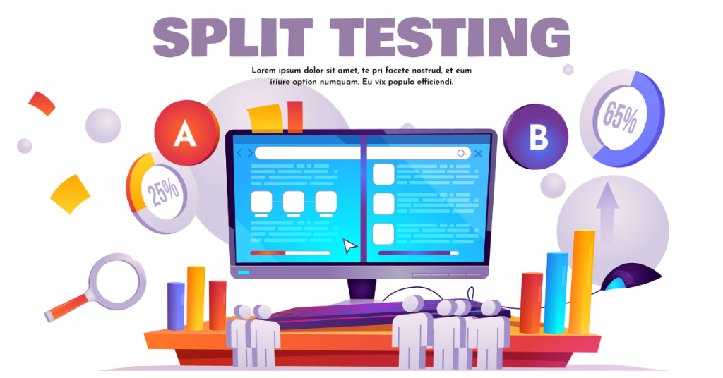
7. A/B Test Everything
Think your landing page is “done”? Think again.
Landing page optimization is an ongoing process—not a one-time task. In fact, even small adjustments, such as tweaking a headline, changing a button color, or shortening the layout, can have a dramatic impact on your conversion rate.
That’s exactly where A/B testing comes in. It serves as your secret weapon for uncovering what truly resonates with your audience.
What to A/B Test on Your Landing Page
You don’t need a full redesign to boost your landing page performance. Often, small tweaks to high-impact elements can lead to noticeable improvements. Start by focusing on key areas that influence user behavior and decision-making:
Headlines: Your headline is the first thing visitors see, and it often determines whether they stick around or bounce. Test variations that highlight different benefits, address specific pain points, or use different tones (friendly, bold, urgent). A simple shift in phrasing can dramatically increase engagement.
Button Text and Color: Your CTA button carries a lot of weight. Experiment with action-driven text like “Get My Free Guide” versus “Download Now.” You can also test different button colors to see which ones draw the eye or encourage more clicks. Sometimes, a small visual tweak can make a big difference in conversions.
Page Layout or Length: Not all audiences respond to the same structure. Some prefer a short, punchy landing page with minimal scroll; others need more detail and reassurance. Try testing single-column versus split layouts, long-form versus short-form content, or repositioning your CTA to appear earlier on the page.
Imagery or Video: Visuals have a powerful impact on trust and emotion. Swap your current hero image with a new one, test using a video instead of static imagery, or compare real customer photos against polished stock photos. Even subtle changes in visuals can shift how users feel about your brand.
These small experiments, when done strategically and measured properly, can lead to significant conversion gains without overhauling your entire page. Start with one change at a time and let the data guide your next move.
Best Practices for Smart A/B Testing
To get reliable results and avoid misleading conclusions in your landing page experiments, it’s crucial to follow a few proven testing principles. These best practices ensure your data reflects real user behavior, not random noise.
1. Test One Element at a Time – Always isolate your variables. For example, if you change both your headline and your CTA button in the same test, you won’t know which adjustment actually caused the shift in performance. By focusing on one element at a time, you gain clear, reliable insights into what truly moves the needle.
2. Run Tests Long Enough: Patience pays off. Aim to run each test for at least one full week or until you reach 100 conversions, whichever comes first. Short test durations can be misleading, as daily traffic patterns and behaviors vary. Give your test enough time to collect a meaningful data set.
3. Compare Apples to Apples: Consistency matters. User behavior can differ depending on the day of the week, so it’s important to measure results accordingly. For example, compare Monday traffic for version A with Monday traffic for version B, rather than comparing different days. This avoids skewed outcomes and gives you more accurate insights.
4. Don’t dismiss “Ugly” Designs: A polished, modern design isn’t always the top performer. Simple or even “ugly” layouts often convert better because they’re clearer, faster to load, or less distracting. Let the data guide your decisions, not your personal preferences or design bias.
By sticking to these principles, you’ll ensure your landing page tests deliver meaningful, actionable results. That way, every change you make is backed by real evidence and built for better conversions.
Why Most Landing Page Fails (And How to Fix Yours for Better Conversions)
You’ve built a landing page with sleek visuals, eye-catching colors, maybe even an embedded video. On the surface, it looks polished and professional.
But the truth? Design alone doesn’t convert.
A pretty landing page that doesn’t drive action is just digital wallpaper.
If you’re wondering why your landing page isn’t delivering results, here are some of the most common (and costly) mistakes that hold most pages back from converting casual visitors into qualified leads.
Here are 5 Common Reasons Your Landing Page Isn’t Converting
1. Your Message Isn’t Clear in the Landing Page
Generic headlines like “Innovative Solutions for Business Growth” sound impressive, but they’re also meaningless. Visitors don’t want fluff. They want to know:
- “What is this?”
- “Who is this for?”
- “How does it help me?”
Your message should be laser-focused, benefit-driven, and instantly understandable.
Fix it: Use direct, outcome-focused headlines like:
“Get More Leads in 7 Days With This Proven Funnel Blueprint”
2. Your Landing Page Is Too Busy
When visitors land on a cluttered page with multiple CTAs, sidebars, popups, and long-winded copy, they feel overwhelmed. And when people are overwhelmed, they bounce.
Fix it:
- Stick to one primary CTA per page
- Use short, skimmable copy
- Let your layout breathe with white space
- Eliminate distractions that don’t lead to your goal
3. Your Call to Action in the Landing Page Is Weak or Confusing
If your CTA button says “Submit,” “Send,” or “Learn More,” you’re leaving money on the table. These don’t tell your audience what they’re getting or why they should care.
Fix it: Use action-oriented CTAs that reinforce the benefit:
- “Get My Free eBook”
- “Start My Free Trial”
- “Show Me the System”
4. You’re Missing Social Proof
Without testimonials, reviews, or recognizable client logos, your brand can feel untrustworthy, especially to cold traffic. In today’s digital world, credibility is currency.
Fix it:
- Add short testimonials from happy customers
- Show screenshots of messages or results
- Include user stats like “Over 10,000 downloads”
- Mention media features or certifications if available
Even if you’re just starting, leverage case studies, beta tester feedback, or your personal experience.
5. Your Landing Page Loads Too Slowly
Speed matters. A delay of just one second in load time can reduce conversions by up to 20%. If your page takes more than 3 seconds to load, you’re already losing nearly half your visitors before they even see your headline.
Fix it:
- Compress images
- Use lazy loading for videos
- Remove unnecessary scripts or plugins
- Use reliable hosting and a fast theme
If your landing page is underperforming, don’t panic and don’t start from scratch.
Start small. Test one change this week. Begin with your headline, since that’s the first thing visitors notice, then work your way through your call-to-action, social proof, and layout flow.
The best part? Modern funnel-building tools make it easy to update, test, and optimize your landing page—and the great news is you don’t need any coding skills or a design degree to do it.
Final Thoughts: Turning Traffic Into Trust and Sales with a Landing Page
A high-converting landing page isn’t built on luck or good looks—it’s the result of clear messaging, thoughtful design, and intentional strategy. So, if your current page isn’t performing, don’t view it as a failure. Instead, treat it as feedback. Every bounce, skipped CTA, or missed signup is a clue pointing you toward what needs improvement.
To begin, focus on the essentials. First, craft a headline that speaks directly to your visitor’s pain point or deepest desire. Next, use a single, compelling call-to-action that leaves no room for confusion. Then, add real social proof to establish credibility and trust. Finally, ensure your layout is fast, clean, and easy to navigate—because even small amounts of friction can kill conversions.
Remember, the goal isn’t perfection—it’s progress. With consistent testing and small, strategic tweaks, you can gradually transform cold traffic into warm leads and, ultimately, loyal customers.
That’s why now is the best time to act. Every improvement you make today lays the foundation for stronger conversions tomorrow.