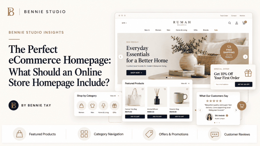
For many Malaysian businesses, building an ecommerce homepage that supports buying decisions is not just a design question. It affects how quickly a visitor understands the offer, how confidently they contact the business, and how much work the owner must do after launch. A useful decision starts with the customer journey rather than a feature list.
The first step is to define what the website must help a customer do. A visitor may need to compare options, request a quotation, book a call, send a WhatsApp message, or complete a purchase. When that action is clear, the content, page structure and calls to action can support it.
The job of an ecommerce homepage
A website also has an operating cost. Someone must maintain the platform, keep information current, monitor enquiries, review performance and make improvements. Treating these responsibilities as part of the project leads to a more realistic budget and a more useful long-term result. A homepage is not a catalogue dump. It should orient new visitors, guide returning visitors and make the most important buying paths easy to find.
Before comparing providers, write down the scope in plain language. Include the pages, integrations, content responsibilities, tracking requirements, ownership arrangements and support expectations. Clear scope makes quotations easier to compare and reduces unpleasant surprises. The strongest sections answer the questions customers bring with them. What is sold, who is it for, why should they trust the store, and how can they get help? The practical implication is that the page should be planned around a clear decision, not assembled as a collection of disconnected sections. Explain the context before presenting the action, and make the action easy to complete.
Make the offer clear above the fold
Search visibility is part of the same picture. Search engines need clear page topics, useful explanations, logical internal links and technically accessible pages. Visitors need the same clarity in a different form. Good SEO and good conversion design therefore reinforce each other. The strongest sections answer the questions customers bring with them. What is sold, who is it for, why should they trust the store, and how can they get help?
A professional website should make the next step obvious without becoming aggressive. A visitor should be able to see the service, understand why it is relevant, find proof, and contact the business using a method that feels natural on mobile and desktop. A useful homepage can be simple and still feel complete. Clear hierarchy, strong imagery, concise copy and reliable navigation usually outperform decoration that hides the next step. The practical implication is that the page should be planned around a clear decision, not assembled as a collection of disconnected sections. Explain the context before presenting the action, and make the action easy to complete.
Create paths for different visitors
The strongest approach is practical and evidence-led. Start with the business model, understand the audience, identify the important questions, then build the smallest structure that can answer them well. Add complexity only when a real requirement justifies it. A useful homepage can be simple and still feel complete. Clear hierarchy, strong imagery, concise copy and reliable navigation usually outperform decoration that hides the next step.
There is no universal answer for every business. A simple information site, an enquiry-focused service site and a complex online store have different requirements. The correct decision depends on the customer journey, internal capacity, growth plans and level of control required. A homepage is not a catalogue dump. It should orient new visitors, guide returning visitors and make the most important buying paths easy to find. The practical implication is that the page should be planned around a clear decision, not assembled as a collection of disconnected sections. Explain the context before presenting the action, and make the action easy to complete.
Use categories and products intelligently
This is especially important for small and growing companies. Time is limited, content is often incomplete and the person approving the website may also be running the business. A process that reduces ambiguity is usually more valuable than a long list of fashionable features. A homepage is not a catalogue dump. It should orient new visitors, guide returning visitors and make the most important buying paths easy to find.
One useful test is to ask what happens one week after launch. If nobody knows who updates the site, checks enquiries or improves weak pages, the original plan is incomplete. Websites create more value when ownership of ongoing work is explicit. The strongest sections answer the questions customers bring with them. What is sold, who is it for, why should they trust the store, and how can they get help? The practical implication is that the page should be planned around a clear decision, not assembled as a collection of disconnected sections. Explain the context before presenting the action, and make the action easy to complete.
Build trust before asking for purchase
Before comparing providers, write down the scope in plain language. Include the pages, integrations, content responsibilities, tracking requirements, ownership arrangements and support expectations. Clear scope makes quotations easier to compare and reduces unpleasant surprises. The strongest sections answer the questions customers bring with them. What is sold, who is it for, why should they trust the store, and how can they get help?
Another useful test is clarity. Can a new visitor understand the offer without asking for an explanation? Can a search engine identify the main topic of the page? Can the owner update important information without depending on a developer for every small change? A useful homepage can be simple and still feel complete. Clear hierarchy, strong imagery, concise copy and reliable navigation usually outperform decoration that hides the next step. The practical implication is that the page should be planned around a clear decision, not assembled as a collection of disconnected sections. Explain the context before presenting the action, and make the action easy to complete.
Make delivery and returns easy to find
A professional website should make the next step obvious without becoming aggressive. A visitor should be able to see the service, understand why it is relevant, find proof, and contact the business using a method that feels natural on mobile and desktop. A useful homepage can be simple and still feel complete. Clear hierarchy, strong imagery, concise copy and reliable navigation usually outperform decoration that hides the next step.
The goal is not to build the largest website possible. The goal is to build a dependable digital channel that communicates clearly, captures demand and can be improved as the business learns what customers need. A homepage is not a catalogue dump. It should orient new visitors, guide returning visitors and make the most important buying paths easy to find. The practical implication is that the page should be planned around a clear decision, not assembled as a collection of disconnected sections. Explain the context before presenting the action, and make the action easy to complete.
Design for mobile shopping
There is no universal answer for every business. A simple information site, an enquiry-focused service site and a complex online store have different requirements. The correct decision depends on the customer journey, internal capacity, growth plans and level of control required. A homepage is not a catalogue dump. It should orient new visitors, guide returning visitors and make the most important buying paths easy to find.
For many Malaysian businesses, building an ecommerce homepage that supports buying decisions is not just a design question. It affects how quickly a visitor understands the offer, how confidently they contact the business, and how much work the owner must do after launch. A useful decision starts with the customer journey rather than a feature list. The strongest sections answer the questions customers bring with them. What is sold, who is it for, why should they trust the store, and how can they get help? The practical implication is that the page should be planned around a clear decision, not assembled as a collection of disconnected sections. Explain the context before presenting the action, and make the action easy to complete.
Support SEO and discovery
One useful test is to ask what happens one week after launch. If nobody knows who updates the site, checks enquiries or improves weak pages, the original plan is incomplete. Websites create more value when ownership of ongoing work is explicit. The strongest sections answer the questions customers bring with them. What is sold, who is it for, why should they trust the store, and how can they get help?
The first step is to define what the website must help a customer do. A visitor may need to compare options, request a quotation, book a call, send a WhatsApp message, or complete a purchase. When that action is clear, the content, page structure and calls to action can support it. A useful homepage can be simple and still feel complete. Clear hierarchy, strong imagery, concise copy and reliable navigation usually outperform decoration that hides the next step. The practical implication is that the page should be planned around a clear decision, not assembled as a collection of disconnected sections. Explain the context before presenting the action, and make the action easy to complete.
Improve the homepage with evidence
Another useful test is clarity. Can a new visitor understand the offer without asking for an explanation? Can a search engine identify the main topic of the page? Can the owner update important information without depending on a developer for every small change? A useful homepage can be simple and still feel complete. Clear hierarchy, strong imagery, concise copy and reliable navigation usually outperform decoration that hides the next step.
A website also has an operating cost. Someone must maintain the platform, keep information current, monitor enquiries, review performance and make improvements. Treating these responsibilities as part of the project leads to a more realistic budget and a more useful long-term result. A homepage is not a catalogue dump. It should orient new visitors, guide returning visitors and make the most important buying paths easy to find. The practical implication is that the page should be planned around a clear decision, not assembled as a collection of disconnected sections. Explain the context before presenting the action, and make the action easy to complete.
How to choose the right next step
There is no universal answer for every business. A simple information site, an enquiry-focused service site and a complex online store have different requirements. The correct decision depends on the customer journey, internal capacity, growth plans and level of control required. Start by listing the audience, the main service, the most valuable enquiry and the information a customer needs before contacting you. Then decide which pages, proof points and conversion actions are necessary.
One useful test is to ask what happens one week after launch. If nobody knows who updates the site, checks enquiries or improves weak pages, the original plan is incomplete. Websites create more value when ownership of ongoing work is explicit. A good brief should also state what is not included. This keeps the project focused and gives the business a clear basis for discussing future improvements.
Questions to ask before you commit
Ask who will own the domain, who will manage hosting, what happens when information changes, how revisions are handled, and how the website will be checked after launch. Ask how forms, calls and WhatsApp actions will be measured, and whether the provider can explain the result in business language.
Also ask how the site will grow. Service pages, location pages, FAQs, case studies and landing pages may become important later. A sensible structure should make these additions possible without forcing a complete rebuild.
Build a website that keeps working
The goal is not to build the largest website possible. The goal is to build a dependable digital channel that communicates clearly, captures demand and can be improved as the business learns what customers need. At Bennie Studio, the managed website approach is designed for service businesses that want a professionally built site, hosting, maintenance and ongoing support handled through one guided process. It is intended to help turn attention into WhatsApp messages, calls, bookings and quotation enquiries without asking the owner to become a website administrator.
Where a business needs full CMS control, ecommerce, complex integrations or bespoke functionality, a custom WordPress project may be more suitable. The right choice depends on the requirement, not on a claim that one model is best for everyone. Ready to assess the direction for your business? See My Website Preview or review the website pricing guide.