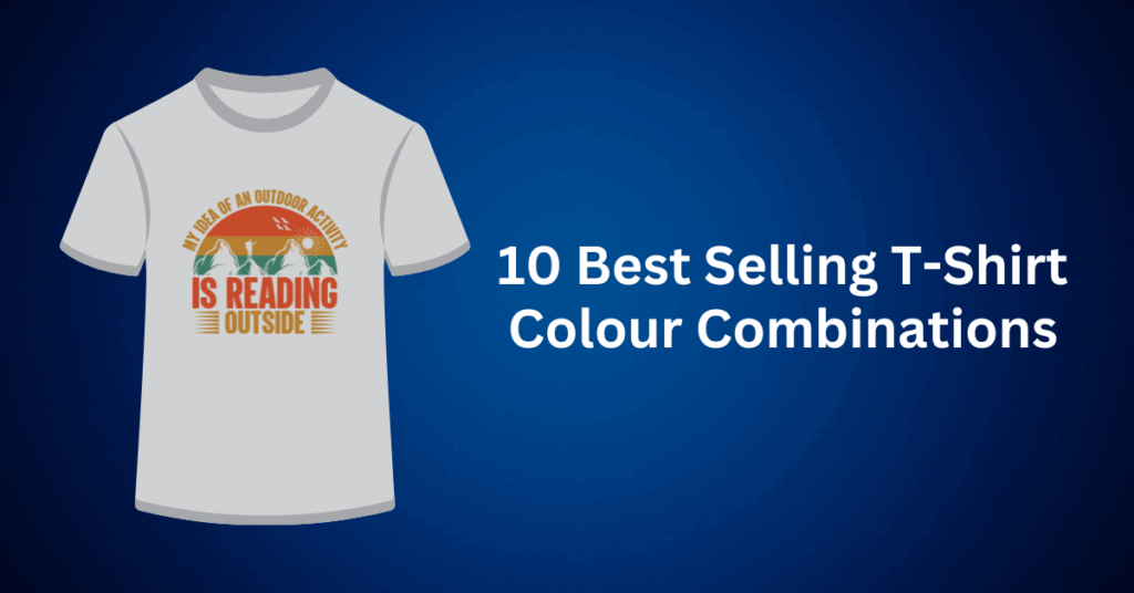
Designing and selling custom t-shirts is not only a creative outlet. In fact, it can also be a highly profitable business. Whether you’re launching your own apparel line or designing merchandise for a brand, one thing is certain: the right t-shirt and ink colour combination can make or break your design.
With so many shirt colours, ink options, and printing techniques available, it’s easy to feel overwhelmed. But by understanding a few essential colour principles and learning how to apply them effectively, you can confidently create t-shirts that are both visually stunning and commercially successful.
In this guide, we’ll walk you through how to choose t-shirt and ink colour combinations that stand out, look professional, and align with your design goals, whether you’re going for bold and attention-grabbing or sleek and minimalist.
Colour is one of the first things people notice about a t-shirt. It sets the tone for your design, influences purchasing decisions, and plays a huge role in how your brand is perceived. High-contrast combinations help your design elements pop, while subtle, coordinated palettes convey sophistication and timelessness.
But creating the perfect combination isn’t just about guessing what looks good. It’s about understanding the science and psychology of colour.
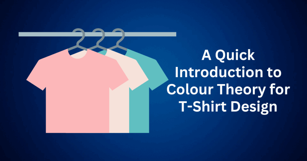
A Quick Introduction to Colour Theory for T-Shirt Design
Before jumping into specific combos, it helps to have a basic understanding of colour theory, especially if you want your designs to look polished and professional.
The Colour Wheel
At the heart of colour theory is the colour wheel, which consists of:
- Primary colours: Red, blue, and yellow
- Secondary colours: Green, orange, and purple (created by mixing primary colours)
- Tertiary colours: These are blends of a primary and a secondary colour, such as teal, chartreuse, and magenta.
To create harmonious or dynamic colour combinations, designers often turn to the colour wheel as a foundational tool. There are several key types of colour schemes to consider:
First, complementary colours are directly opposite each other on the wheel, such as red and green or blue and orange. When used together, especially in ink and t-shirt pairings, they create a strong contrast and help designs truly pop.
Then, analogous colours sit side by side on the wheel, like blue, blue-green, and green. This type of scheme tends to feel more natural and harmonious, making it ideal for calm, unified designs.
Finally, triadic colours are evenly spaced around the wheel. For example, red, yellow, and blue. This scheme results in vibrant, energetic visuals that are perfect for bold statement tees.
Tips for Choosing the Right Shirt and Ink Colour Pairings
Here are some practical tips to help you pick combinations that look great and sell well:
1. Start with the Shirt Colour
The base colour of the t-shirt significantly influences how your ink appears. For example, dark shirts like black or navy pair well with bright or light ink, creating a strong contrast. On the other hand, light shirts such as white, ash, or cream are better suited for darker or more detailed designs, allowing finer elements to stand out.
2. Use High-Contrast for Visibility
If your goal is to make a design stand out, then opt for high-contrast colour combinations. For instance, white ink on a black shirt or red ink on a gray tee are both examples that create a strong visual impact.
3. Neutral colours Are Always in Style
Shades like white, black, grey, and beige are popular because they pair well with nearly any ink colour. These combinations appeal to a wide audience and work well for both minimal and intricate designs.
4. Know Your Audience and Brand
If your goal is to make a design stand out, then opt for high-contrast colour combinations. For instance, white ink on a black shirt or red ink on a grey tee can create a strong visual impact. Beyond contrast, think about the overall vibe you want your shirts to convey. Are you designing for a streetwear brand, a nature-inspired line, or motivational merch? Your colour choices should not only reflect your brand’s personality but also resonate with your target market.
10 T-Shirt and Ink Colour Combinations That Sell (and Look Amazing)
With so many shirt colour options in the Printify Product Catalogue, some styles offering 60+ choices, it’s easy to feel paralyzed by decision-making. While having a wide palette to choose from is exciting, not all t-shirt and ink colour combinations are created equal when it comes to design impact and market appeal.
To help you cut through the noise and make selections that not only look great but actually sell, we’ve rounded up 10 t-shirt colour combinations that consistently perform well in custom apparel design.
1. Black and Yellow: High-Contrast and Attention-Grabbing
Few colour combos are as instantly recognizable and visually powerful as black and yellow. This pairing is commonly used in sportswear, urban fashion, and bold branding for a reason; it just works.
- Black shirts with yellow ink radiate energy and give your design a sharp, standout contrast.
- Yellow shirts with black ink deliver legibility with a punch of personality.
Whether you’re designing tees for a music brand, athletic line, or trendy streetwear collection, this colour combo ensures visibility and impact.
2. Red and White: Bold and Striking
Red instantly grabs attention. It’s the colour of passion, urgency, and confidence. When paired with white, the result is a clean, high-contrast look that makes designs pop.
- White ink on a red shirt is ideal for crisp logos, detailed illustrations, and clear typography.
- Red ink on a white base gives a bright, cheerful aesthetic that feels fresh and youthful.
This classic combo works well for promotional tees, seasonal collections, or statement apparel.
3. Orange and Blue: Vibrant and Dynamic
As complementary colours on the colour wheel, orange and blue create eye-catching contrast that’s perfect for energetic designs.
- Royal blue and bright orange feel sporty and playful, great for gym wear or team merchandise.
- For a more wearable version, try navy blue ink on a softer orange shirt.
This pairing is a favorite for brands targeting an active, upbeat audience.
4. Blue and Gold: Rich, Elegant, and Elevated
If you’re going for a premium, upscale vibe, blue and gold is a winning combo. The deep tones of navy or cobalt blue give the shirt a solid foundation, while gold ink adds a sense of luxury and refinement.
- This pairing is perfect for vinyl prints, custom graphics, or high-end branding.
- Metallic gold ink on navy blue delivers a timeless look that appeals across demographics.
Great for events, branded merchandise, or signature pieces in a clothing line.
5. Black and White: Classic and Versatile
When in doubt, go back to the basics. Black and white is a fail-proof colour scheme that works with virtually any design style.
- White ink on a black tee has an edgy, modern vibe.
- Black ink on a white tee is clean, minimal, and crisp.
This high-contrast pairing is ideal for detailed illustrations, fine typography, or simple brand logos. It’s a must-have combo in any t-shirt designer’s toolkit.
6. Blue and White: Timeless and Refreshing
Looking for a colour combo with broad appeal? Blue and white never go out of style. This pairing is especially popular for casual wear, nautical designs, and summer collections.
- White ink on medium or dark blue shirts keeps text and graphics highly readable.
- Reverse it with blue ink on white for a light, airy look that feels seasonal and fresh.
Experiment with different shades. Navy for a traditional feel, or teal for a modern twist.
7. Olive and Gold: Unique and Stylish
This underrated pairing is perfect for brands that want to offer something different from the typical t-shirt fare.
- Olive green serves as a muted, earthy base that allows gold ink to shine without overwhelming the design.
- Works especially well for bold fonts, logo-based graphics, or minimalist statement designs.
If you’re targeting trend-conscious shoppers or want to offer elevated streetwear, this combo delivers.
8. Maroon and White: Rich and Clean
Maroon is a deep, luxurious colour that brings vintage charm and collegiate appeal to your designs. Paired with white, it creates crisp, readable prints that work year-round.
- Ideal for school merch, retro-inspired designs, or fashion-forward statements.
- Flip it with maroon ink on white to switch things up with a lighter feel.
This combo is flexible enough for both casualwear and niche branding.
9. Red, Blue, and Yellow: Bold Primary Power
Want to go bold? Use the three primary colours together to create eye-catching designs full of life and motion.
- Start with a blue shirt and layer red and yellow ink for contrast.
- Adjust the intensity by using deeper tones for balance, or go bright for youthful appeal.
This combo is perfect for teamwear, playful graphics, or retro-themed collections.
10. Green and Grey: Earthy Meets Modern
Looking for something subtle yet impactful? Green and grey are an unexpectedly effective combination.
- Dark grey with kelly green ink gives a bold, sporty look.
- Light grey with forest green feels organic, calm, and perfect for eco-conscious branding.
- Heather grey with mint green adds a trendy, fresh vibe ideal for warm-weather drops.
For extra punch, add white or black outlines around your design to increase visibility and contrast.
How to Choose the Right T-Shirt Colour Combination
Finding the right colour combo isn’t just about what looks good. Instead, it’s about what works best for your brand and your audience.
Tips for Choosing the Right T-Shirt Colour Combo:
When choosing the right colour combinations for your designs, it’s essential to start with the classics. Black and white pairings are always a safe bet, especially for minimalist customers who appreciate simplicity. However, it’s also important to consider your audience’s preferences. Do they lean towards bold, vibrant colours, or do they prefer soft, subtle tones?
Using the colour wheel can help guide your choices. Complementary colours, which are opposites on the wheel, create high contrast and make designs stand out, while analogous colours, or neighbouring shades, offer a more cohesive and calming effect. Prioritizing contrast is also key. Using light ink on dark shirts (or vice versa) ensures your design is visible and catches the eye.
Finally, don’t forget to look for inspiration. Checking out trending t-shirt designs on platforms like Etsy, Instagram, or TikTok can give you a sense of what’s popular and help inform your decisions on what to create next.
How to Launch Your Own T-Shirt Business With Printify, No Upfront Investment Required
Thinking about starting your own t-shirt business but overwhelmed by the logistics? Whether you’re a designer, artist, or entrepreneur, Printify offers an easy, low-risk way to turn your creative ideas into profitable products, without the need to buy inventory or manage fulfillment.
Here’s a step-by-step guide to help you launch a successful print-on-demand t-shirt brand from scratch:
1. Create a Free Printify Account
Getting started is 100% free. To begin, simply sign up on the Printify website, no credit card or subscription fees required. From there, you can easily explore the platform, experiment with designs, and test products, all without any financial commitment.
2. Pick Your T-Shirt Styles and Colours
To get started, browse Printify’s extensive product catalog, which features hundreds of t-shirt options in various fits, fabrics, colors, and sizes. Whether you’re looking for basic unisex tees or premium fashion cuts, there’s something to suit every target audience and design aesthetic.
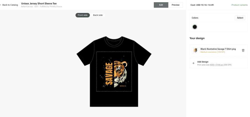
3. Upload and Customize Your T-Shirt Designs
Use Printify’s intuitive Product Creator tool to upload your artwork, add text, and position your graphics exactly how you want them. You can preview your designs on mockups instantly, no design experience needed..
4. Connect Your Online Store
You can seamlessly integrate Printify with leading eCommerce platforms like Shopify, Etsy, WooCommerce, and more. Once connected, your products are automatically published to your store, allowing you to manage listings and orders all in one convenient place.
5. Start Selling Your T-Shirt and Printify Takes Care of the Rest
Once a customer places an order, Printify’s trusted print providers take care of everything from printing your t-shirt to professionally packaging it and shipping it directly to your customer’s doorstep. Meanwhile, you can stay focused on growing your brand while Printify handles the backend operations.
Thanks to this hands-off approach, running a t-shirt business online is easier than ever. There’s no need for storage space, printing equipment, or upfront inventory costs. Whether you’re launching a side hustle or scaling a full-fledged apparel brand, Printify empowers you to build a store that’s both professional and profitable from day one.
Final Thoughts: 10 Best Selling T-Shirt Colour Combinations
Choosing the right t-shirt and ink colour combinations is crucial, as it can make or break the success of your print-on-demand business. A thoughtfully designed shirt that’s both visually appealing and wearable is far more likely to attract attention, drive sales, and foster brand loyalty. As you explore color pairings and fine-tune your designs, it’s important to keep in mind your target audience, embrace contrast, and stay aligned with current design trends.
Fortunately, with Printify, launching your t-shirt business has never been easier. From design to delivery, every step is streamlined, allowing you to focus on creativity and brand growth. Whether you’re just getting started or ready to scale, the perfect t-shirt colour combination could be the spark that sets your store apart.
So, are you ready to bring your vision to life?
Sign up with Printify today. It’s free, fast, and the first step toward building your successful online t-shirt brand.