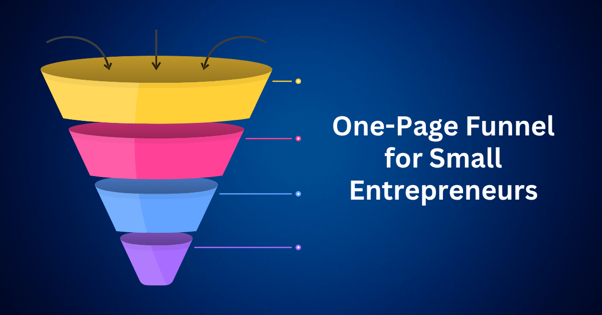
Running a business today often feels like managing a dozen spinning plates. From email marketing and website updates to lead generation tools, checkout systems, upsells, and customer support. The list goes on. However, what if you could simplify all of it into a One-Page Funnel?
That’s where the one-page funnel comes in. A streamlined, high-converting solution that allows you to run your entire business from a single page. Importantly, this isn’t just a typical landing page. Rather, it’s a complete business ecosystem. Whether you’re a solopreneur, coach, freelancer, or digital product seller, a one-page funnel can handle everything—from attracting leads and making sales to nurturing customers, all while eliminating the usual tech overwhelm.
So, let’s dive into how this powerful concept works, explore why it’s ideal for modern entrepreneurs, and discover how you can build one that runs your business on autopilot.
What Is a One-Page Funnel?
A one-page funnel is a strategically designed webpage that performs multiple business functions in a single flow. It’s not just about looking good. Instead, it’s engineered to:
- Attract and convert visitors
- Sell products or services
- Upsell or cross-sell
- Capture email leads
- Automate follow-ups
- Onboard new customers
Everything happens on one high-converting page; no need for five tools or complicated tech stacks. It’s like having your website, sales page, checkout, and email automation in one seamless experience.
Why One-Page Funnels Are a Game-Changer for Small Businesses
Small business owners often face a variety of challenges when it comes to running and growing their businesses online. One major hurdle is dealing with an overwhelming number of tools, each with its own subscription cost, which quickly adds up and eats into profits. Beyond the financial burden, juggling multiple platforms often creates inconsistent user journeys. When potential customers move from one tool or page to another, the experience can feel disjointed and confusing, causing them to drop off before converting.
Low conversion rates are another common pain point. With scattered touchpoints and unclear calls to action, many small businesses struggle to turn visitors into leads or customers. On top of that, marketing tasks like email follow-ups, page creation, and content updates become time-consuming, especially when systems aren’t streamlined or connected.
A well-designed one-page funnel addresses all these issues by simplifying and centralizing the entire user experience. It creates a clear, focused path from first click to conversion, eliminating distractions and confusion along the way. Instead of jumping between tools and pages, users stay engaged on a single page that captures leads, builds trust, and drives sales—all while saving business owners time, money, and stress.
Simplicity That Scales
Forget about multiple plugins, third-party software, or hiring a web developer. One-page funnels are simple to build and easier to maintain, especially with modern funnel builders like Systeme.io, ClickFunnels, or Leadpages.
Higher Conversion Rates
A focused, distraction-free funnel removes exit points and confusion. It creates a smooth journey from landing to checkout, increasing the chance of converting casual visitors into paying customers.
Fast Implementation
Whether you’re testing a new product or launching a service, a one-page funnel lets you go live in hours, not weeks. You can validate ideas quickly and start earning faster.
The Problem With Traditional Websites and Multi-Page Funnels
Let’s face it. Most small business websites are built using the same outdated playbook.
You start with a homepage, add an “About” section, throw in a few product or service pages, plug in a contact form, sprinkle in some blog content, and maybe tack on a pricing page for good measure. Then you bolt on email marketing tools, tracking scripts, and live chat popups.
Suddenly, your “simple website” has become a tangled mess of pages, links, and plugins, all working in silos.
The Hidden Cost of Complexity
What looks comprehensive on paper often turns out to be confusing in practice. Instead of creating a smooth experience, a multi-page setup tends to overwhelm visitors. They bounce between different sections, unsure of where to go next. This scattered layout dilutes your messaging, spreading it thin across various pages instead of reinforcing a clear, compelling offer.
As a result, your calls-to-action either compete with one another or get lost entirely, buried under layers of content. This disjointed structure causes your funnel to leak valuable prospects long before they ever reach the point of conversion. The most frustrating part? You lose sales not because your offer isn’t strong, but because your website fails to guide people confidently toward the sale.
More pages don’t necessarily mean more conversions. In fact, they often introduce more friction. Simplicity and focus are what move people to act.
The Power of Focus: Why One-Page Funnels Outperform Traditional Sites
Now imagine this instead: A visitor lands on one single, focused page. No menu to distract them. No endless tabs. Just one smooth, intentional path that guides them from curiosity to conversion.
That’s the power of a one-page funnel. It simplifies the experience for your visitor while amplifying results for your business.
What Makes One-Page Funnels So Effective?
A well-crafted one-page funnel accomplishes what most traditional websites struggle to do. It drives action with clarity and precision. Instead of scattering information across multiple pages, it brings everything together in one streamlined, focused experience designed to convert.
It starts by capturing leads through attention-grabbing opt-in forms that immediately engage visitors. Then, it presents your offer with a compelling, benefits-driven narrative that speaks directly to your audience’s needs and desires. Trust is built along the way using testimonials, satisfaction guarantees, and authentic social proof, helping to ease any hesitation.
Common objections are addressed head-on through strategically placed FAQ sections, comparison tables, and clear, confident answers. When the visitor is ready to buy, they can do so directly on the page with a secure, integrated checkout, no redirects, no confusion.
Behind the scenes, the funnel can trigger automations such as a welcome email series or relevant upsell offers, eliminating the need for manual follow-up. Instead of sending users on a scavenger hunt across your website, a one-page funnel keeps everything they need right in front of them. The result? Fewer drop-offs, more conversions, and a smoother, more enjoyable customer experience.
Control the Journey, Increase Your Conversions
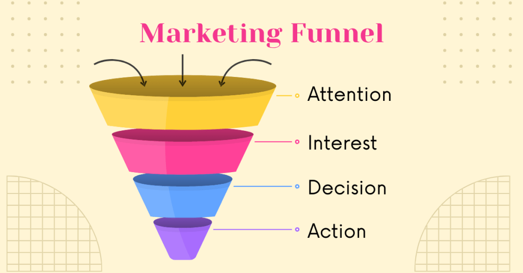
The beauty of the one-page funnel lies not just in its simplicity but in the control it gives you over the entire customer journey. Instead of leaving it to chance, hoping a visitor lands on the right page. You’re intentionally guiding them through every step with precision.
You start by grabbing their attention with a strong hook that speaks to their needs or pain points. Then, you build interest and trust through a compelling story or irresistible offer. From there, you eliminate doubt using proof, clarity, and credibility, answering objections before they even arise. Finally, you make it easy for them to take action, whether that’s buying, signing up, or opting in, all without ever leaving the page.
When every section on your funnel has a clear purpose, you don’t need a maze of extra pages. You just need a better, more focused path—and that’s exactly what a one-page funnel delivers.
Why Simpler Funnels Lead to More Sales
It’s a common misconception: the more details you provide, the more professional you appear. But in reality, too much structure, like endless navigation menus, tabs, links, and optional paths, doesn’t build trust. It builds confusion.
In a world full of distractions, clarity is currency. Your audience isn’t looking for an online textbook. They’re looking for confidence to take the next step. And that’s exactly what a one-page funnel delivers.
Choice Overload Kills Conversions
When your website presents visitors with too many options, they freeze. This phenomenon is called choice paralysis, and it’s a major conversion killer. Instead of moving forward, people hesitate, unsure of which path to take.
Think about it: should they read the About page or check out the Pricing page first? Is the free guide more valuable than the webinar? Do they book a call now, or browse your blog for more information? Every additional choice divides their attention and delays their decision-making.
This is exactly where traditional websites often fall short. By trying to offer everything at once, they end up overwhelming users and stalling action. A scattered experience leads to uncertainty, and uncertainty rarely converts.
One Message. One Goal. One Outcome.
A one-page funnel works because it removes the noise. It presents a single, compelling offer and leads the visitor down a carefully crafted journey, from interest to action.
Each scroll builds momentum:
- Clear hook to grab attention
- Story-driven value proposition
- Trust signals like testimonials and guarantees
- Offer a presentation with urgency
- Objection handling and FAQs
- Seamless call-to-action or checkout
There’s no menu to wander off to. No conflicting CTAs. No exit path.
Just one smooth, persuasive narrative that drives conversions.
Momentum Sells
In digital marketing, momentum is everything.
Once someone starts scrolling through your funnel, each section increases their emotional investment. With no distractions or detours, they’re more likely to stay engaged and convert.
By reducing complexity, you make the decision easier. And when the decision is easy, more people say yes.
Avoid These Common One-Page Funnel Mistakes That Hurt Your Conversions
Building a one-page funnel sounds simple, but simple doesn’t mean easy.
While this streamlined sales tool can be incredibly effective, a few small missteps in design or strategy can lead to disappointing results. The good news? These mistakes are easy to fix, once you know what to watch for.
Let’s break down the top one-page funnel mistakes that cost businesses conversions and how to avoid them for a high-performing funnel that works.
Mistake #1: Squeezing Too Much In a Page
Many funnel builders fall into the trap of trying to squeeze everything important into the top part of the page, thinking users won’t scroll.
But here’s the truth: if your headline and visuals are engaging, people will scroll.
What to do instead: Give your headline room to breathe. Use clean design, spacing, and a compelling lead-in that encourages curiosity. Let each section of the page build momentum.
Mistake #2: Weak or Vague Headlines
You only have a few seconds to capture attention and make a strong first impression. If your headline doesn’t immediately communicate what you offer and why it matters, most visitors will leave before scrolling any further.
To fix this, craft a clear, benefit-focused headline that speaks directly to your ideal customer’s pain point or desired outcome. Keep it simple and specific. If a 10-year-old wouldn’t understand your hook, it’s probably too vague or abstract.
For example, instead of saying, “Revolutionizing Health Through Innovation,” try something like, “Feel Better in 30 Days—Naturally Boost Your Energy Without Expensive Supplements.” It’s direct, outcome-driven, and instantly tells people why they should care.
Mistake #3: No Clear Value Proposition
A long list of features doesn’t inspire action. Visitors want to know one thing: What’s in it for me?
The fix: Highlight transformational outcomes, not just features. Don’t say, “Includes 5 video modules.” Say, “Learn how to grow a profitable online business in 30 days, even if you’re starting from scratch.”
Mistake #4: Skipping Mobile Optimization
More than 60% of online traffic now comes from mobile devices. If your one-page funnel isn’t optimized for mobile. If it doesn’t load quickly, look great, and function smoothly, you’re potentially losing the majority of your audience before they even engage.
To fix this fast, start with a responsive design that automatically adjusts your layout across all screen sizes. Test your funnel on different devices to catch any display or usability issues. Make sure buttons are large enough to tap comfortably without zooming in, and reduce text clutter to keep things clean and scannable.
Also, compress and optimize images to speed up loading times. A mobile-friendly funnel isn’t just a nice-to-have. It’s essential for keeping visitors engaged and converting them on the spot.
Mistake #5: Too Many Calls-to-Action
When everything is a call-to-action, nothing truly stands out. Bombarding visitors with multiple CTAs like “Subscribe,” “Book a Call,” “Buy Now,” and “Learn More” only creates confusion. Instead of guiding users toward a clear next step, it weakens the overall impact of your funnel.
The solution is to simplify. Choose one primary call-to-action that aligns with your main goal, whether that’s generating leads or closing a sale, and make it the focal point of your page. Reiterate that CTA strategically throughout the content, but avoid offering multiple, competing directions. A single, consistent path leads to stronger conversions and a more focused user experience.
Mistake #6: Ignoring Page Load Speed
Every second your page takes to load decreases the chance someone will stick around. Pages that load in 1 second convert 3x better than those that load in 5 seconds.
To improve load times quickly, start by compressing images without sacrificing quality. Use a reliable hosting platform that delivers fast, consistent performance. Minimize the number of plugins and unnecessary scripts, especially those that slow down your page behind the scenes. Finally, run your funnel through tools like Google PageSpeed Insights to identify and fix performance bottlenecks.
A fast-loading funnel keeps visitors engaged, improves user experience, and dramatically boosts your chances of converting traffic into customers.
The Anatomy of a High-Converting One-Page Funnel
A one-page funnel isn’t just a minimalist landing page. It’s a strategically engineered sales system designed to guide your visitors step by step toward a single, focused outcome.
Whether you’re using a funnel builder like Systeme.io, ClickFunnels, or even custom coding your page, the secret to high conversions lies in following a proven structure that does the heavy lifting for you.
Here’s what every successful one-page funnel includes:
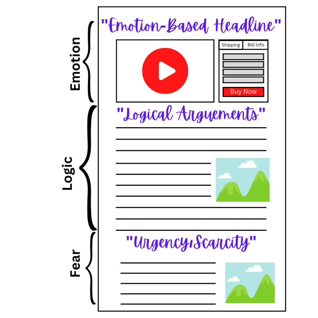
1. Hero Section (Hook + Transformation)
This is your first and possibly only chance to grab attention, so make it count.
To do this effectively, start by crafting a bold, benefit-driven headline that immediately communicates the transformation your visitors can expect. Next, pair that headline with a subheadline that further amplifies the value, and complement it with a compelling visual to reinforce your message.
Then, shift the focus away from the product itself and zero in on the result. In other words, make it instantly clear what’s in it for them, because that’s what truly motivates action.
2. Lead Magnet or Clear CTA
Give your visitor a reason to act right away. This could be a free download, a limited-time discount, or access to a webinar or checklist.
Keep it simple, high-value, and action-oriented. This is your gateway to building your email list or driving immediate conversions.
3. Authority Builders
People buy from those they trust, so building that trust quickly on your page is crucial. To establish credibility right away, start by incorporating elements that reassure potential customers and validate your offer.
First, include authentic customer testimonials that highlight real experiences and measurable results. Then, if you’ve collaborated with well-known brands or partners, showcase their logos to lend instant recognition and authority. Next, support your offer with success statistics or relevant performance metrics that emphasize your impact.
In addition, don’t overlook the value of your personal story or credentials. These details help humanize your brand and demonstrate that you’re genuine and qualified.
Ultimately, these forms of social proof work together to reduce skepticism, build trust, and give visitors the confidence they need to take the next step.
4. The Offer Stack
This is the section where you break down what the customer will receive when they make a purchase or sign up. It’s your chance to show the full value of your offer in a way that feels irresistible.
Start by listing the core features and benefits. What they get and why it matters. Then, sweeten the deal with any bonuses or limited-time extras to create urgency and added value. Be transparent about the price, and highlight any savings or special offers to emphasize the deal.
Wrap it up with a concise summary that reinforces how your offer solves a specific pain point or fulfills a strong desire. Your goal is to position the offer as a no-brainer, something they can’t afford to miss.
5. Objection Handling Section
Not everyone will be ready to say “yes” right away, and that’s perfectly normal. That’s why it’s important to address doubts head-on and remove any lingering hesitation.
Start with a well-crafted FAQ section that answers common questions and clears up confusion. Use risk-reversal language like a money-back guarantee or a “try-before-you-buy” option to lower the perceived risk. You can also include comparison charts or snapshots of real results to show how your offer stands out from the competition.
The goal here is simple: eliminate every possible objection and make it easy for your audience to move forward with confidence.
6. Seamless Checkout Section
Make buying as easy and seamless as clicking a button. Your checkout process should be designed for speed, simplicity, and trust, especially on mobile, where most users are browsing.
Ensure your checkout form is mobile-optimized and fast-loading, so it performs smoothly on any device. Keep it simple by minimizing the number of required fields. Only ask for what’s necessary. Most importantly, make it secure, using trusted payment gateways and visible security badges to reassure customers.
Every second of delay or hint of confusion adds friction, and that could cost you the sale. The smoother the checkout, the higher the conversion.
7. Upsell Teaser or Next Steps
The funnel doesn’t end at the sale. It’s just the beginning of the customer journey. To maximize impact and long-term value, guide users to the next step right after they buy.
You can include a soft upsell or bonus upgrade that complements their purchase without feeling pushy. Clearly explain what happens next, whether it’s access details, onboarding instructions, or how to get the most out of their new product or service.
This not only keeps the momentum going but also builds trust and sets the stage for repeat business. When customers feel supported and valued, they’re more likely to come back and refer others.
Choosing the Right Platform to Build Your One-Page Funnel
To make your funnel function like a true business system, not just a flashy landing page. You need more than a pretty design. Your platform must have conversion-focused features and built-in automation that keeps your business running even when you’re not online.
When choosing a one-page funnel builder, there are a few essential features to look for, because the right tool can make all the difference.
Start with a drag-and-drop page editor. You shouldn’t need to write a single line of code. The ideal builder will let you visually design your page, easily rearrange sections, and create a seamless, scroll-based experience. In short, it should offer simplicity without sacrificing flexibility. Next, prioritize built-in checkout functionality. Forget the hassle of integrating third-party payment systems. A native checkout streamlines your setup, reduces buyer friction, and makes it easier for customers to complete their purchase instantly, all in one place.
Then, consider automated follow-up sequences. Your funnel should keep working even after visitors leave. Look for a builder that includes automated email sequences to nurture leads, deliver post-purchase content, and keep your audience engaged, without constant manual input. Also, take advantage of pre-made funnel templates. There’s no need to reinvent the wheel. Professionally designed, proven templates allow you to hit the ground running. You can customize, launch, and start seeing results in hours, not weeks.
Final Thoughts: Supercharge Your Business with One Page Funnel
If you’re tired of juggling scattered tools, clunky websites, and overly complex marketing systems, then it’s time to make a change. Instead of patching things together, simplify your workflow with a well-built one-page funnel—a smarter, more streamlined way to run your business from a single, high-converting page.
With just one page, you can do it all. Capture leads, sell your products or services, build trust, and automate follow-ups, without ever switching between platforms. No more tech overwhelm, and no more juggling disconnected tools. In fact, just one streamlined, focused journey that guides visitors effortlessly from curiosity to conversion.
Even better, today’s no-code funnel builders make it possible to launch your entire system in a single day. It’s fast, it’s efficient, and most importantly, it gets results. This is the exact approach smart entrepreneurs are using to build lean, profitable businesses without the chaos of complex systems.
Now it’s your turn.