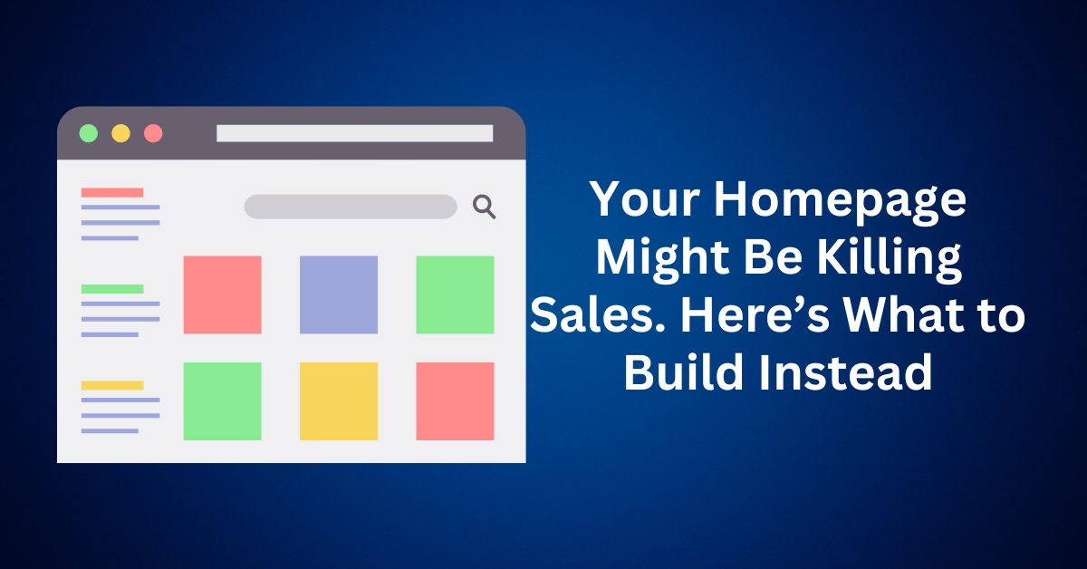
For years, marketers and web designers have preached the same gospel: “Your homepage is the face of your business.” It has long been treated like a digital storefront—in other words, a one-size-fits-all welcome mat designed to impress.
However, here’s the uncomfortable truth: your homepage may actually be sabotaging your conversions.
Today, in an age of personalized marketing and data-driven funnels, a static homepage is no longer enough. So, if you’ve been wondering why website traffic isn’t translating into leads or sales, chances are your homepage structure is the real bottleneck.
Why Traditional Homepage Fall Flat
At first glance, your homepage might look polished and professional. It has your logo, a navigation bar, maybe even a mission statement, and a few featured services. But dig deeper, and you’ll realize it’s trying to speak to everyone and reaching no one.
Here’s the core issue: a generic homepage treats every visitor the same. Whether someone lands on your site from a Facebook ad, a Google search, or a referral, they’re all shown identical content. That’s a problem.
Let’s say someone clicks on your ad for “small business accounting services.” They arrive on your homepage and see a broad, generalized pitch for your firm, not the tailored messaging that persuaded them to click in the first place. The result? Confusion, friction, and a missed opportunity to convert.
Your homepage isn’t designed to adapt. It can’t dynamically adjust based on the user’s intent, referral source, or stage in the buying journey. And since it’s often built on static frameworks, making changes requires time, technical help, and often, a complete redesign.
Meanwhile, your competitors are launching targeted landing pages, A/B testing headlines, and optimizing each click path to lead toward a sale. You? You’re hoping that a one-size-fits-all page can close the deal.
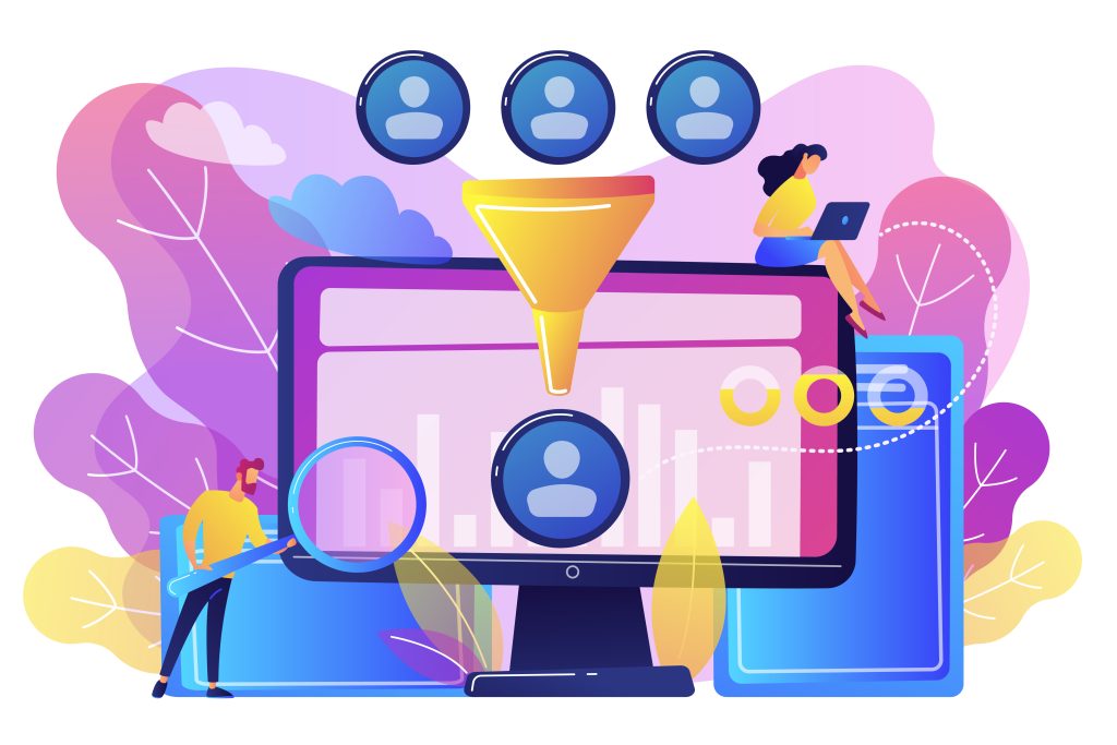
Funnel Sell, Not Static Homepage
Modern web users don’t want to dig for answers. They want a clear path forward, tailored to their needs and pain points. That’s exactly what a conversion-optimized funnel provides.
Unlike a traditional homepage, a high-converting funnel guides users step by step from awareness to interest to action. It simplifies decisions, builds trust, and nudges people toward the next best step, whether that’s signing up, booking a call, or making a purchase.
Funnels allow you to:
- Deliver targeted messages based on where the visitor came from
- Track performance at every stage of the journey
- Rapidly test offers, headlines, and layouts without rebuilding your site
- Focus on one action per page. Eliminating distractions and decision fatigue
In other words, funnels turn your website into a marketing machine, while your homepage remains a digital brochure collecting dust.
Why Funnel Converts Better Than a Traditional Website Homepage
When it comes to turning visitors into customers, simplicity wins. One of the most overlooked reasons your website isn’t performing is choice overload. Most business websites are cluttered with navigation menus, dropdowns, blog posts, contact forms, and social media icons, all competing for attention. The result? Visitors get overwhelmed, distracted, or click away before taking meaningful action.
That’s where a conversion funnel changes the game.
Rather than presenting users with dozens of options, a well-structured funnel offers a single, focused path. Every element on the page, headline, copy, imagery, and call to action, is crafted to lead the user toward one clear objective.
Let’s say a potential customer clicks on your ad for bookkeeping services. If instead of finding what they’re looking for right away, they land on your general homepage, they’re suddenly forced to figure out their next move. Should they browse your blog, click on “Services,” read your About page, or contact you directly?
This confusion creates friction, and friction kills conversions.
Now, imagine the same person landing on a dedicated landing page with a clear offer:
“Get Your Free Bookkeeping Checklist – Download Now.”
One message. One action. One outcome.
This is the essence of funnel-based design:
- No distractions
- No confusion
- Simple decision
Just a clear, guided experience that moves the visitor closer to becoming a lead or customer.
How to Transform Your Homepage Into a High-Converting Funnel
If your website’s homepage is acting more like a digital brochure than a lead generator, it’s time for a transformation. A static homepage might look good, but it rarely converts. To maximize your impact, you need to shift your homepage strategy from showcasing everything to focusing on one goal: conversions.
Here’s how to redesign your homepage into a conversion-focused funnel that drives measurable results.
Step 1: Identify Your Primary Offer (And Make It Irresistible)
To begin, get laser-focused on one core offer—the specific service or product that directly addresses your audience’s most pressing challenge. Rather than promoting everything you offer, zero in on what resonates most deeply with your ideal customer. In other words, avoid overwhelming them with a laundry list of services.
For instance, instead of using a vague description like: “We provide accounting, bookkeeping, tax, and payroll services,” opt for a more compelling hook such as: “Struggling with messy books? Download our free 15-minute daily bookkeeping system.”
This approach not only explains what you do but also taps into a specific pain point and offers a quick, tangible solution. Ultimately, that’s the kind of message that drives real action.
Step 2: Remove the Clutter and Eliminate Distractions
This is where most businesses hesitate, but it’s the key to higher conversion rates.
To create a homepage that functions like a landing page, strip away everything that doesn’t directly support your main offer. That means removing:
- Navigation menus
- About pages
- Blog links
- Contact forms
- Social media buttons
- Secondary CTAs
While this may feel counterintuitive, the goal isn’t to provide more choices. Instead, it’s to guide visitors toward one specific action without confusion or hesitation.
Remember: When visitors have too many paths to choose from, they often take none. Simplicity sells.
Step 3: Design a Singular Path Forward
Traditional websites encourage exploration. Funnels encourage action. Every element of your homepage funnel should lead users in one direction. That includes:
- A headline that stops the scroll
- Subheadline that builds curiosity or urgency
- A single, eye-catching call-to-action button
- Visuals or testimonials reinforcing the benefit
- Zero distractions from your goal
Whether you want users to sign up for a lead magnet, book a consultation, or try a demo, every piece of content should guide them toward that specific goal.
Pro tip: Use tools like heatmaps and scroll tracking to ensure users are actually engaging with your CTA.
Step 4: Structure Your Homepage for Fast Clarity and Conversion
A high-performing funnel-style homepage follows a clear, proven structure:
- Headline: Call out the exact problem your customer is facing
- Subheadline: Offer a clear benefit or unique solution
- Call to Action: Tell them exactly what to do next
- Social Proof: Add reviews, case studies, or recognizable client logos
- Urgency Trigger: Use scarcity (e.g., limited-time bonus, spots filling fast)
Within the first 5–10 seconds, your visitor should know:
- What you offer
- Why it matters to them
- How can they take the next step
Step 5: Set Up an Automated Follow-Up System
Once someone opts in to your offer, the work doesn’t stop there. You now need to nurture that lead and move them closer to becoming a paying customer.
Here’s how:
- Set up a welcome email sequence (3–5 emails minimum)
- Share valuable insights, how-tos, or mini case studies
- Answer common objections or FAQs
- Reintroduce your paid product or service with added urgency
This email sequence acts as a continuation of your funnel, keeping your brand top of mind while slowly warming up cold leads.
Step 6: Track, Test, and Optimize for Better Results
Your homepage funnel should never be static. Treat it like a live experiment.
Start by monitoring key metrics:
- Conversion rate (visits vs. sign-ups or bookings)
- Bounce rate
- Average time on page
- Email opt-in rate
- CTA click-through rate
Run A/B tests on:
- Headlines
- CTA button copy and colour
- Testimonials vs. no testimonials
- Lead magnet format (checklist vs. video)
Let’s say your current opt-in rate is 2%. With some strategic adjustments, you might double that to 4%. That means twice as many leads from the same amount of traffic, a win without spending more on ads.
Advanced Funnel Strategies That Actually Drive Conversions
Once you’ve built a solid funnel foundation, complete with a compelling offer, clear CTA, and follow-up sequence, it’s time to level up. Small tweaks based on real human behaviour can significantly boost your results. These advanced funnel optimization strategies help you connect deeper with your audience, increase repeat visits, and convert more leads into paying customers.
Here’s how to take your funnel from functional to exceptional.
1. Rotate Your Offers to Encourage Habitual Discovery
If your funnel always promotes the same lead magnet or offer, returning visitors may start to tune it out. Over time, seeing the same message repeatedly can lead to reduced engagement and missed opportunities. However, when you switch up your core offer every few weeks, you introduce an element of surprise and curiosity that keeps people coming back.
This approach is known as habitual discovery. The idea is that visitors return to your site or landing page regularly because they anticipate finding something new, valuable, and relevant to their needs. By consistently offering fresh content or incentives, you encourage repeat visits and build trust over time.
To implement this strategy, consider rotating between different types of lead magnets or entry offers, such as free checklists, limited-time consultations, mini-courses, discounted service trials, or exclusive downloads. Each of these options can appeal to different segments of your audience or catch attention in new ways. Just make sure that every new offer still solves a specific, high-impact problem your ideal customer truly cares about. Consistency in value is key, even when the format changes.
2. Open With Questions That Demand Attention
Your headline is your first and often only chance to hook someone. To make the most of it, one powerful tactic is to start with a question that speaks directly to your audience’s pain point.
Rather than using a dull headline like: “Welcome to ABC Accounting Firm,” try something more emotionally charged, such as: “Tired of staying up late reconciling your books?”
Why does this work? Because questions naturally force the brain to engage. They don’t just grab attention—they create curiosity gaps your audience subconsciously wants to close. Even more importantly, they signal that you truly understand what your audience is struggling with.
As a pro tip, test both open-ended and yes/no questions to discover which type drives more clicks and conversions. Over time, this data-driven approach can significantly improve your results.
3. Tell Micro-Stories Inside Your Call-to-Action
Generic CTAs like “Download Now” or “Get Started” feel flat and transactional. But when you weave in a tiny success story, your offer feels more tangible and far more appealing.
For Example: Instead of: “Download the bookkeeping checklist”
Try: “Get the same checklist Sarah used to save 3 hours a week on bookkeeping.”
These micro-narratives make your offer real. They spark emotion and create instant relatability. In other words, people don’t just see the tool; they imagine the result.
Bonus tip: Incorporate these CTA stories into your buttons, image captions, or even testimonial boxes for extra impact.
4. Track Behavior and Personalize Follow-Ups
Funnel success isn’t just about what happens at the first click. It’s about what you do afterwards. The real power of a funnel lies in how you track and respond to user behaviour throughout the journey.
Use tools like Google Analytics, Hotjar, or your built-in CRM analytics to understand your audience’s actions. Identify who visited your landing page but didn’t opt in, who downloaded a guide but never booked a call, or who opened your emails but never clicked through. These insights allow you to tailor your follow-up strategies.
With smart segmentation, you can adapt your messaging based on each user’s behaviour. For example, show return visitors a different offer instead of repeating the same lead magnet. If someone downloaded a resource but didn’t convert, follow up with a relevant case study. And for those stuck in the consideration phase, send testimonials and credibility-boosting content to build trust.
This approach allows you to create a dynamic, behaviour-driven funnel that meets users where they are, rather than a static one that treats every visitor the same.
5. Double Down on Simplicity and Empathy
When in doubt, simplify.
A successful funnel doesn’t need to be flashy or technically complex. Instead, what makes it truly effective is its ability to align with how real people think and feel. At the heart of it, users want to avoid costly mistakes, feel understood, and—perhaps most importantly- believe that meaningful progress is within reach.
This is precisely why the highest-performing funnels are built on empathy-driven messaging. Rather than just trying to sell, your role is to guide. To do that effectively, speak to your audience in plain, human language. Avoid jargon that creates distance. Instead, mirror their thoughts and concerns to show you genuinely understand what they’re going through.
Once you’ve established that connection, provide a clear, simple next step—one that feels doable and delivers immediate value. After all, simplicity builds trust, and trust is what ultimately drives action.
6. Use Urgency That Feels Real, Not Manufactured
There’s nothing wrong with using urgency. It can be a powerful motivator. But in today’s online world, people are bombarded with fake countdown timers and vague “limited-time” offers that feel manipulative. If you want urgency to be effective, it needs to be genuine and believable.
Instead of using generic phrases like “Offer ends soon” or “Act now before it’s gone,” focus on real limitations that make sense. For example, say “Only 5 consultation slots available this month. First come, first served” or “We only take 10 new clients per quarter. Reserve your spot today.”
These types of messages work because they feel authentic. They show real scarcity or capacity limits, and they respect your audience’s intelligence. When urgency is honest, it builds trust instead of breaking it, and trust is what drives conversions.
Final Thoughts: Is Your Homepage Killing Conversions
At the heart of every successful online business is a simple truth: funnels work because they guide people toward decisions, rather than overwhelming them with choices. Traditional homepages tend to treat every visitor the same, whether they’re just browsing, mildly interested, or ready to buy. This one-size-fits-all approach leaves potential customers without direction and often results in lost opportunities.
A well-structured funnel, however, is built to meet people exactly where they are in their buying journey. It removes distractions, presents a clear value proposition, and offers a single, compelling next step. Whether that’s downloading a lead magnet, booking a consultation, or making a purchase, the funnel keeps visitors moving forward step by step, toward conversion.
To make this strategy work, you need the right tools. Your funnel-building software should make it simple to bring all the moving parts together: landing pages, email automation, payment processing, and performance tracking. The goal is to eliminate the need for multiple platforms or technical headaches so you can stay focused on growth. Platforms like ClickFunnels and Systeme.io are great examples of all-in-one solutions that help you launch and scale without complexity.
Ultimately, your funnel isn’t just a marketing tactic. It’s the engine of your entire business. If you’re still relying on a static homepage, you’re leaving too much to chance. Instead of hoping visitors stumble onto the right page or decide to contact you, give them a clear, guided path to the solution they’re already searching for. A focused, conversion-optimized funnel does more than attract attention. It turns it into action. And in today’s digital landscape, that’s what truly drives results.